Introduction
Most research websites speak the language of data. MindMarket chose to speak the language of people. The redesign of MindMarket’s website wasn’t about visual reinvention for its own sake. It was about translating an intangible business value — human understanding — into something visible, navigable, and structurally sound.
The challenge was not to explain what qualitative research is, but to make it felt. The result is a website where brand strategy, design, and front-end engineering are inseparable. Not layered, interlocked.
The Thread as a Strategic Device
At the heart of the project sits a single idea: the thread.
Not a metaphor added after the fact, but a guiding principle that shaped brand expression, UX logic, and technical execution. The thread represents MindMarket’s role as a connector: between companies and consumers, between cultures, between raw conversation and actionable insight.
On the homepage, the thread becomes the narrative spine. It guides the scroll, connects sections, and creates continuity across otherwise complex content. From a UX perspective, it functions as orientation. From a brand perspective, it becomes a visual signature. From a technical standpoint, it establishes a repeatable interaction pattern that can scale with content.
This is where brand strategy moves beyond messaging and becomes interface logic.
Human Energy, Precisely Engineered
MindMarket’s work is rooted in real conversations. The site had to reflect that reality without resorting to clichés or corporate gloss.
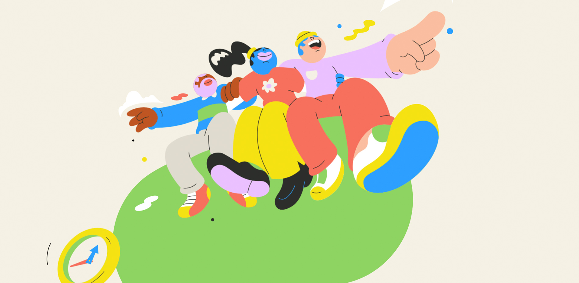
The visual system leans into warmth and expressiveness: bold colors, custom hand-drawn illustrations, and animated characters that feel intentional rather than ornamental. Importantly, none of this relies on stock imagery or AI-generated visuals. Every illustration was crafted to reinforce diversity, curiosity, and imperfection — qualities central to qualitative research.
From a technical perspective, motion was handled with purpose. Animations were built to create rhythm, not distraction. Scroll-based transitions are smooth to preserve readability while adding a sense of progression. The energy of the site is not driven by constant movement, but by timing.
This balance required tight collaboration between design and development. Motion elements were treated as part of the content flow, not as separate layers applied at the end.
Front-End Decisions That Serve the Story
The technical architecture was designed to support three core priorities: performance, scalability, and narrative clarity.
- Purposeful motion
Interactive elements and animations were implemented only where they reinforced meaning. The thread itself acts as a structural animation, guiding users without interrupting cognitive flow.
- Performance-aware implementation
Despite rich illustration and motion, the site remains lightweight. Assets are optimized and animations tuned to avoid unnecessary repaint or layout shifts, ensuring consistent performance across devices and regions.
- Scalable content structure
The site was built to grow with MindMarket’s editorial ambitions. Case studies, insights, and long-form content sit within a flexible system that preserves hierarchy and brand coherence as new pages are added.
- SEO without compromise
Narrative storytelling and search visibility were treated as complementary, not opposing goals. Content is structured semantically, allowing rich copy to coexist with a clear UX and strong discoverability.
The development choices are largely invisible — and that’s precisely the point. The technology never competes with the message. It supports it quietly, confidently, and consistently.
The Scroll-Controlled Path Animation
On the homepage, the thread doesn’t just sit there. It unfolds.
As you scroll, a path gradually draws itself across the page, guiding you through MindMarket’s story with a kind of quiet momentum. It’s subtle, but structural: a navigational gesture as much as a visual one.
Every illustration placed along that path is a Rive animation, triggered only when it enters view using an Intersection Observer. Nothing runs unnecessarily. Motion is treated as pacing, not decoration.
What makes this system deceptively complex is how manual it had to be. Each illustration and SVG was positioned by hand across breakpoints to preserve rhythm, spacing, and continuity. In total, the homepage includes 85 animated and static elements, carefully placed one by one. No AI shortcuts. Just patience and precision.
To create depth, the thread is built using three layered paths:
- Main path (this.$mainPath): the starting layer
- Secondary path (this.$secondaryPath): the ending layer
- Shadow path: sits between the two to add depth
The secondary path’s only purpose is to render above the gradient shadow, keeping the layers visually distinct as the animation unfolds.
createTimeline() {
    // We create and pause the timeline because it will be controlled by scroll.
    this.masterTimeline = gsap.timeline({ paused: true });

    // Beginning path (in green in the demo)
    this.masterTimeline.fromTo(
        this.$mainPath,
        { drawSVG: '5%' },
        {
            drawSVG: '100%',
            ease: CustomEase.create('custom', 'M0,0 C0.952,0.017 0.744,0.69 1,1'),
            duration: 0.9
        }
    );

    // End of the path (in blue in the demo)
    this.masterTimeline.fromTo(
        this.$secondaryPath,
        { drawSVG: '0%' },
        { drawSVG: '100%', ease: 'none', duration: 1 }
    );

    // The shadow fading in when the secondary path overlaps the main path
    this.masterTimeline.fromTo(
        this.$shadowPath,
        { opacity: 0 },
        { opacity: 1, ease: 'none', duration: 0.15 },
        0.95
    );
}
Scroll Synchronization
Locomotive Scroll lets us know exactly when the timeline enters the viewport. It emits custom events with a normalized progress value (from 0 to 1), which makes it perfect for driving animations.
We simply pass that progress straight into the GSAP timeline:
This keeps the path perfectly locked to the user’s movement, so the drawing feels responsive rather than pre-scripted.
And ultimately, that’s what makes it work: not a single tool, but how everything comes together: the scroll progress, hand-placed visuals, layered paths, and carefully tuned easing.
Where Strategy, Design, and Code Align
What sets the MindMarket website apart is not a single interaction or visual moment, but the discipline of alignment.
Brand strategy defined the idea.
Design gave it form. Front-end development turned it into a durable system.
The result is a digital experience that doesn’t just describe qualitative research. It behaves like it. It listens. It guides. It connects. And it leaves space for meaning to emerge.
In an industry often dominated by abstraction and dashboards, MindMarket’s website proves that clarity, humanity, and technical rigor can coexist and that sometimes, the strongest interfaces are the ones that know when to step back and let the story breathe.
Tech Stach
- Astro: Front-end framework powering the site
- CMS: DatoCMS for content management
- Deploy: Netlify with Cache-Tag caching strategy
- Styling: Tailwind CSS
- Rive: Illustration and micro-animations
- GSAP: Core animation engine, using DrawSVGPlugin for smooth stroke animations
- Locomotive Scroll: Lightweight scroll library for modern web experiences, built on top of Lenis
About KOKI-KIKO
KOKI-KIKO is a tiny studio, run by two, powered by many. We believe in the magic of tailored teams, curating the perfect blend of talent for each unique project. We build holistic experiences where strategy, brand, design, motion, and code work together as one system, not separate layers. The result are products that not only catch the eye, but truly connect to the real world through experiences that feel cohesive, human, and alive. ✌️
Credits
Brand and Digital Strategy: Kim Levan
Brand and Web Creative Direction: Louis Paquet
Web Design: Louis Paquet, Marie-Christine Dion, Pier-Luc Cossette
Web Development: Deven Caron, Pier-Luc Cossette
Project Management: Kim Levan
Illustrations: Spencer Gabor