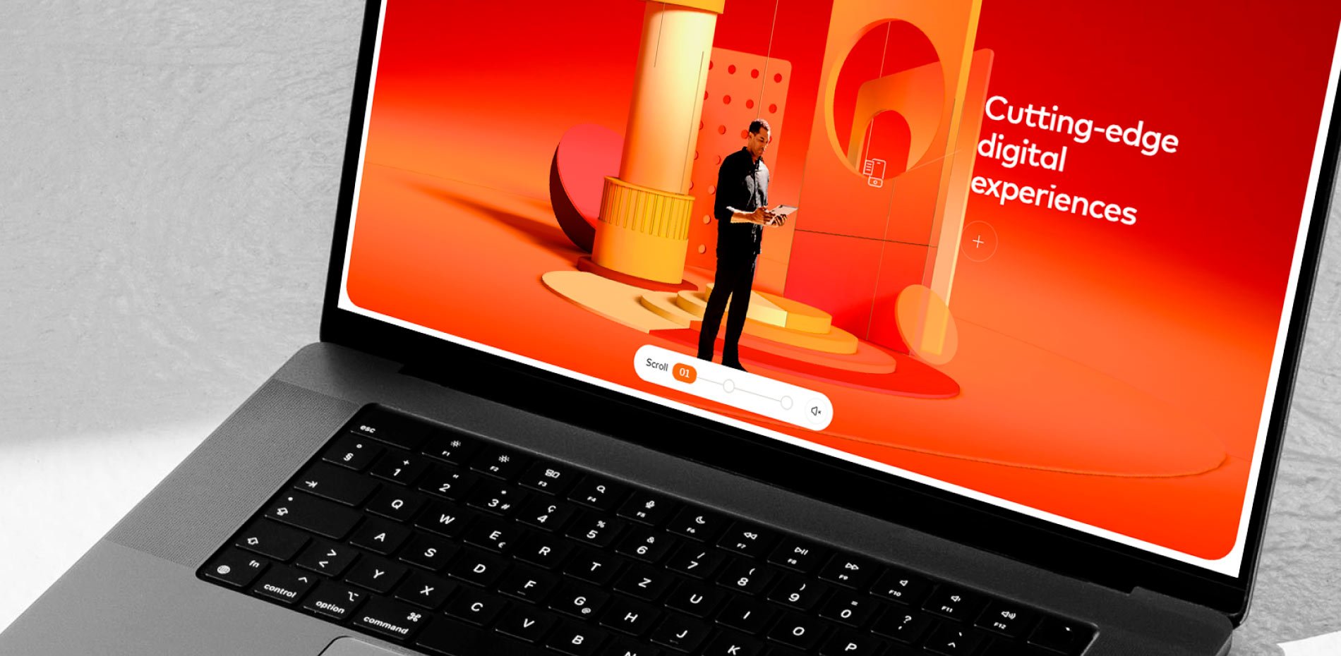
When Mastercard set out to create the Business Outcomes platform, the goal was not to build another corporate website. The mission was to reimagine how a global brand communicates its impact, not through product listings or service pages, but through stories of real transformation.
1. Challenge
The challenge was significant from day one. The brief included only a PDF summarizing six key outcomes, along with a few high-level brand materials and statistics. There was no content architecture, imagery, or narrative direction.
Yet Mastercard’s ambition was clear:
“We want this platform to become a tool for our teams. Something they can use to start conversations, inspire clients, and demonstrate how Mastercard helps businesses grow.”
The platform needed to bridge two worlds: a sales support tool for internal use, and an open storytelling experience for external audiences. It had to communicate Mastercard’s role not as a card issuer, but as a strategic growth partner helping businesses innovate, scale, and thrive.
Above all, it needed to make the invisible visible, turning abstract capabilities into experiences that people could see, feel, and understand.
2. Concept
At the heart of the project was a simple narrative idea: Start from Mastercard’s global business perspective, then guide the user deeper into specific, tangible outcomes, with real examples of transformation happening across industries.
This “macro-to-micro” structure mirrored Mastercard’s philosophy: a company operating on a global scale while creating local, human impact.
The idea of making the invisible visible became the creative thread linking every layer of the experience. As users scrolled through the site, they moved from a strategic overview of Mastercard’s capabilities to the behind-the-scenes realities of how those outcomes take shape in the real world.
Key Experience Principles
- Dynamic, outcome-based navigation with its own narrative arc
- Immersive 3D scenes that bring abstract services to life
- Screen capture functionality for Mastercard sales teams to reuse content
- Personalization logic guiding business visitors toward relevant outcomes
UX Phase
A proof-of-concept video was created during the UX phase to define the flow and behavior of the immersive experience. It demonstrated:
- The transition from macro to micro storytelling
- Core interaction principles for the 3D worlds
Initially, the concept included fully 3D characters transitioning from filmed footage to digital environments. To balance visual fidelity, performance, and resources, the team adopted an alternate approach, projecting 2D character images onto 3D planes.
The result was an intuitive, elegant, and human structure: a storytelling platform disguised as a digital tool.
3. Look & Feel
The visual journey began with Mastercard’s brand guidelines. The goal was to go beyond them: to translate the brand’s energy and vision into an immersive, emotional digital universe.
The site’s design was guided by three principles:clarity, depth, and presence.
While Mastercard’s palette and geometry provided the foundation, the team sought to elevate these familiar codes through spatial design, motion, and interactivity.
At this stage, all 3D elements were placeholders carefully selected to reflect the final creative intent. They helped the Mastercard team visualize how the finished 3D environments would look and feel while the 3D designer worked on the final assets. The creative intent was to make the experience feel unmistakably Mastercard, yet fresh and exploratory.
Each outcome section became its own world, an abstract landscape representing a specific capability. The interface was kept deliberately minimal to let the 3D environments and case studies take center stage.
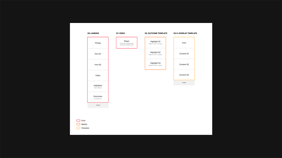
Scroll-based storytelling created rhythm and immersion, guiding visitors from video to 3D to content seamlessly. Subtle parallax and microinteractions added moments of delight without distracting from the story.
The tone of the interface was confident and premium, echoing Mastercard’s trusted global presence while expressing the curiosity of a brand looking toward the future. Every design choice, from typography to spacing, served a single purpose: to make complex ideas feel effortless.
4.Content Production
If design was the visible layer, content was the foundation, and one of the most challenging parts of the project.
Structuring the Story
At the start, Mastercard had no structured editorial content. Only a PDF of six outcomes, scattered case studies, and a few business insights.
The team built a scalable content framework using a “funnel of discovery” approach:
- Global narrative: What Mastercard stands for
- Outcome level: How Mastercard enables progress
- Case level: Specific examples of transformation

This macro-to-micro model turned fragmented information into a logical and navigable story.
Curating Case Studies
Each outcome came with multiple potential stories. The team analyzed, selected, and refined these into concise, outcome-focused narratives. Every case study's goal was to be clear, actionable, and emotionally resonant.
Sourcing Visuals
Mastercard’s internal image library was a mix of treasure and trash. Hundreds of photos and videos and clips were reviewed to find those that matched each narrative. Color correction, framing, and toning were applied meticulously to unify the visual language and align it with the platform’s overall mood.
Creating the Outcome Videos
Each outcome opened with a short video introducing the theme before transitioning into the 3D environment.
With no existing footage and a limited budget, six short narratives were created around relatable protagonists (a business owner, a customer, or security expert) each representing a facet of Mastercard’s ecosystem.
These videos acted as narrative bridges, blending reality into the 3D world and symbolizing the shift from visible to invisible.
5.3D & Interactivity
One of the project’s defining features was the creation of six custom 3D environments, each designed to visualize a Mastercard outcome through metaphor, form, and motion.
Design Language
Each scene began as a sketch exploration based on Mastercard’s geometry: circles, arcs, and cylinders. These elements became the DNA of the 3D worlds: recognizably Mastercard, yet open to different moods and meanings.
Every scene balanced abstraction and emotion. They were complex enough but clear enough to understand at a glance.
Visual Execution
Materials were tuned for premium realism: metallics, translucency, and soft diffusion. Transparent surfaces posed technical challenges in WebGL, requiring optimization and compositing to preserve both performance and visual fidelity.
Each environment became a signature identity piece within a cohesive visual system that embodied Mastercard’s innovation-driven DNA.
6.Conclusion
The Mastercard Business Outcomes platform transforms a complex, service-based offering into a clear and emotionally engaging narrative.
By merging editorial clarity, 3D immersion, and interactivity, the platform repositions Mastercard as a partner in progress, showing how technology, data, and trust translate into real impact.
It’s both a storytelling platform and a working tool, bridging communication, education, and brand expression.
Technologies
Frontend: Nuxt, Three.js / WebGL, GSAP, Lenis
Tools: Blender, Figma, After Effects, Photoshop, Illustrator
Performance: Dynamic asset loading, adaptive resolution, GPU-based rendering
Company Info
KKPK is a creative production studio specialized in digital storytelling, brand expression, and experiential design. Helping brands turn abstract ideas into meaningful, human experiences.
Little Red Robot is an agency that partners with ambitious brands. From strategy and brand identity to cutting-edge web, XR, and campaign production, they blend technique with creative vision.
