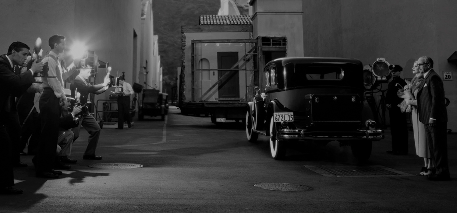
Mank is a celebration of everything that goes into storytelling in the film era, from finding inspiration, to the written page, and eventually to the screen. In Mank, director David Fincher takes us back to the “golden age” of Hollywood, painting a picture of the unsung screenwriter of Citizen Kane, and reminding us that this time may have not been so golden after all.
Our digital adaptation of a physical book that was created for Mank honors all of the elements that make this film and book unique. It manages to bridge the gap between the two elements to become an entity in and of itself. Utilizing content selection, intuitive design, and subtle animation, the experience is a showcase of the film and book’s attention to detail.
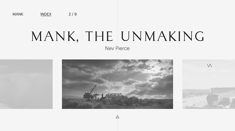
When you pick up an art book, you immediately know what to do with it. You flip through to look at images, browse articles, and experience the content almost subconsciously without needing to “learn” how to absorb it. This is how we approached the digital interpretation of the Mank book. We wanted everything to be immediately intuitive to the user without any guidance. In order to achieve this, we created fluid navigation that makes reading text simple, and an experience that feels tangible like a printed page.
We created fluid navigation that makes reading text simple, and an experience that feels tangible like a printed page.
When creating the experience, we wanted to make sure that the beautiful photography and filmmaking in Mank was front-and-center with little to no barrier to entry. Our goal was to assure that however the user is browsing the experience, the quality or integrity of the content is never compromised. With this in mind, we set out to avoid anything that interrupts or blocks the content.
We wanted to make sure that the beautiful photography and filmmaking in Mank was front-and-center
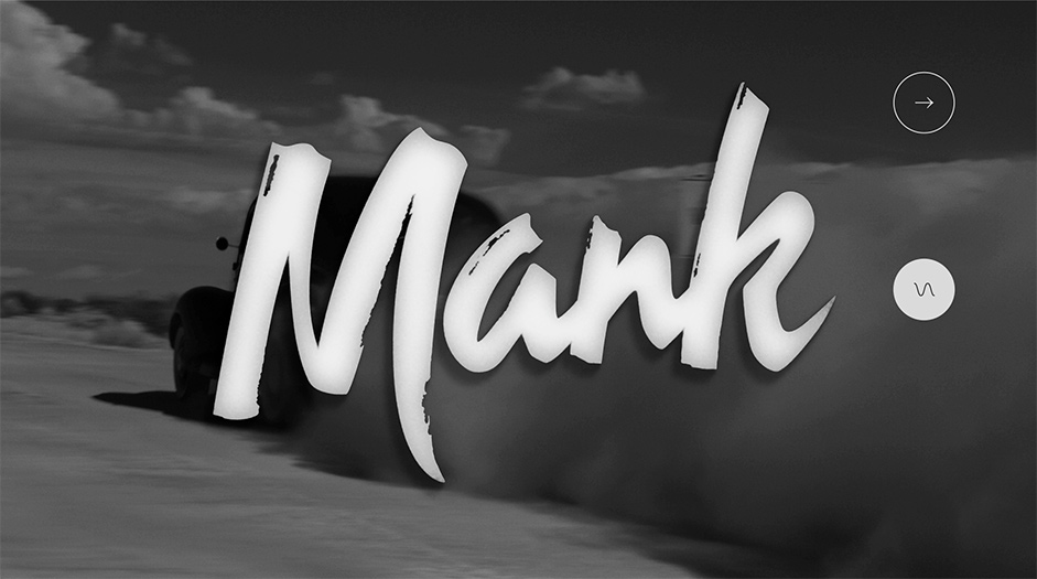
We wanted the digital experience to match thematically and aesthetically with both the book and the film itself, while still being a unique user experience on its own. The framing, navigation, and overall visual layout is set up to be as simple as turning the page, and will have a nostalgic and classic feel while still being intuitive and forward-thinking in the ways we implement animation, transition, and all of the other elements that digital can offer.
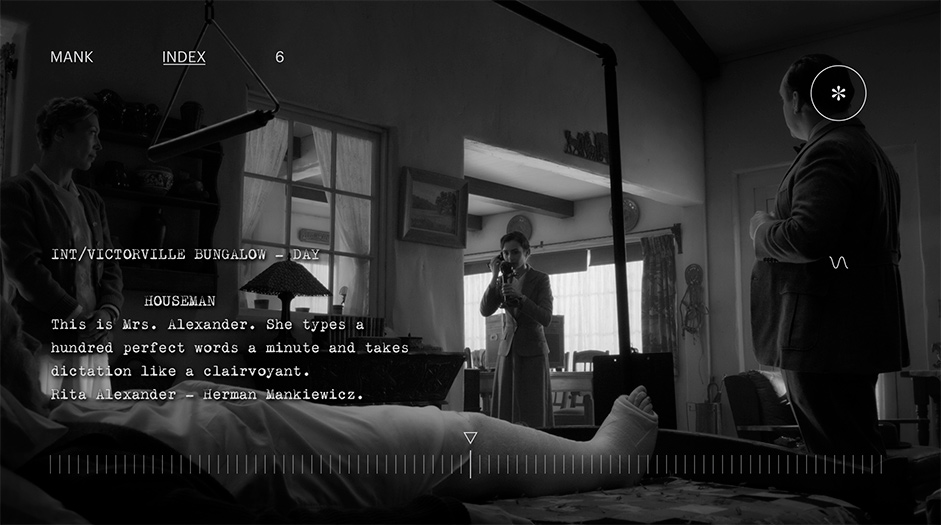
We utilized careful image selection to tell a story as the user progresses through each section, or “reels”. Throughout the experience, icons appear representing content that contains additional audio and video extensions that can be explored. These icons can be tapped to seamlessly open the content without disrupting the experience.
Scrolling through “Mank: The Unmaking” feels as natural as running your fingers through the pages of a book, stopping whenever you find something you want to read or get a closer look at. Read articles and interviews about the people who made this film possible, browse behind-the-scenes photography, or listen to the mesmerizing soundtrack by Trent Reznor and Atticus Ross.
Technologies
The Mank digital campaign was a unique challenge. The film itself is a work of art, using a combination of high-definition photography and era-appropriate black-and-white that make it look unlike any other film on the market. Our digital experience set out to capture the depth of the work that went into the film without distracting from it. The solution? A digital editorial experience that feels like flipping through a high-quality art book.
As any developer or designer can tell you, print layout and digital layout are completely different beasts. We needed to adapt the design of a book with a very specific layout into the digital space, accounting for both desktop and mobile versions.
Additionally, the amount of heavy assets and the layer tree of the browser made this very challenging to manage from a technical perspective.
We faced time constraints that challenged us to come up with new solutions to simplify the mobile site without diminishing the effectiveness of the site and its content.
Tools:
The entire site was built from scratch, so there were no framework or libraries used. For navigation, we used a WebGL javascript API. Built-in WebGL allows the user to navigate smoothly and seamlessly from page to page.
Company Info
Watson Design Group is an award-winning creative boutique specializing in digital storytelling and online development. We are imaginative, innovative, and driven by our passion for interactive design. Projects we’ve brought to life include campaigns for Suspiria, Once Upon a Time in Hollywood and the Isle of Dogs. We’ve had the pleasure of working with clients from FX, A24, Netflix, Disney, Riot Games, Fox Searchlight and are constantly looking forward to creating new, exciting digital marketing and social initiatives. We are not afraid to challenge ourselves and push the envelope of what's possible, setting our goals high and keeping our eye on the digital horizon.