Jul 15, 2026
La Revoltosa: Rebooting a 70-Year-Old Spanish Soda Brand for the Scroll Generation

Introduction
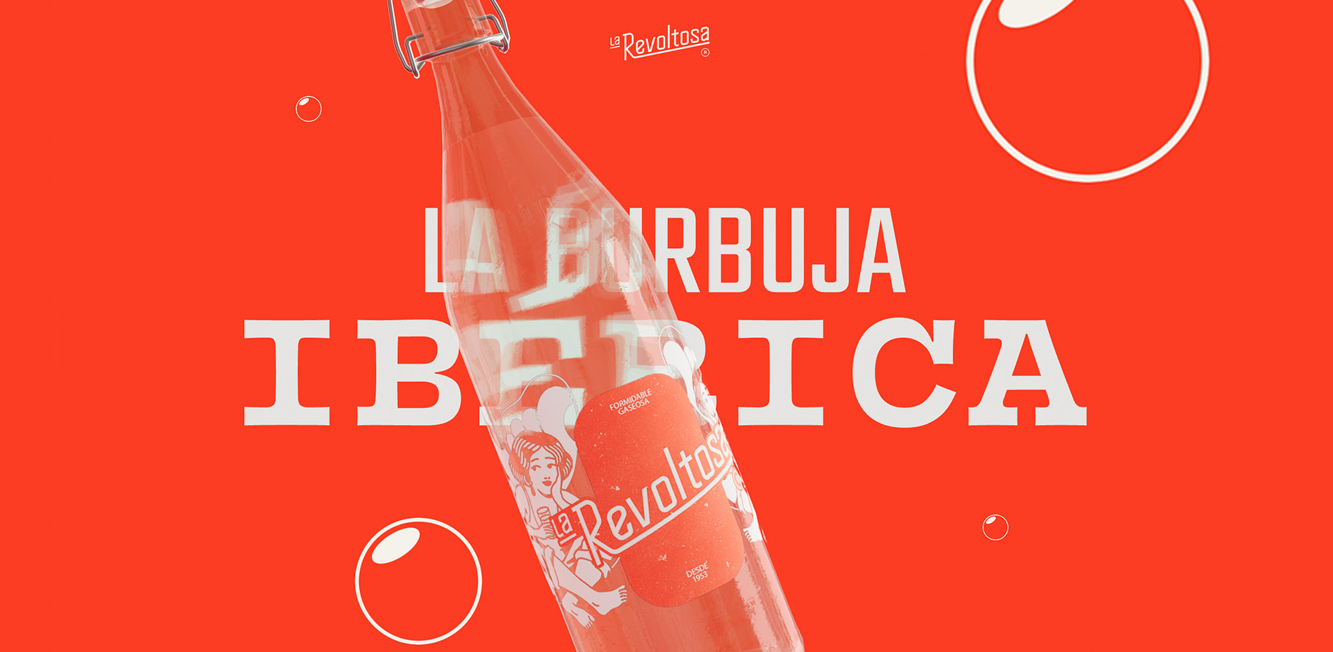
La Revoltosa is a Spanish soda brand born in 1953, deeply rooted in bar culture and family memory across Spain. When Refrescos del Atlántico came to waka, the brief wasn't to invent a new brand, it was to bring an existing one, beloved but dormant, back into relevance without losing its soul.
The client handed us the keys and gave us total freedom to create. That trust is exactly what gave us the confidence to take some big technical risks and really push ourselves to build something that breaks the mold.
This case study focuses on the digital side of the project: how we translated a strong, character-driven brand identity into a website that doesn't just show the brand, but talks like it, and the technical challenges that came with making that happen on every device.
The concept: a website that doesn't shut up
The first thing we knew for certain was what we didn't want to do. Spain's food and beverage industry is full of websites that look like brochures: third-person "about us" sections, product carousels, stock photos of people toasting. Functional, correct, interchangeable, and absolutely nothing like the brand we had in our hands.
La Revoltosa has a verbal identity packed with personality. Bar-counter familiarity, irony and a bit of rough affection. It felt like a waste to pour that voice into a site that, structurally, talked like any other. So we flipped the brief: the website doesn't introduce the brand; the brand introduces itself.
The entire site is written in the first person. It's a scrollytelling of La Revoltosa talking to you, on first-name terms, telling you her life story. And she doesn't do it all at once, she does it in chapters. Each section you move through as you scroll is one more step in a conversation that progresses in tone, story and personality. You arrive not knowing who this brand is, and you leave feeling like you've just met someone at a bar (someone you'd actually like to see again).
“It's La Revoltosa talking to you, on first-name terms, telling you her life story”
The brand concept runs through the entire project: "a nuestra manera" (our own way). La Revoltosa doesn't need to imitate anyone because she has her own history, and that confidence shows in how she talks. If the brand has its own voice, the website had to sound exactly the same.
Behind the curtain: the stack
Let's talk plumbing.
The site runs on custom monolith WordPress (no builders, no pre-built templates) combined with WebGL for everything 3D. The client needed to manage content: products, copy, campaign images… without depending on developers.
The Core Challenge: Pushing the Browser to its Limits
The main challenge wasn't just adapting the site for mobile; it was a constant battle for performance across the board. The home page is packed with computationally demanding sections, and achieving a natural, seamless transition between them meant we had to constantly track scroll states and progress with extreme precision.
We were fighting on three main fronts:
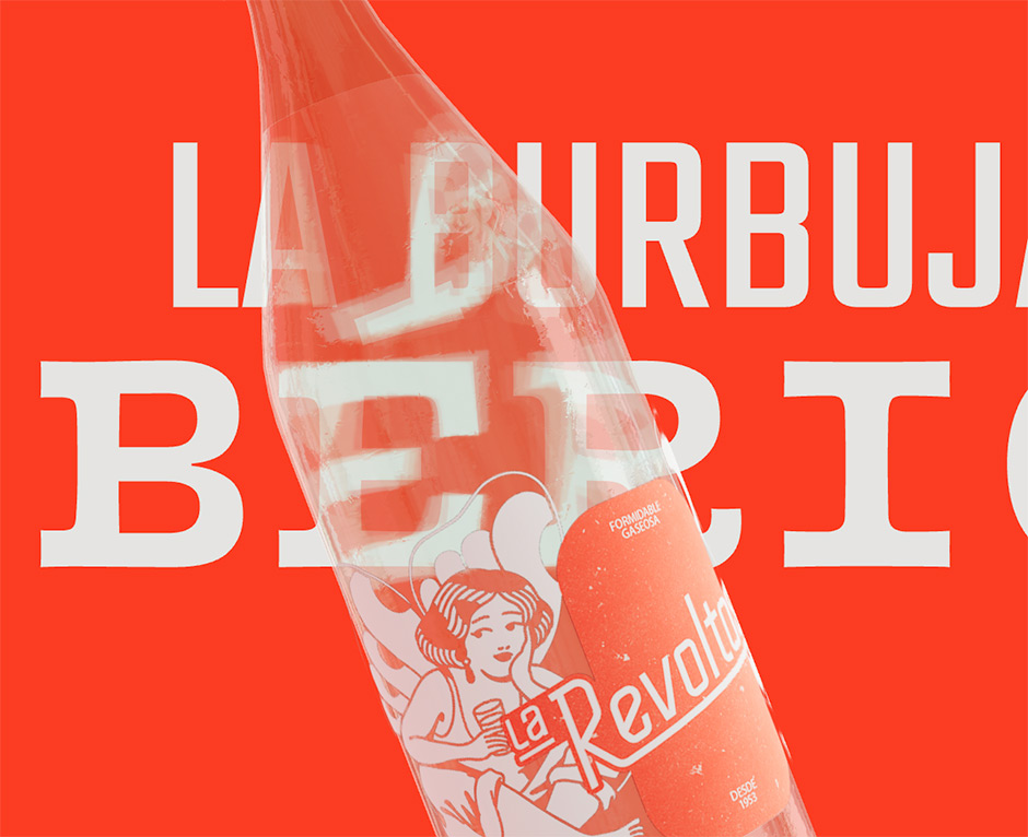
1. Heavy 3D Materials and Geometry The 3D bottle is actually split into two parts with different materials, both relying on complex Refraction Indices (IOR) and light reflections—which are notoriously expensive to render. Furthermore, because we wanted the Hero copy to distort behind the bottle's refraction, we couldn't use standard HTML text. We rendered the headline inside the Three.js scene, treating every letter as independent geometry so we could animate them on entry, adding a massive load to the render cycle.
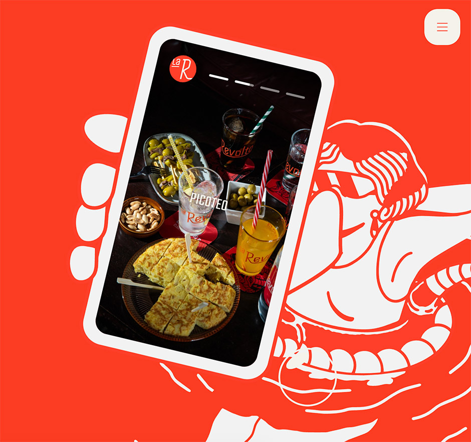
2. DOM Synchronization at Scale Right after the heavy 3D intro, we hit the "La Revoltosa" SVG section. We are massively scaling an SVG (until the glasses cover the entire screen) directly over an autoplaying 5-second background video loop. To complicate things further, a floating mobile phone element required constant, per-frame mathematical calculations to keep its position perfectly synced with the SVG's movement.
3. The Mobile Reality Check On a desktop GPU, you can brute-force your way through some of this. On mobile, we had to be realistic. We combined aggressive polygon reduction with texture reuse (sharing base geometry and only swapping labels or colors) and implemented progressive loading—pulling only the active bottle into memory and releasing the rest.
If we're being completely honest, achieving a flawless 60fps on every single mid-range phone is nearly impossible with a setup this heavy. However, by fine-tuning every possible variable and aggressively managing memory, we managed to tame the beast, ensuring the experience feels fluid, pleasant, and highly polished no matter what device you're holding.
The products page: every flavour, its own world
If the homepage is the brand's introduction, the "Mis Bebidas" page is where the concept is pushed to its most playful extreme.
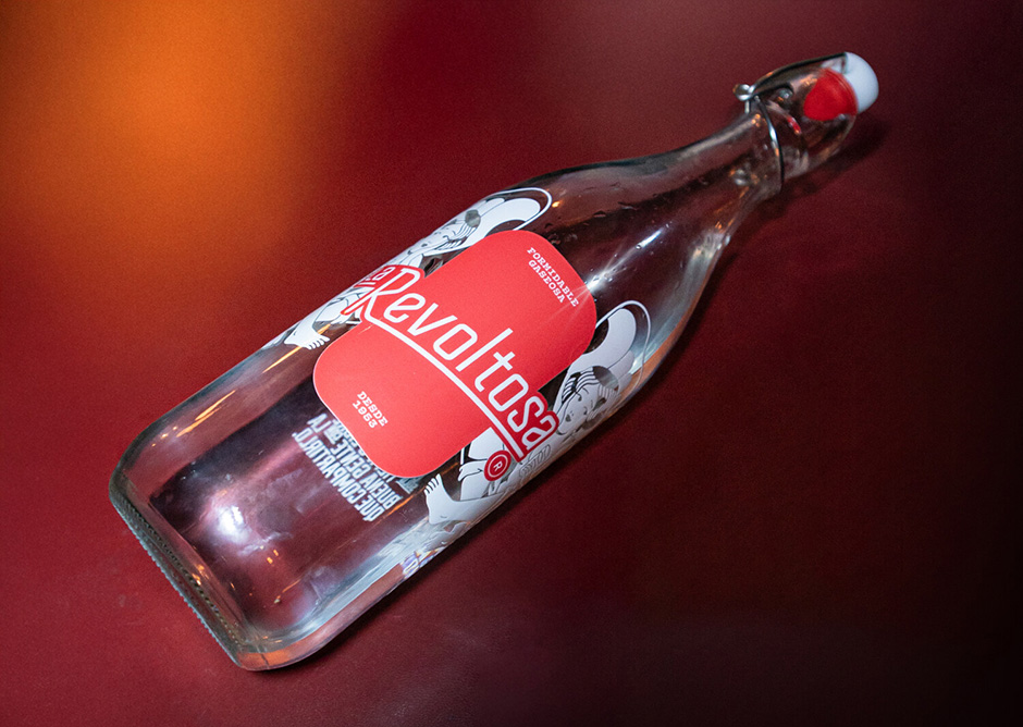
Instead of a standard product grid (which we also had to develop) we wanted to build a scroll experience where each flavour is literally its own world. As you move through it, it's not just the 3D bottle that changes: the background illustration, the colour palette and the copy all shift at once, as if you'd stepped into a different room. The soda has its butterfly, its backdrop, its tone ("better alone than in bad company"). The seltzer has its own dragon and its "aim and fire." The tonic has its nocturnal crocodile and its "bitter, with a wink." Each product is treated as a character with its own personality within the same family.
Technically, this meant syncing three independent layers (3D model, 2D illustration and background) to a single scroll progression, with transitions that had to feel more than just an image swap.
Since a classic grid visualization mode was also needed, we implemented a mode switch with smooth animations between both views to create a more connected and consistent experience.
What you don't see in the code: we made it all in-house
One of the things we're proudest of about this project is that almost the entire visual and narrative universe of La Revoltosa was produced in-house.
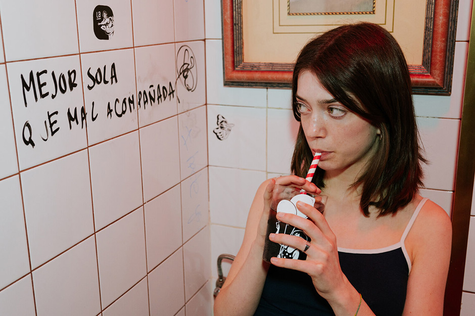
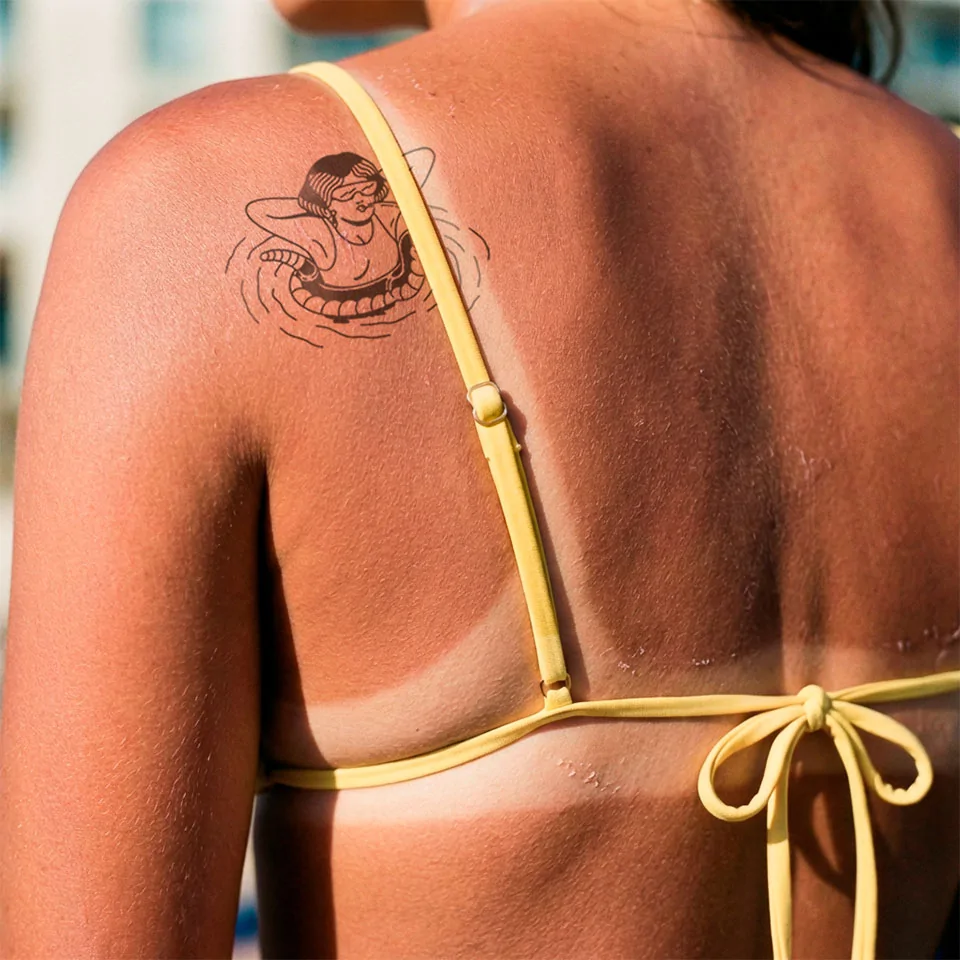
The iconography, the design system, the logo (we recovered and redrew one of the brand's historic logos from the 1970s rather than inventing a new one from scratch), the full packaging line, and of course the entire website. All of it came out of waka. The illustrations are the work of Gonzalo (aka GL6RIA), an illustrator and tattoo artist who's an old friend. His old-school style, with one foot in traditional Spanish tattoo art and the other in something far freer, was exactly what we needed: authentic but unexpected, traditional but rebellious.
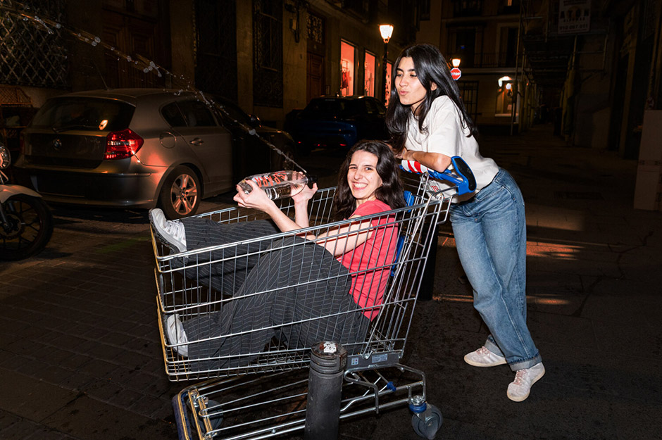
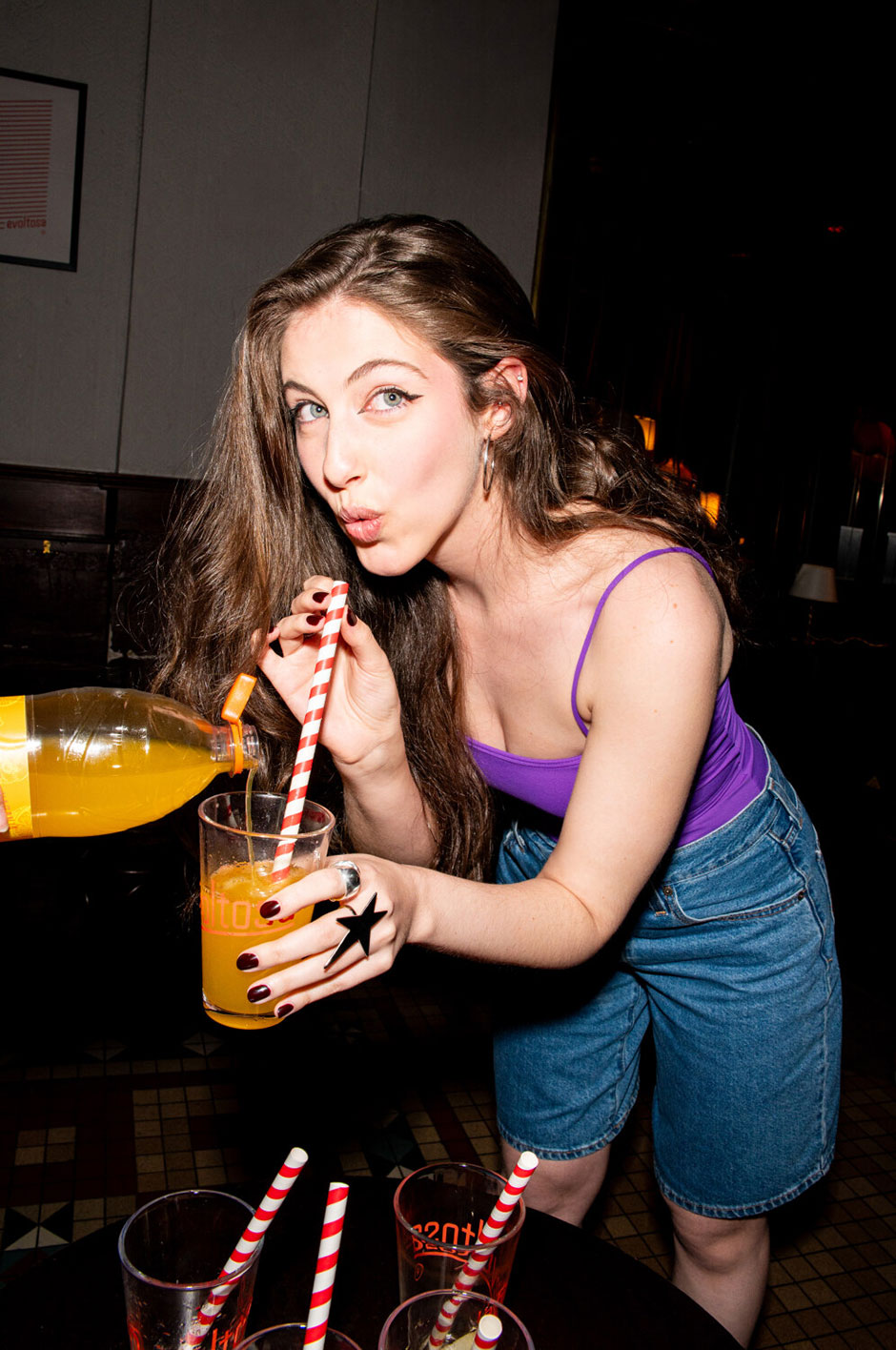
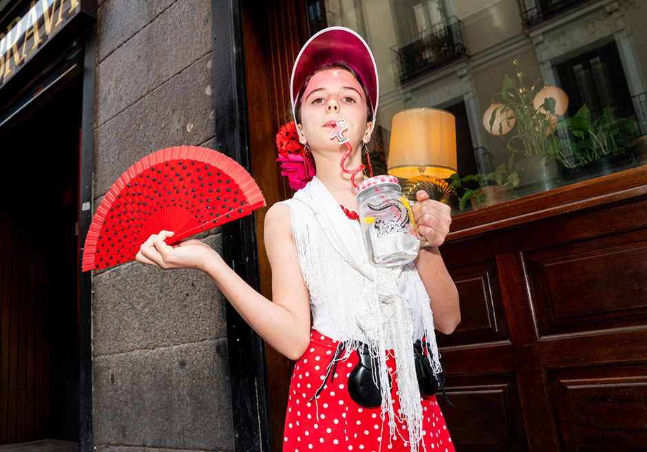
The video featured on La Revoltosa’s homepage features the studio’s own team and the client’s friends enjoying a drink at the bar. No models were hired. The people you see toasting at La Revoltosa are part of the community behind the project.
What's next: La Revoltosa hits the street
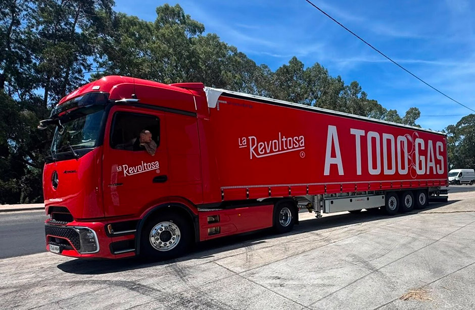
The digital project isn't the end of the story but the start of the next phase. We're currently preparing the brand's physical relaunch with a series of festive cultural events: live performances in streets and towns across the Madrid region, featuring local artists and open participation from residents. The idea is for the brand's rebellious, festive, and popular spirit to jump from the screens to the streets. The website tells the story; the events live it.
Technologies used
Front End languages and framework
- Custom wordpress theme (html, php, scss, js) bundled with Webpack.
- WebGL and svg scroll-based animations
- Libraries used: Three.js, Lenis, Gsap
Like with any project we take on, we approached the development phase by leaning on a custom system we’ve been building and perfecting over time.
At its core, it’s a highly customized WordPress theme organized around the BEMIT methodology. This approach keeps every component completely modular and independent, while still allowing them to communicate seamlessly through a custom event-driven architecture powered by emitter.js.
Of course, no build of ours is complete without GSAP and Lenis. They are our go-to industry standards for ensuring interactions feel smooth and refined. Upon this robust base, we layer in whatever specific libraries a project demands.
For this particular site, the undisputed crown jewel of our stack was three.js. Fun fact: this project actually marked our very first foray into the world of WebGL and three.js! Combining it with GSAP and the rest of our ecosystem opened up a realm of infinite possibilities, and honestly, each step of the process was incredibly fun to figure out and build.
Want to see it live? Head to larevoltosa.es and start scrolling.
Credits
Client: Refrescos del Atlántico — La Revoltosa
Agency: waka — branding & design studio, Madrid
- Alejandro Herrero — Creative & digital direction
- Victor Fernández — Web design & development
- Jose Carlos del Pozo — Creative direction & design
- Daniela Santelmo — Brand Design
- Fran Vicente — Concept & copy
- César Rigabert — Brand Concept
- Jaime Penalva — Video & motion design
- Gonzalo GL6RIA (@gl666ria) — Illustration
Thanks to Ricardo García Llanos (@animaticss)
Company Info
We are waka a brand and design studio, based in Madrid since 2010.