
The brief
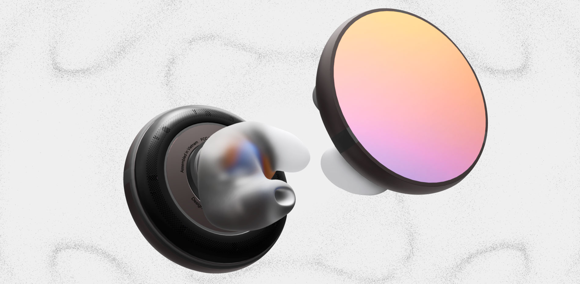
The iyO One is the world's first audio computer: voice-first, screen-free, and worn in the ear. It's the premier device from iyO, a startup spun out of Google X (Google's moonshot factory) to get people off their screens. Founder Jason Rugolo came to us with a clear problem: the existing site explained the product but the user couldn't feel it. The information was all there, but flat: not polished, underwhelming, and not at the level of the product itself.
So the objective was clear: take six years of work in agentic computing and turn it into a visual journey worthy of the technology, one that captures the imagination of what's coming next. With the pre-order option built in, this was a full shopping experience, not a landing page. The guiding idea was simple. If the technology is revolutionary, the experience has to feel like one, as alive as the device itself and enough to make people smile. The stakes were real, too. For a 20-person company about to more fully launch the device and raise its next round, this was the site they'd be putting in front of investors, the press and their first customers.
“Futuristic minimalism, the visualization of sound, and tactile 3D interaction: the three principles we calibrated in our art direction to keep navigation intuitive and engaging.”
A journey in three acts
iyO One is a first-of-a-kind product. No one visiting the site had likely ever held one, and the use case itself was new, so the site couldn't just inform. It had to convince. We built it as a single journey in three stages.
- The homepage makes visitors feel it: an emotional first impression of Chladni patterns and cycling haiku, with one plain line, "We make agentic computers you can talk to," to say exactly what it is.
- The product page makes the curious understand it: the device comes apart with the scroll, revealing how it works, piece by piece.
- The store makes users engage with it: a high-fidelity 3D model turns a full 360°, ready to configure and inspect up close.
WebGL is what makes that arc possible. Not as decoration, but as the way a frontier physical object becomes something you can feel through a screen, and e-commerce that sells through experience rather than a spec sheet.
The sound is the message
The homepage had to win people over to the idea behind it, with an opening that felt conceptual and bold rather than a wall of features.
So we built it around sound itself. A field of real, interactive particles forms Chladni patterns (the shapes a frequency draws when it vibrates a surface) and never settles: a pattern assembles, resolves into one of ten short haiku, holds, then dissolves back before forming the next. The haiku are pointed, almost provocative, small manifestos against the attention economy the device is built to escape: you are not the product, your data is not for sale, attention is yours. A handful of words that carry the whole argument behind the iyO philosophy.
“life is out there, friend do not stare into the light look up and be here" — one of ten homepage haiku, written by Jason Rugolo
We built it as a GPGPU simulation of up to 1.6 million particles. Instead of crossfading between states, the shader reads the dark pixels of each word and pulls the particles into place so the type is always made of the same particles as the pattern before it. It responds to the cursor, too, rippling as users move across it, giving the first taste of realness, even in a digital space.
Inside the device
Each product has its own page, laid out conventionally, with photography and text appearing as you scroll.
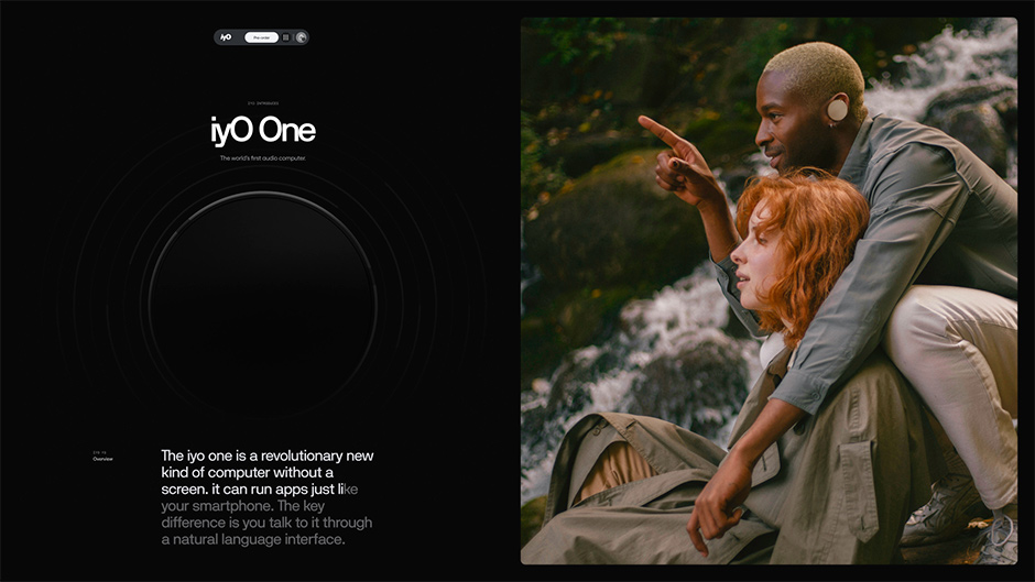
What sets them apart is the background: the key sections and the footer carry their own color and Chladni pattern, unique to each product, echoing the homepage while giving every device a world of its own.
Jason walked us through the hardware himself, and the care he took told us this was the heart of the product, the thing the site most needed to land. There's a lot inside: a custom earmold, an acoustic package, the computer that drives it. It's dense, and hard to take in from a photo.
In the second section, rather than static schematics, we built an interactive 3D exploded view, driven by scroll. It was down-rezzed from the device's CAD to the major components a customer would actually see, never the detailed internals. As the hardware separates along the Z-axis, you explore it part by part, and hovering over a component floats it forward with a small hotspot naming what you're looking at. The more parts a product has, the further it comes apart: the VAD Pro (iyO’s first product) splits into even more pieces. A dense story becomes something you handle rather than read; the specs and FAQs stay practical, and anyone who wants more can branch off into video: Jason's TED talk, a hands-on demo, a teardown.
A digital showroom
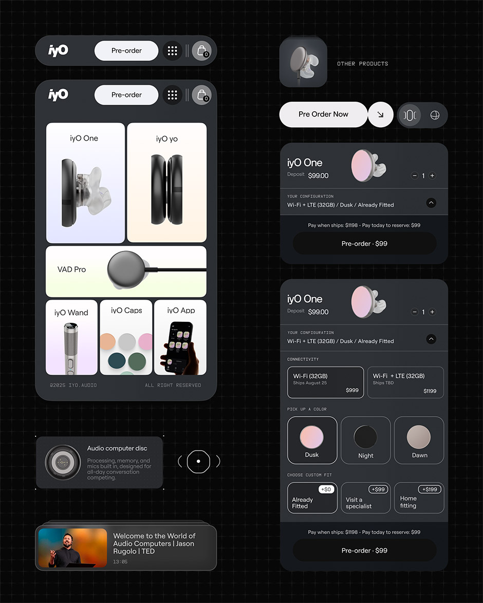
The shop was our chance to make buying feel like a real store experience. Each product has its own page, closer to a configurator than a checkout: a clean, glassmorphic panel down one side for connectivity, color and fitting, and an infinite slider of polished renders to scroll through, where a press and hold pauses it on a frame. Change the colorway in the panel and the slider changes with it, the same shots re-rendered in the new palette.
A small switch takes it further. The slider fades out, a live 3D model rises in its place, and you can spin the device and study the finish up close, the color you picked carried straight across. Getting that 3D to feel real took the most work. We sat down with the product's industrial designer to reproduce the materials as faithfully as we could, across the whole disc, including the dusk finish, which throws off strange reds, blues and oranges as the light moves over it. Change the color here and the new material doesn't just swap; it spreads out from the center in a concentric ripple, propagating through the model like a sound wave.
Standard e-commerce works for commodities. For a breakthrough no one has touched yet, it's a conversion killer, making something revolutionary look ordinary.
The experience has to match the innovation, so turning the device over, recoloring it and inspecting it by hand is what builds the desire and trust a checkout never could. The brand world and the shop stop being two separate things: the experience is the storefront.
Futuristic, but familiar
We kept the everyday interface clean and minimal: glassmorphic panels, muted colors, a restrained techno-futuristic style that keeps the product center stage. The same menu, components and motion run across every product, so the range feels like one thing rather than a set of separate sites. That was the point: an interface you don't have to learn. Futuristic to look at, familiar to use.
From engineering to e-commerce ready
Some of the most important work is the kind no one sees. The 3D models across the product pages and the shop didn't start as web assets: under NDA, they came to us as the device's real CAD, the same engineering files the hardware is built from, each carrying thousands of components and far too heavy for any browser to render in real time. Turning them into something that loads on a phone meant rebuilding each one, retopologizing the geometry down to what actually reads on screen, baking the fine detail into textures instead of carrying it in millions of polygons, and exporting to lean, Draco-compressed glTF. The result is a simplified version of the engineering source, light enough to load anywhere and clear enough to communicate the technology to customers.
Materials were the harder problem. The device comes in three finishes, dawn, dusk, and night, and the hardest to reproduce was dusk's dichroic coating, a sputtered film on the Gorilla Glass that shifts color as the light moves over it. Getting it right on screen meant working hand in hand with the engineering and design teams until we landed on something everyone was proud of, the manufacturer included. Across those finishes and the titanium, glass and steel mesh beneath them, we rebuilt 27 distinct materials in all, each matched to the real thing.
Making it run everywhere
There's a lot happening at once: a homepage of 1.6 million particles, a 3D model on every product page, a configurator swapping real materials in real time. Keeping all of it smooth, on a phone as much as a laptop was the real challenge.
Performance shaped every decision. The particle system scales to the machine, dropping to a quarter of that count on an older phone to hold 60fps at every tier. On retina screens we render at a slightly lower pixel ratio, which on its own cut the shader workload by roughly 44% with no visible difference. And because the site is one continuous experience with no full page reloads (taxi.js handles the transitions), every scene and listener is cleaned up on each navigation, so memory stays flat instead of creeping up.
The closest you can get
"There are thousands of people like me all trying to build the future. A huge part of it is how well you can capture the imagination of the general public and your future customers” Jason Rugolo, Founder & CEO, iyO
What stays with us is how much of the engineering was in service of one simple thing: letting people get close to a product they couldn't touch. None of the WebGL was there to show off. It existed so that a frontier device could be felt through a screen. For a product this new, the site isn't a brochure for the thing; it's the closest many people will get to it, and that raised the bar on every detail.
Technologies
Frontend & libraries:
- Webflow (CMS + base markup) with a custom TypeScript front-end layer
- Three.js powering the GPGPU particle system and product rendering
- GSAP (https://gsap.com/)
- Lenis for smooth scroll
- @unseenco/taxi for page transitions
- smooothy (https://smooothy.federic.ooo/) for sliders
E-commerce:
- Storesynk (Shopify-powered store inside Webflow, previously Shopyflow), running in pre-order mode
Server / hosting:
- Static front-end with a lightweight API layer, deployed on Vercel
Credits
Matteo Donini
Art Direction, Lead Design & Development
Website / Instagram
Enrico Deiana
UI Design
Website / Instagram
Federico Valla
WebGL Development
Website / Instagram
Awards
- Awwwards Site of the Day
- Developer Award
- FWA of the Day
- CSS Design Award