
1. Introduction
Inversa equips wildlife agencies to tackle invasive species where it matters most: out in the field, knee-deep in the mud and brush. Their work is hands-on, powered by real-time data and a vision for large-scale ecological restoration. When we joined forces with Inversa, our goal was clear: create an interactive digital experience that doesn't feel like every other software product. We set out to translate their mission into a living, breathing narrative that captures both the grit and the intelligence behind their work.
That required us to ditch dry corporate facts. We didn't want to talk about "leveraging data" or "synergizing efforts." Instead, we designed an interactive experience that clearly showcased their vision. In the end, the project was less about chasing web traffic and more about building a genuine, emotional bridge between Inversa and the communities they serve. We focused on the human element of environmental work: the people who use these tools to protect their local ecosystems. By the time we finished, the site felt less like a brochure and more like a window into the real work Inversa does for conservation.
2. The Challenge: More Than Software
The real challenge for Inversa was about identity. They didn’t want to be seen as just another software vendor in a crowded field. Their ambition was bigger: to become the intelligence behind real-world restoration, not just a dashboard. Inversa’s platform isn’t just about storing data; it’s about interpreting it, guiding action, and supporting the people making decisions on the ground. It’s the brain that empowers the boots in the field.
So our approach was to turn that expertise into something you could actually feel online. We wanted visitors to see how Inversa’s tools help nature bounce back, not just read about features. Instead of focusing on the tech itself, we put the spotlight on the results: a forest coming back to life, a river running clear. The goal was to show that Inversa isn’t just monitoring problems; they’re part of the solution.
Simplifying Complexity
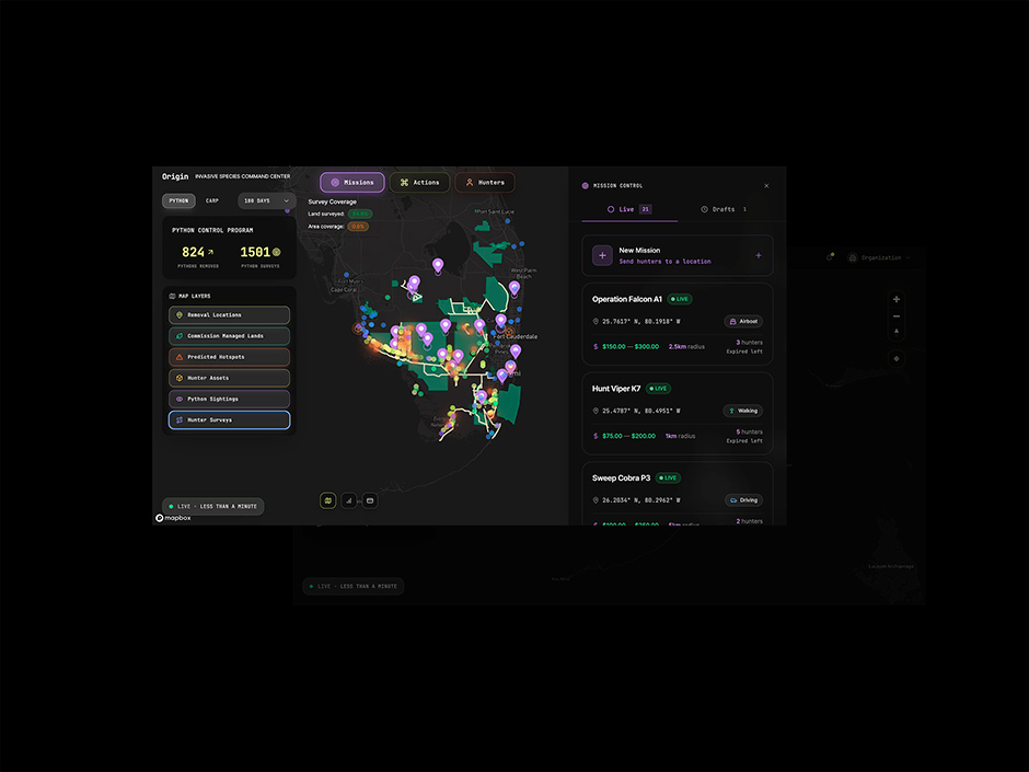
Origin, Inversa’s core platform, is packed with data; so much that it can be overwhelming at first glance. Our job was to cut through that complexity and shape it into a story anyone could follow, whether you’re a field tech or a policymaker. We looked for ways to make the tools like geospatial alerts, satellite imagery & real-time habitat data feel intuitive and purposeful.
We pulled these technical threads together into one clear story. By focusing on the essentials, we turned dense data and complex interfaces into something intuitive. We wanted people to see how Origin supports restoration teams in the field and delivers results you can actually spot on the ground. It was about making the invisible work of data visible, something you can sense when you step into the woods.
“The site transforms dense data into an approachable, engaging story. It makes Inversa’s mission tangible, builds trust with its audience, and establishes the brand as a leader in environmental intelligence.”
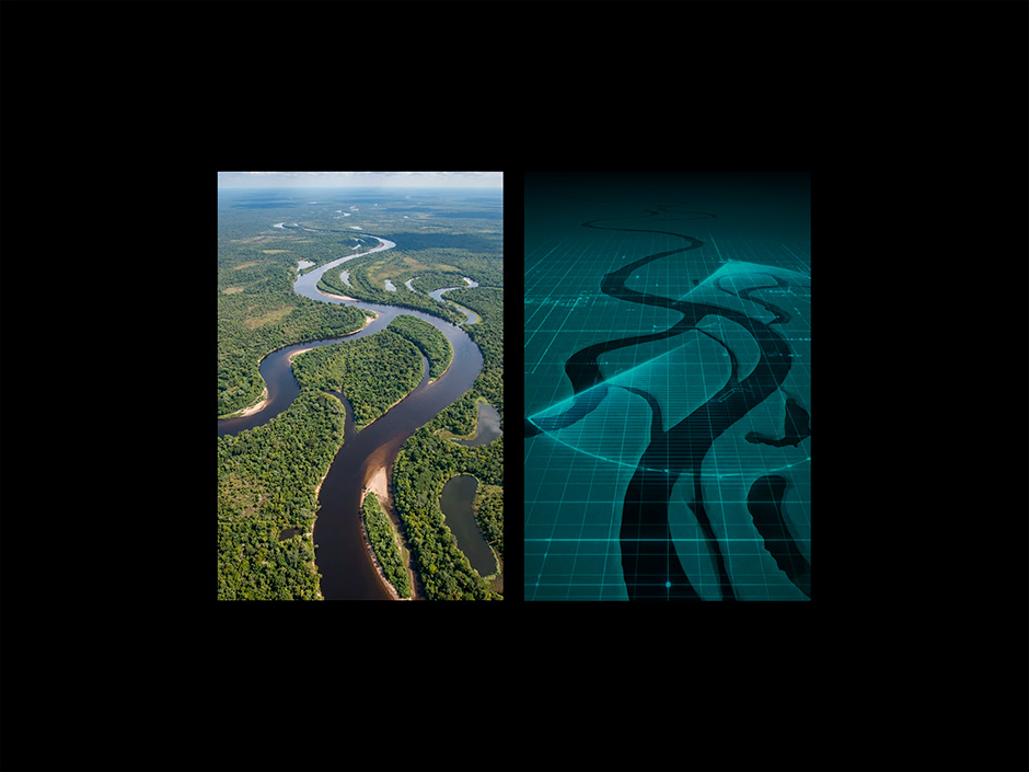
Blending nature and technology
Origin is like an invisible layer of intelligence running through the landscape, quietly analyzing everything from soil to satellite feeds to guide restoration. To capture that sense of hidden power, we built a design that fuses nature and technology. We stayed away from the usual green non-profit look, but also avoided the cold, tech-for-tech’s-sake vibe you see in so many startups.
To bring Inversa’s dual identity to life, we went for a high-contrast design, mixing crisp UI with striking nature photography. This keeps things sophisticated but always rooted in purpose. We skipped the usual tech-blue gradients and let sharp lines and clean type give the spotlight to the environment itself. The result is a look that says Inversa is serious about technology, but even more committed to managing nature.
3. UX/UI Design & Immersive Storytelling
We started by shaping the story, and everything else followed from there. With the narrative in place, we built the UX and motion to guide visitors naturally, ensuring no one ever felt lost in the data. Every detail, from interactions to visuals, was chosen to keep things clear and immersive. The end result is an experience that feels seamless, drawing you in from the first scroll.
Early UX Explorations
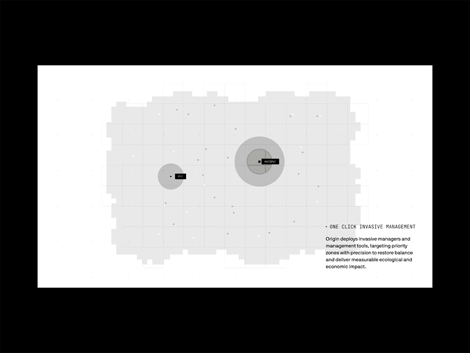
On the homepage, we let the story do the heavy lifting. By visualizing the hidden data layer at work, we show how removing invasive species brings a landscape back to life. Instead of just telling visitors the software works, we let them see it for themselves. As you scroll, the environment heals: invaders fade away, and ecosystems return. It’s a simple, powerful metaphor for the change Inversa is driving in the real world.
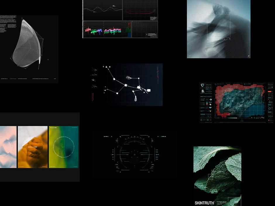
Illustrations and Visual Storytelling
We brought Inversa’s story to life with custom line illustrations, showing the people in the field, the tools in their hands, and the drones overhead. These visuals add a layer of storytelling that makes the process feel real and relatable. The hand-drawn style keeps things approachable, reminding visitors that behind all the tech, it’s still humans making the difference.
Interactive Origin Showcase
One of the site’s standout features is the interactive Origin showcase. A static screenshot wouldn’t cut it, so we built a guided tour that lets users see exactly how the system supports restoration crews and tracks real results. By making the process transparent and easy to follow, we turned a complex tool into a story anyone can engage with. It's a way to make Inversa’s impact feel real and immediate.
4. The "Look under the Hood" (Development & Motion)
On the technical side, we stuck with tools we trust. The site needed to be fast and reliable, especially with all the rich imagery and video. Nuxt runs the front end, making sure everything stays smooth no matter the device.
GSAP ScrollTrigger enables the scroll-driven animations that bring the storytelling elements to life. We spent a lot of time fine-tuning the "feel" of these animations. They needed to be smooth and responsive, not distracting. We combined SVG animations and video to dynamically showcase UI components and workflows. This ensures that the Origin interface feels tangible and alive, even on a static screen.
We set up the site so Inversa can manage everything themselves: testimonials, case studies, team bios, and more. This keeps things fresh and personal, letting them share new stories as they happen. The site isn’t just a finished product; it’s a living tool that will grow with the company.
5. About Exo Ape
Exo Ape is a global digital design studio operating from the historic city of Roermond, The Netherlands. We specialize in crafting a high-end digital presence for experience-driven brands—from hospitality and fashion to entertainment.
By blending narrative-led design with immersive content, we translate a brand’s physical craft and sophistication into the digital realm. We believe that in an ever-expanding sea of noise, digital character and the human touch are the ultimate luxuries. Our mission is to turn simple digital touchpoints into unforgettable journeys.
6. Credits
Creative Direction
Clay Boan
Creative Development
Rob Smittenaar
Motion Design
Ronald Gijezen
Digital Design
Robbert Schefman