Effective design and good typography go hand-in-hand. This is especially true when you consider UI design - where text content makes up the bulk, or in some cases the entirety of a given interface. This sentiment of synergy might best be described in the case where a typeface in UI design is at its best when going unnoticed.
Often referenced in discussions on typography for digital interfaces, Oliver Reichenstein article, “Web Design is 95% Typography” presents one of the most salient points regarding the place of text in UI design:
A great designer knows how to work with text not just as content, he treats text as a user interface”
While optimizing typography includes maximizing readability, accessibility and graphic balance, it is in large part, about usability. When considering user interactions with a typeface on a screen, a designer is forced to confront additional elements such as balance, positing, hierarchy and structure. Ultimately, the goal is to reduce and remove any friction between the viewer and the interface. Highlighting this point, Tobias Frere-Jones - renowned American type designer and creator of the Gotham font among others - notes that:
All text needs legible typefaces. But especially at interfaces, our eyes need fonts that cooperate rather than resist”
The importance of typography to UI design cannot be understated, and improving your typographic design is an important step in improving your UI as a whole.
What Makes a Good UI typeface
When searching for a good typeface to use in a UI design, there are a number of characteristics to look for
Scalability – many UIs will need to be used in a variety of settings and sizes, so the typefaces selected should perform well across all those different sizes. Many typefaces look great and are easily readable when set at larger sizes, but typefaces with very thin letterforms or overly ornate designs start to break down at smaller settings. Even many normal, not-overly intricate serif fonts start to cause problems at very small sizes. If a typeface is going to be used for small labels in a UI as well as larger headlines and bursts of text, then you must be sure that it scales accordingly to maintain readability and usability in every size.
Clearly Recognizable Letterforms – many typefaces have certain letterforms that are indistinguishable from others in that set. This can make it very difficult to read the text of that interface. Further than letters, figures are very often overlooked in comparing various fonts’ attributes for a given project.
The example below shows the Gill Sans typeface. Eric Gill designed the ‘1’ in Gill Sans without a flag, making the number virtually indistinguishable from the capital letter “I” and lowercase “l”. Taking a look at the example below, you can see that all three of these letterforms look nearly identical.
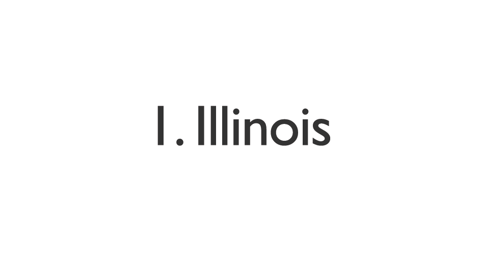
Source: Webydo
A Variety of Weights – another valuable characteristic to look for in a typeface is a variety of weights. This variety allows you to set this same typeface in different ways and it can greatly help with that aforementioned scalability requirement not to mention when it comes to hierarchy and setting headings, sub headings and paragraphs. A good typeface will offer you a large selection for your UI.
A Few More Examples
Source: Thomas Byttebier
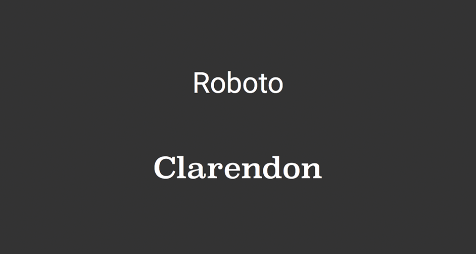
Which typeface makes a lasting impression from the pair above? Clarendon. Yet, with all of its flourishes and curvature, it’s wonderful weight and style, it struggles when implemented in the UI. All of the additions distract from the main goal, a frictionless process of getting from point A to point B without having to think twice about what’s written on the screen. Clarendon’s distinctive characters, while visually attractive, distract from the instructions that they may be meant to convey. An additional consideration is that these letterforms, along with a slew of fronts from the Serif family, break down at small sizes.
In contrast to Clarendon stands the unflashy, impersonal Roboto. This typeface, the standard typeface on Android since Ice Cream Sandwich, is an example of a UI typeface functioning on all levels. Roboto scales incredibly well for both large and very small text (see example below). It also includes a variety of weights and styles that give it much needed versatility. While the individual letterforms themselves may not have the same distinctive style that Clarendon exudes, the straightforward design of Roboto’s character set makes it ideal for UI - no distractions. Instead of saying “look at me” with its design style, it says “look at this”.
Source: Webydo
Tips on Setting Type in UI's
Using the tips above to select the perfect typeface is the first step, but knowing how to set that type in your UI design is of equal importance. Here are some steps you can use when setting type:
- Size text up and down – similar to scalability, the way that you set type may work in a specific situation, but break under the pressure of being sized up or down. Will this destroy your UI? As most user interfaces require elements at various sizes, testing your text at different scales is the only way to ensure that you have a readable final product, irrespective of medium.
- Consider Scenarios – when designing the text to be used in your UI, consider different scenarios and how the text will be adapted to fit them. For instance, what happens when your UI needs to display an alert message? The text must be differentiated to ensure that it stands out. It is one thing to have a UI that works in ideal situations, but the mark of great UI design is when it stands up to any given event.
- Use Actual Copy – when you are testing the way that a UI’s text scales and works in different scenarios, it is critical that you do so with the actual text. Lorem Ipsum placeholder text can be useful in some cases, but in UI design, the letters of the words and sentences you are using are the most critical component in the design. Issues such as the 1 - I - l example, reinforce this importance. As such, it is essential to decide on the words that will be used before you begin to set the type in your design.
- Ask for an Opinion (or Two) – if you are designing a UI, you likely know what the text says and what the UI does. This means that aspects of the design which may not be immediately clear to most, might have the propensity to slip in initial testing. By getting people who are not as familiar involved in the testing of the UI, you ensure that text is clear to everyone.
- Test on the Actual Medium – this may seem like a straightforward concept yet it is often neglected. If you are developing a mobile application, you should be testing on mobile platforms. If your UI is meant to be responsive, run your tests on a variety of screen sizes and devices to determine if the decisions you made or the text of that UI were suitable.
Source: Webydo
Conclusion
When text represents a functional element, say a menu or directional caption, that text is UI and all practices of UI design apply to your chosen typeface. When it comes to successful UI design, there is no room for poor typography. Text that scales well and is flexible enough to be used in a variety of circumstances is key to the fluidity of uses’ viewing experience with your design. Implementing these steps and adhering to these principles will give you an edge over other UIs and are the sign of an accomplished interface designer.
Reverting once more to the seminal article on typography by Oliver Reichenstein, “control over typography is not just a basic design necessity, knowing how to treat text as a user interface is the key factor for successful Web design” - text is UI.