Creating a new version of your own website is always an introspective and challenging process. We wanted our redesign to be a clean, elegant and unique expression of our brand but also something that would turn heads and melt faces.
Technology evolves so rapidly now that what were once unprecedented features of a website are now commonplace or expected. We knew that to even approach the high bar of what it means to make an “amazing” website meant pushing the boundaries of what our team was capable of creating. As they say, we couldn’t just skate to where the puck was, we had to skate to where it was going to be. The intensive effort behind the relaunch of madeinhaus.com required a deep collaboration between every department at the studio – from UX and design to development and QA. With our pencils finally down, we can say we’re proud of what we have built.
Art direction
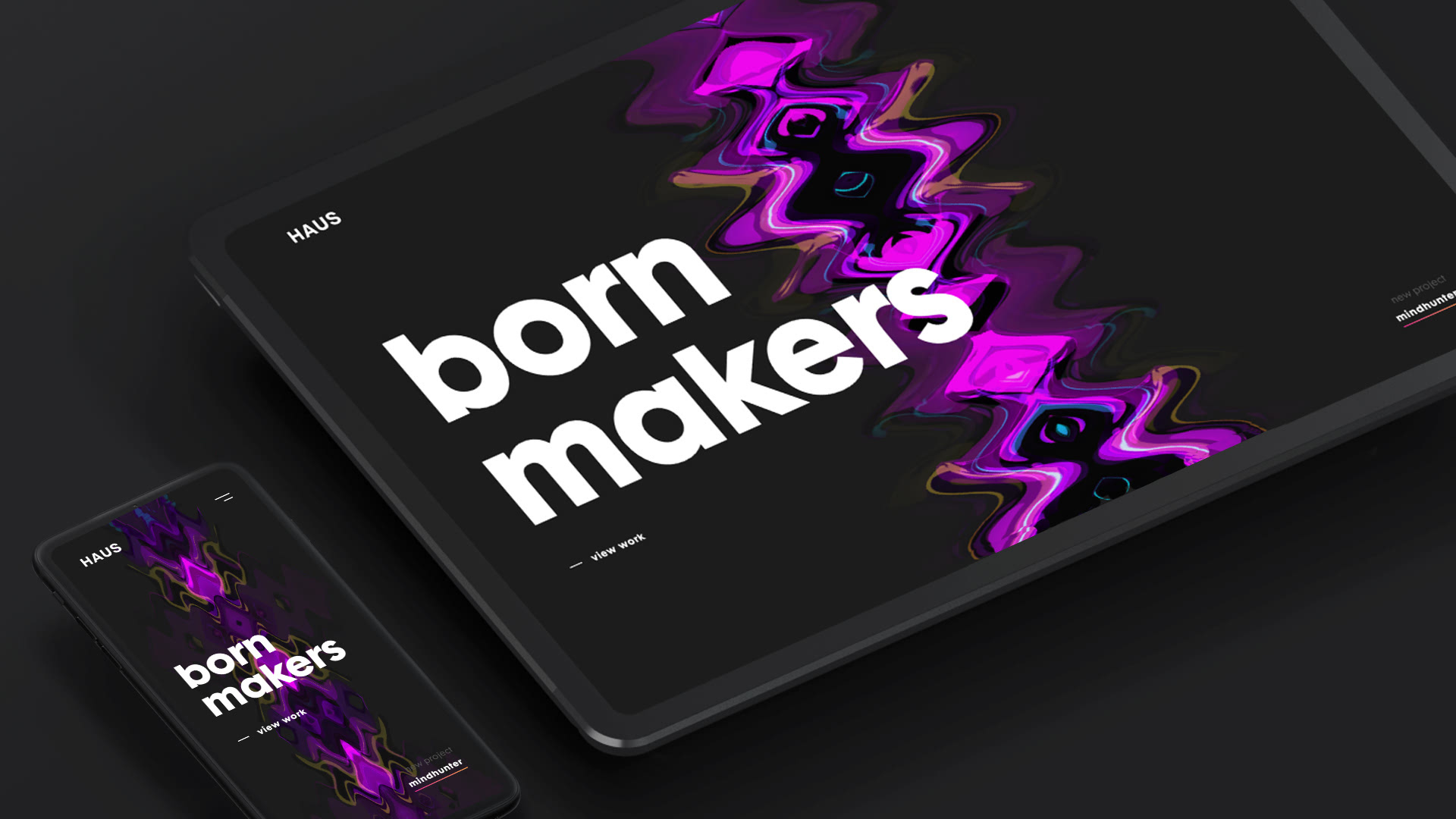
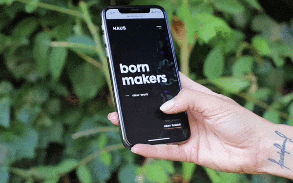
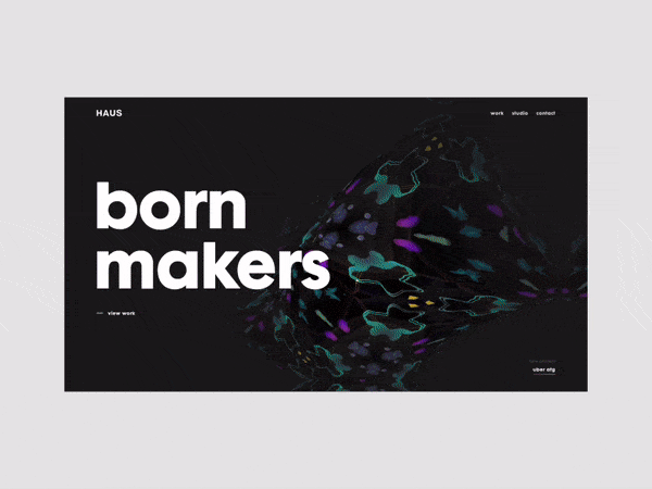
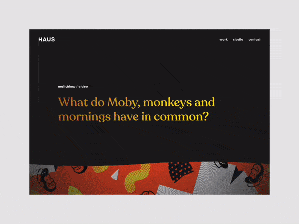
Inspired by psychedelia and clean modern design principles, we wanted our redesign to be as diverse and quirky as the crew that made it. We drew inspiration from funky patterns, colors and typefaces, being careful not to turn the whole thing into a flower power 70’s tribute band frozen in time. By creating a set of visual elements and conceptual guides drawn from the psychedelic experience, we were able to find new and interesting ways to give a modern twist to an old idea. The art direction of the site succeeds in freeing it from its 70’s historical context and infuses it with new life for an interactive digital experience befitting the age.
Site Architecture
As proponents of well thought-out site architecture and design systems for our clients, we knew that our own website had to have that same rock solid foundation. We went for a seamless user experience that transported the user from page to page in a fluid, connected and highly visual way.
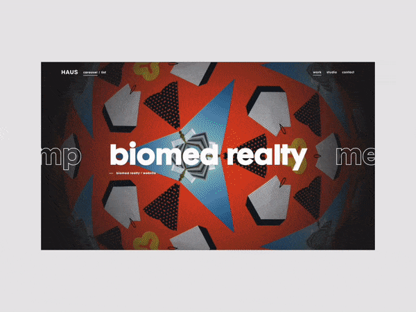
As the backbone of the site we came up with the idea for a geodesic sphere layered with tessellated, kaleidoscopic imagery that could morph and transform as needed. The landing page acts as an introduction to the sphere, which evolves in pattern, size and complexity as the user clicks deeper into the site. It also served as a visual touchpoint – helping to ground the navigation between different pages and sections of the website, blurring the line between page content and UI. The goal was for the user to begin to feel the interface rather than see it – allowing for more intuitive navigation and less time looking for the right button to click.
Technologies
After fully understanding the visual qualities and artistic intent, we hunkered down to ideate around a tech stack that supported our overall creative effort. We landed on a universally-rendered React application, powered by Next.js, with the appropriate amount of WebGL and custom shader work. This gave us the headroom to keep the experience seamless, performant, and expressive while working against a sound component-based application architecture. On the content management end, our frontend is entirely decoupled from our authored data—which is powered by Contentful.
When presenting users with a fresh take on user experience and interface, the technology powering the experience should require no cognitive effort. Performance and animation are always associated characteristics in that they should always exude a natural, organic quality—otherwise they feel forced and without purpose. We kept this mantra throughout the development process.
our contact page shows the human side of our digital company and that we like to have a little fun doing what we love.
We also actively sought out opportunities to bring the ‘quirk factor’. Sticking with tradition, we took what is normally a boring contact page and turned it into an opportunity to express what makes us unique.
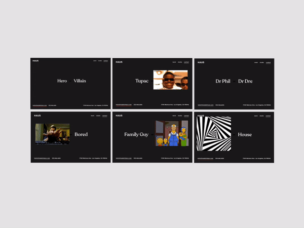
As a company who uses Slack for almost all internal communications, we leveraged our gif expertise in creating a set of “this or that” questions that added a fun interactive element to the page. Things like whether we prefer rat tails or mullets, Dr. Phil or Dr. Dre, or where we stand on the age old gif/jif debate (it’s “gif” as in “gift”, btw), our contact page shows the human side of our digital company and that we like to have a little fun doing what we love.
Company info
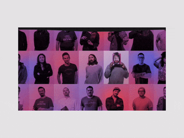
We’re HAUS, an award-winning creative digital studio in Los Angeles. As pixel perfectionists we honed our skills and hardened our resolve to make the best damn magic on the internet.