Congratulations to Obys for winning Site of the Month September for Grids. Thanks to everyone who voted - the winner of the Free Pro Plan in our Designers Directory is at the end of the article.
The site Grids is Obys’ third educational project in a row. Before this one we presented two great projects to the world, which also won the Site of the Day – Typography Principles and Colors Combinations. This site describes our four principles of how grids are used as well as examples of how to use each of them correctly.
Every designer can find something new or useful here. As always we tried to come up with interesting storytelling and an unusual feature. This feature became a crazy mode which can be turned on or off. The main goal of the site is to show that the educational process can be bright and not boring.
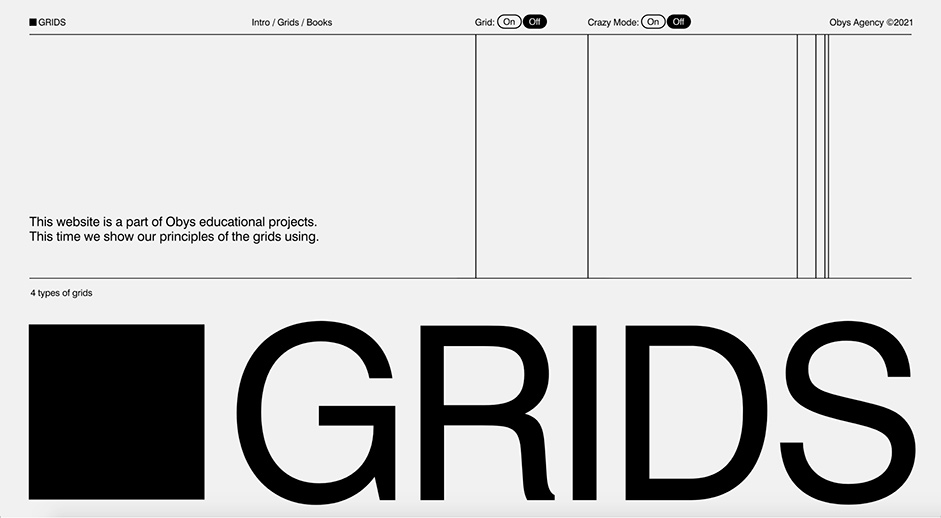
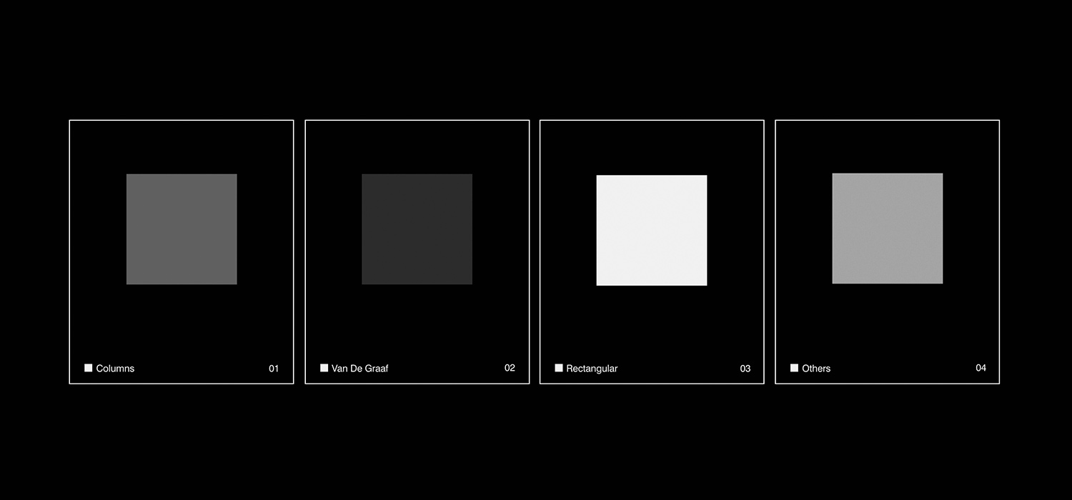
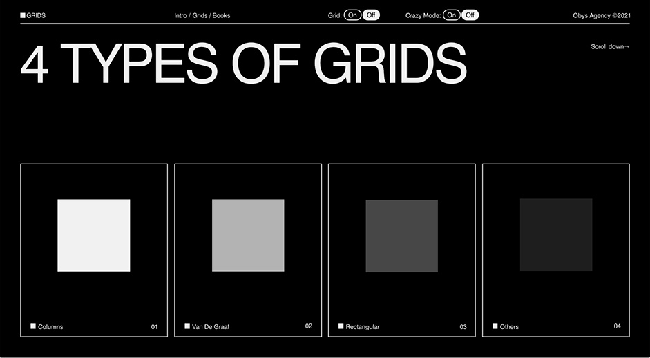
4 Types of Grids
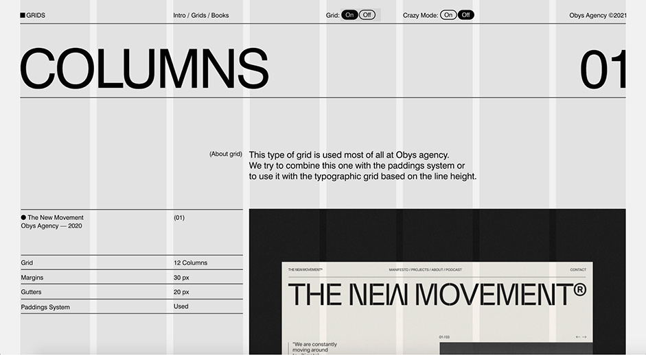
It is not a secret for anyone who knows and follows Obys agency: in our projects we pay much attention to the key design principles – typography, composition, colors and grids. On this site we have divided the grids into four types-categories that Obys uses in everyday life: Columns, Van De Graaf, Rectangular and Others. Talking about each type of grid, we added a short description and examples of our works, where this grid was used. Also we also give some tips in which type of projects designers can use this or that type of grids.
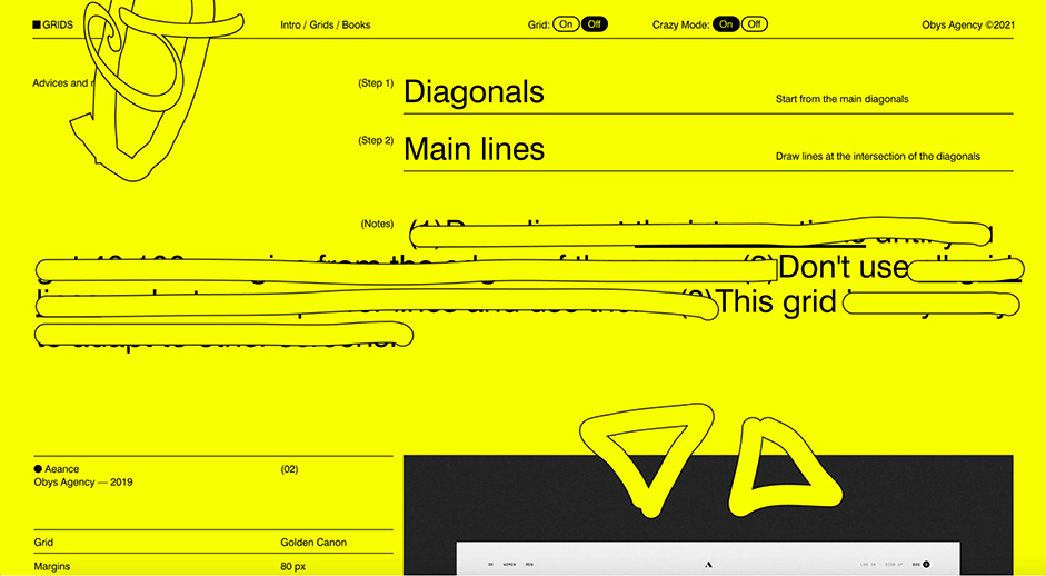
Interesting fact: there are some posters with our tips on the website. Each poster consists of the main graphic element – a square. It is very important for us to create projects with a reference to graphic design. Also the user can switch the grid on and find out how the site is anchored to the grid.
This site turned out to be very minimalistic, but at the same time there are many interesting features on the site, which we will talk about further. Also in this project we kept our classic storytelling. Everything is based on the scroll.
The main goal of Grids project is to show that the educational process can be bright and not boring. And we succeeded in it.
Interesting graphic elements
Grids site has its own identity. The beginning of this project was a little black square and as a result this element has become a logotype of Grids website. From the preloader till the outro the square follows the user throughout the site. So it acts as a main graphic element.
Time to talk about crazy mode. As the site design turned out to be quite minimalistic and classic, we decided to create an additional option – crazy mode. It completely changes the mood and style of Grids project: from black-and-white to poisonous yellow color, from clean design to the emergence of the new additional elements – the floating (flying) shapes. Also our messages to the users are being changed from the useful educational tips into comic information (jokes). Please, pay attention to the screenshot below. The posters are being changed too: the forms stop to be strict, but become more playful.
Challenges
The main challenge was to create a simple minimalistic site without additional graphic elements, with minimal use of pictures and photographs, colors and fonts, and with simple clear grid. But a simple design at first sight should evoke vivid emotions from the users, should be remembered. At the same time we came up with crazy mode, which became an even bigger challenge for us here. A crazy mode design is unusual for us. Before we had not created anything like this. We created new bright elements and tried to surprise people. When we asked people to vote which mode they liked more, the users chose the classic mode with our classic approach to creating projects.
Technologies
For many non-commercial projects we often use Readymag because it gives us a lot of opportunities to work with animation ideas. This tool we used for Grids project again. Readymag is a no-code tool so it gives the designer the ability to create a project without involving a developer. What is the advantage here? The designer can fully control the quality of the design down to the last pixel and fully revive their ideas. We tried to get the most out of Readymag tool and not repeat our past ideas or use them in a new way.
Company Info
Obys is Ukraine-based design agency that creates unique graphic and web experiences all around the world.
More about us is here and here.
Thanks for getting involved with the votes and sharing it on social media - @Madhuri23410896 you have won the pro plan, please send us a DM to collect your prize!