Glyphic Biotechnologies is developing a groundbreaking scientific method: protein sequencing by expansion. The challenge was to introduce a technology the world has never seen before—clearly, convincingly, and without oversimplification.
The website needed to speak to very different audiences at once: scientists and researchers, potential investors, and curious visitors with no scientific background at all. From the outset, it was clear that this project was not about presenting information—it was about making complexity understandable and meaningful.
The Challenge: Turning Science into Story
Our starting point was highly technical input: text-heavy explanations, schematic diagrams, and scientific descriptions of how the technology works. On their own, these materials were accurate but inaccessible.
The real task was to transform raw scientific data into a coherent narrative:
- one that explains what the technology is,
- why it matters,
- and how it has the potential to change its field.
This meant designing not just a website, but a storytelling system capable of guiding users with very different levels of expertise through the same content without friction.
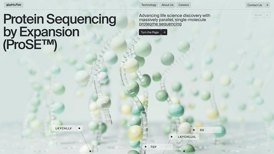
Redefining the Visual Language
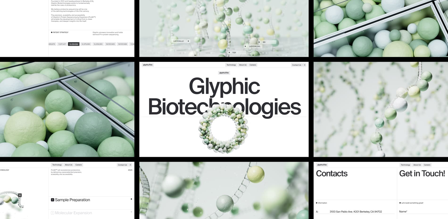
While the Glyphic logo remained unchanged, almost everything else around it was rethought. The original visual language relied on neon oranges, purples, and saturated gradients — common tropes in biotech branding that tend to blur together across the industry. During the design process, we intentionally moved away from this visual noise.
The final direction is built around:
- calm green–yellow tones,
- soft neutrals,
- clean whites.
This palette feels contemporary, restrained, and subtly laboratory-like. It introduces a sense of scientific precision while giving the content space to breathe. The result is a visual identity that feels confident, clear, and distinct without being loud.
“This meant designing not just a website, but a storytelling system capable of guiding users with very different levels of expertise through the same content without friction.”
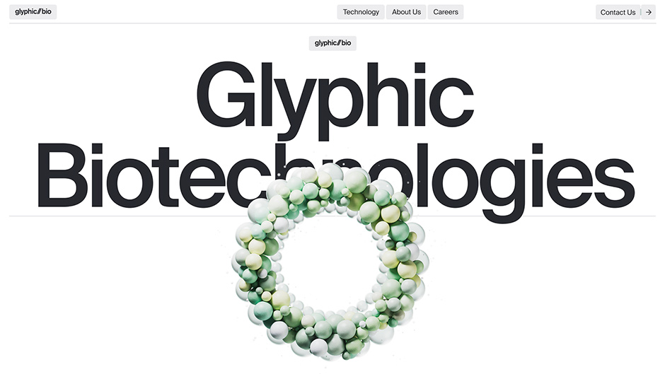
Content as the Core Experience
Content became the true foundation of the site. Because the technology itself is visually complex, we had to carefully define how diagrams, illustrations, and story-driven graphics should behave:
- how detailed they are,
- how color is used,
- how they appear and disappear,
- and how they guide the reader’s attention.
These elements are not decorative. They are the primary carriers of meaning and set the tone for the entire experience.
Storytelling Through Layout and Rhythm
From a web design perspective, storytelling is the site’s central feature. The experience is structured as a rhythm:
- visually rich, detailed sections that explain the technology in depth,
- followed by clean, minimal sections that allow users to pause, reset, and absorb information.
Typography and grid systems remain disciplined and classic, ensuring legibility and structure. Subtle details and transitions add character without distracting from the narrative.
This balance between complexity and clarity, discovery and orientation creates an intuitive experience, engaging, and quietly impactful.
The Biggest Challenge: Performance vs. Expression
The most demanding part of the project was shaping a high-performance storytelling experience around visually intensive content. Many of the key explanatory moments on the site are built using PNG-sequence animations — frame-by-frame visuals that feel crafted and cinematic, but can easily become heavy if handled incorrectly.
A significant part of production was dedicated to:
- optimizing these sequences,
- ensuring smooth playback,
- maintaining image clarity,
- and adapting everything seamlessly for mobile devices.
Finding the balance between expressive storytelling and technical efficiency became the core challenge and ultimately one of the project’s biggest achievements.
Navigation: Invisible by Design
Navigation is intentionally minimal and almost invisible. The entire site is built as a single continuous page, making scrolling the most natural way to explore the content. This linear structure reinforces the narrative and eliminates unnecessary decision-making.
At the same time, a fixed header with anchor links allows users to jump directly to key sections, such as contact, without losing context. The result is a navigation system that feels effortless and fully aligned with the storytelling-driven structure of the site.
If we were to start this project again, we wouldn’t change anything. The final result reflects exactly what the project needed to become – both creatively and collaboratively. The process was shaped by trust, openness to experimentation, and a shared ambition to build something meaningful rather than superficial.
At Obys, our process is built on research, exploration, and close creative dialogue. Because of that, projects tend to arrive naturally at their most refined form. Glyphic Biotechnologies was no exception, and we’re proud of where it landed.
Technologies
We used our standard custom stack for this project.
- Front end: HTML, CSS, JavaScript
- Interactions & motion: GSAP and Smooth Scroll, enabling fluid, tactile motion
- Back end: Strapi, a headless CMS that provides flexibility in structuring and managing content.
There are no exotic or experimental technologies behind the scenes. However, one technique is worth highlighting: PNG sequence play-on-scroll. This approach allows frame-by-frame animation to respond directly to user scrolling, creating precise, cinematic control over motion. It’s a method we continue to refine across our motion-driven projects.
Company Info
Obys is a creative design and development agency working worldwide, specializing in concept-driven websites and digital experiences with a strong focus on storytelling, interaction, and motion.
More about us is here and here.
X: @obys_agency - IG: @obys_agency