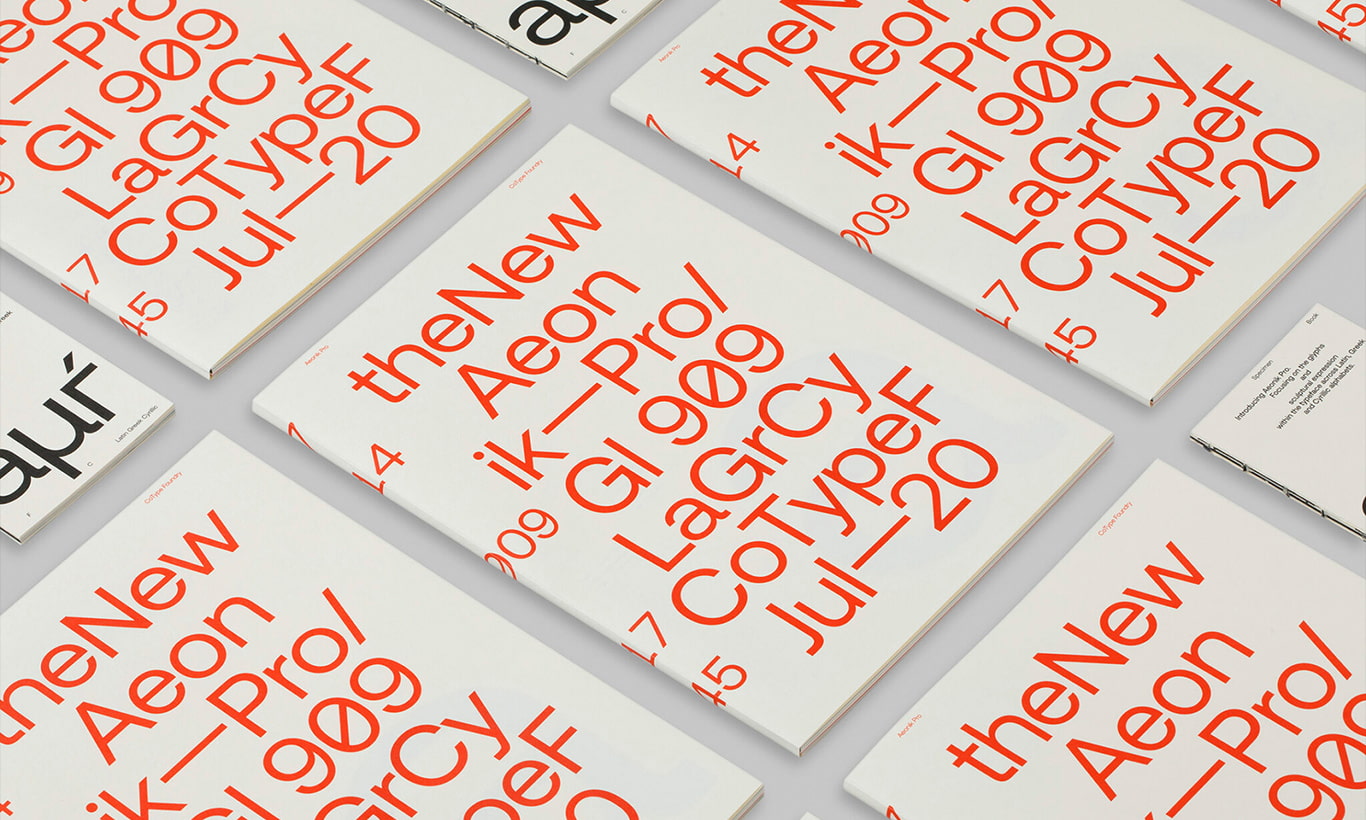
Could Aeonik Pro be the next Helvetica? This modern and versatile typeface by Mark Bloom, derives its name from the Greek word aeon, meaning “lifetime”. Here we take a closer look at this typeface and share some insights from its author, about his process for designing typefaces, getting into type design, pairing suggestions and more font related thoughts.
About the Font
The original, Aeonik, positions itself as a Neo-Grotesk with a Geometric skeleton: wider than a normal Grotesk, but narrower than a typical Geometric Sans. Its mechanical qualities are characterized by perpendicular elongated tails and terminals, and round bowls. The new version: Aeonik Pro, refines its predecessor, with added support for Cyrillic and Greek, making it sharper, tighter, and more versatile.
There are seven weights, ranging from Air to Black with oblique italics, and its most agreeable characters are ‘f’, ‘j’ and ’t’. It contains multiple arrows and geometric shapes to match each weight, and two of the stylistic sets give access to the Bulgarian and Serbian Cyrillic alternates.

CREDITS & DETAILS
Styles: 14 Styles. Supports Greek & Cyrilic
Type: Serif Font
Published: 2020
Designer: Mark Bloom
Foundry: CoType Foundry


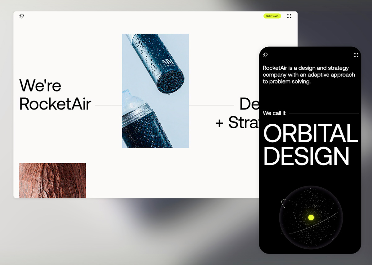
Aeonik Pro in awwwards
See more of this font here, or use our new search feature to find examples of it being used on other websites, as well as tons more type inspiration for your projects.
Interview with Mark Bloom
Business Owner at CoType™ Foundry and Creative Director / Owner of Mash Creative, Mark Bloom has over 20 experience specializing in brand identity and packaging design, working with some of the world’s leading design studios, producing logos and typefaces for major global brands and agencies. Here he shares with the awwwards community his thoughts and experience in the world of type design.

What makes a great font for you?
At this point I can only answer the question from the perspective of my own type foundry practice — a great font is a font that has enough simplicity, and yet enough character, so that it can be memorable and useful for many years to come. This is something I strive to achieve with many of the releases at CoType.
My approach to both type and graphic design follows Dieter Rams’ philosophy of “Less is More” as well as my own mantra “When in doubt, simplify”. I also try not to design to a trend since, like with fashion, trends can look dated after a period of time.
A great font is a font that has enough simplicity, and yet enough character, so that it can be memorable and useful for many years to come.
I draw a lot of my inspiration from Swiss modernist design since it still looks relevant today, some 70 plus years after it was first designed. Akzidenz-Grotesk was a large part of that design movement and has informed a countless number of sans-serif typefaces over the years, including some of my own, namely RM Neue and Aeonik.
When I co-designed Aeonik, my plan was to create “The Next Helvetica” – a huge goal to try and achieve but I’ve always believed in setting my sights high. High on the agenda was creating a typeface that would be an everyday workhorse with just the right level of character and something that would not look dated in years to come. I hope that we have achieved that with Aeonik, whose name was actually derived from aeon, meaning lasting an aeon, age-long.


How did you discover your passion for font design?
I am first and foremost a graphic designer and for most of my professional career, I have specialised in brand identity design. I actually ended up falling into type design by accident.
During my time as a graphic designer, I have always had a passion for type. In 2010 I was commissioned by ICON magazine to ‘Rethink’ the Royal Mail identity as part of the magazine’s ongoing feature. As part of this ‘Rethink’, I designed my first typeface to sit alongside the logo – this was aptly named RM Regular – RM standing for Royal Mail. The typeface was never meant to be commercially released, just part of the fictional brand assets.
After the magazine was published, I received a lot of interest from design blogs who published my work. This, in turn, led to many designers messaging me asking if RM Regular was available to purchase. The interest was so great that just 3 months after the Royal Mail ‘Rethink’ was published, I released my first font RM Regular through an independent type foundry.
As the years passed, my passion for designing typefaces grew but I always found it difficult to find the time to work on new designs.
In 2018, a whole 8 years after RM Regular, I released my second typeface Aeonik which I designed in collaboration with my friend and ex-colleague Joe Leadbeater. I actually sat on the original design for several years but had always planned to release it at some point. One day I was chatting to Joe about the design as I wanted to get his opinion on it (Joe has a type design background). He made a few suggestions of things he could change or add and by the end of the conversation, we agreed to collaborate on it. We eventually released it through its own e-comm mini-site: www.aeonik.co.uk.
Creating my own font foundry is something that I had always dreamt about doing, and in 2019 I decided to make that dream become a reality, launching CoType Foundry.


Which pairing font suits Aeonik Pro?
I personally prefer to stick to one typeface and create hierarchy through size and weight rather than pairing with a different font. For example using Bold/Black for headlines, SemiBold for subheading and Regular for body copy.
Aeonik is a rather neutral typeface, so it can pair well with almost any serif typeface. Lately, we find designers pairing Aeonik/Aeonik Pro with Aeonik Mono or Aeonik Fono, which were added to the library more recently.
The former is a classic fixed-width typeface, whereas the latter is a proportionally spaced ‘fake’ monospace crafted to look like one, without dealing with the irregular kerning and narrow forms they can create. This particular font pairing can help create a nice balance between a more classical grotesque and more technical, outspoken version of the same. We see Aeonik Fono used for headlines and Aeonik for running text; or sometimes Aeonik is used as the main typeface, with a “touch” of Mono of Fono in all caps for small labels.
What is your process for designing typefaces?
New typeface ideas can come from anywhere and are rarely planned in advance, they just seem to happen organically. I’ve never wanted to release a new typeface just for the sake of it – for me, it’s a case of quality over quantity. Like I said before, most of CoType’s releases arise from a gap in the market. My connection with the graphic design world allows me to keep a finger on the pulse of the needs and wants of graphic designers. Sometimes, inspiration strikes and I sit down to draw it.
I typically start with the letters n, o, H and O since they help to inform the rest of the design including letter widths, stem thickness etc. Next step is to draw the lowercase b since this will also inform the d, p and q. Uppercase letters such as A, M and P can also be useful since they will help to inform V, W, N, R respectively. Once I have the fundamental letters for my typeface, I would then test out words such as Hamburgefonstiv to help inform the ascenders and descenders height and depth respectively. I like to work through most of the upper case and lower case, making what feels like a “prototype”. After this step, my type engineer and I collaboratively chip away at the details, planning out the amount of weights, testing alternates, and making multiple beta versions before expanding the prototype to a full working type family.
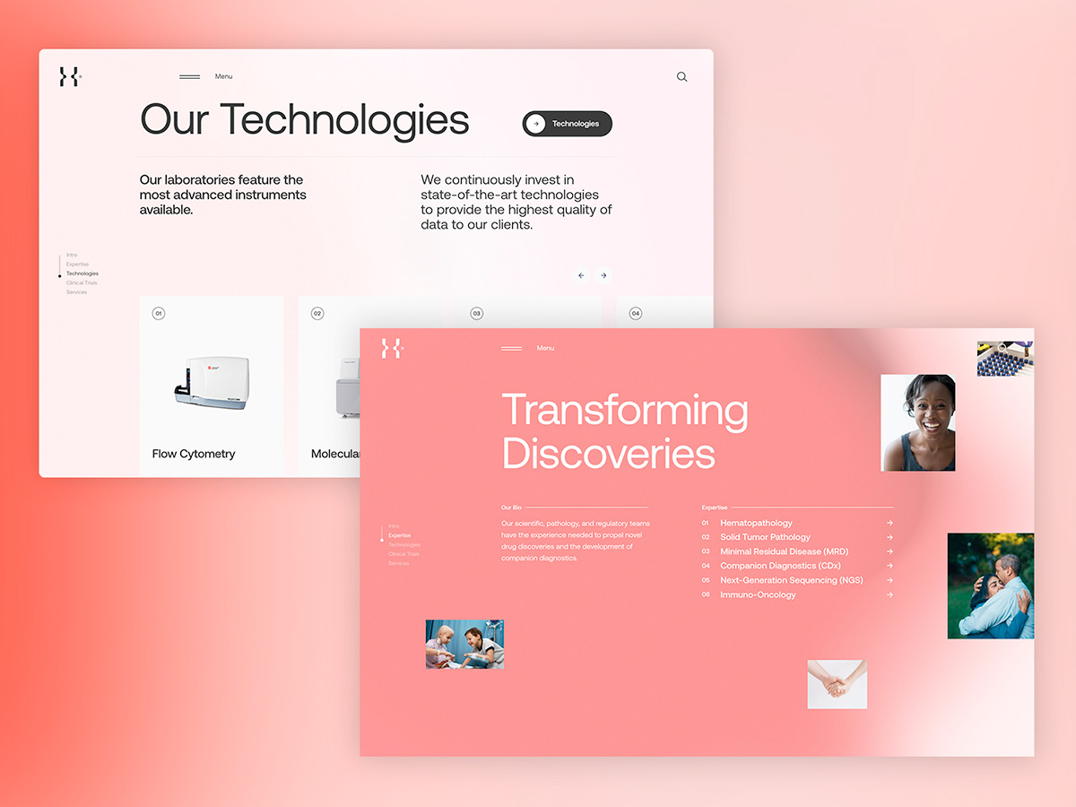
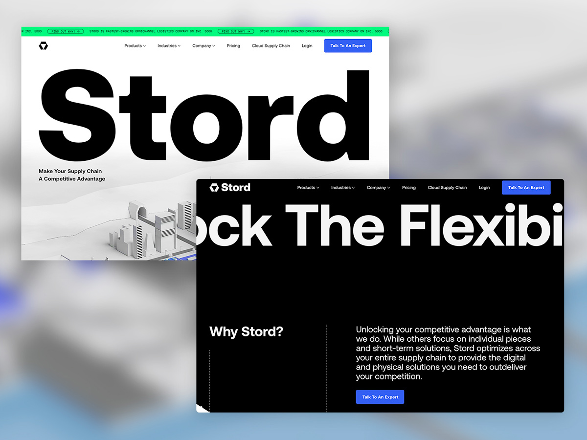
See tons of great examples of Aeonik in use here.