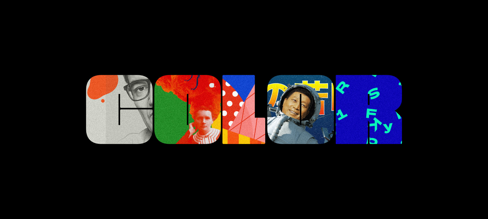
From exploring the growing trends in visual design, one thing is clear: Color 🌈 has taken centre stage. The visual strength and expressiveness of color ranges has seduced users and even designers themselves, who are using color as a focal design element, highlighting it above other content elements, even above images, which initially have the power to communicate more.
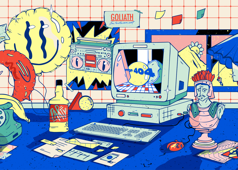
Big masses of color are taking over traditional white backgrounds, with palettes not limiting themselves to just one dominant tone. Strong contrasts of vibrant complementary colors stand out, not seeking harmony - but visual impact.
This is the result of the progressive movement of different styles of contemporary graphic design in a repeating cycle. Like all fashions they keep coming back, changing radically between rational functionality and minimalism, to more transgressive and exploratory visual manifestations.
📗 Check out our new book Hot Right Now Vol. 3, which dives into the latest trends in visual design, a must read for digital creatives.
Vibrant Colors Modulated by Neutrals
After a period dominated by “soft pastels”, we are witnessing the emergence of strikingly risky colors and pairings, that aren’t about harmony, but making an impact. It’s about ranges of vivid colors of differing non adjacent tones.
In general, these combinations of vivid colors are softened by muted or neutral colors, which help direct to where the attention should be focused.
The use of big solid areas of color is characteristic of this trend, it’s also very common to come across (as shown in the following cases) isolated notes of luminous colours that capture the attention.
Color-Blocking & Big Solid-Colored Areas
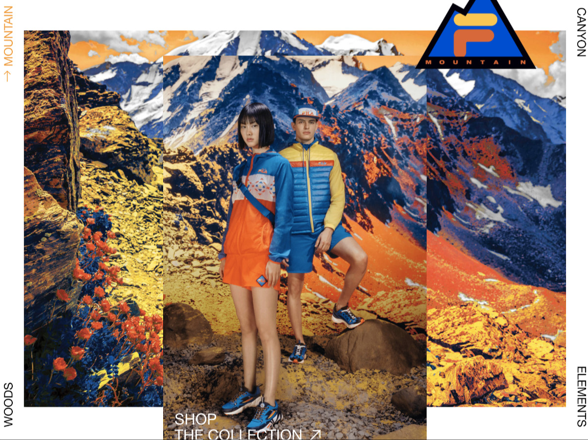
Color-Blocking has been a common practice in fashion design since the 1960s, and can be traced back to the work of the Dutch painter Piet Mondrian. It consists of the exploratory combination of bright bold colors with their complementary colors. In reality, they don't have to be on exactly opposite sides of the color wheel, but the idea is to look for a strong contrast between solid areas of color to find interesting combinations.
Coming up, we'll see masses of color unapolagetically invading the background, as well as organic abstract shapes exploring how hue and shapes interact. These imperfect geometries mixing saturated and muted colors are reminiscent of Mattisse’s “The Cut-Outs” style.
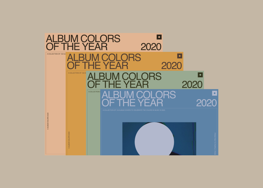
More Colors in the Palette
Creating and standardizing a great color palette helps to achieve a visual language that consistently represents the brand or product in any media.
Traditionally, color palettes have been much smaller, consisting of one or two principal colors. Nowadays, the publication of elaborate design systems (like the redesign of DropBox in 2017), has contributed to the trend of the importance of color, and takes the palette even further than it was before (typically the principal color of the brand with a highlight color and a few neutrals).
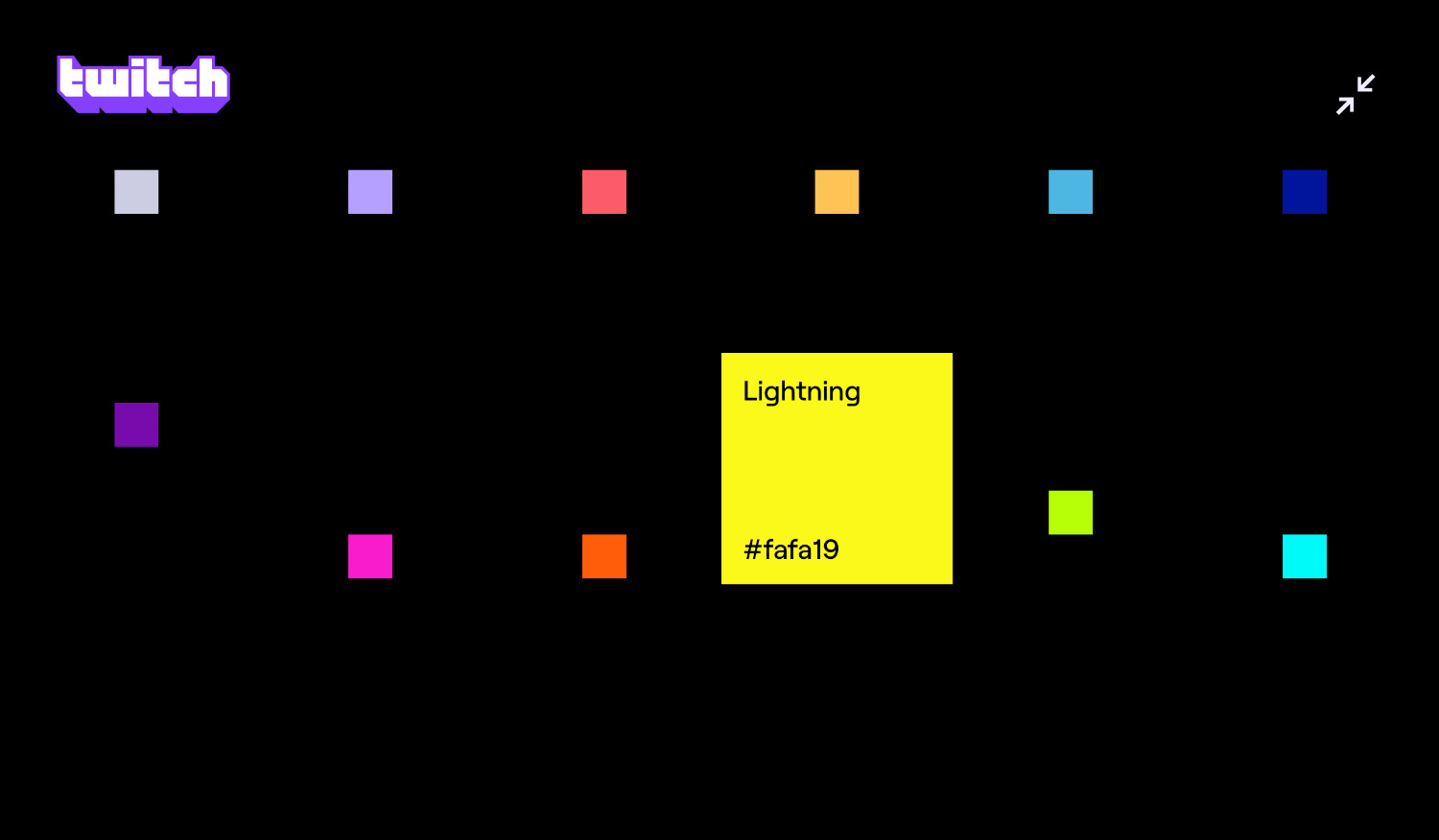
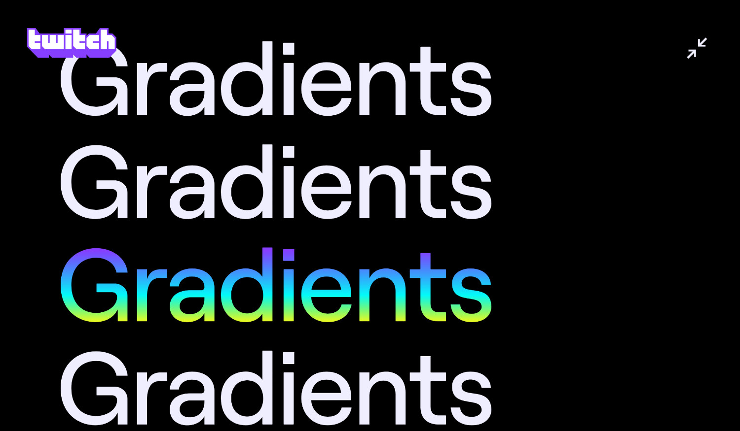
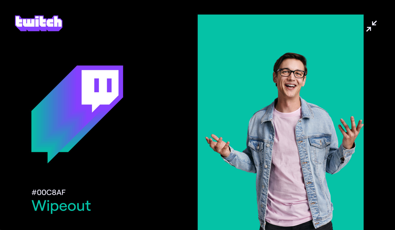
Twitch Rebranding with a New Expanded Palette
Twitch have refreshed the logo, created a custom typeface and expanded the color palette to include lots of vivid shades, as well as amping-up the vibrance of its characteristic purple color. The colors of the palette, dominated by acid Purple, blend into each other, generating duotone gradients to emulate 3D extrusion on the graphic elements.
Multi-Colored Backgrounds
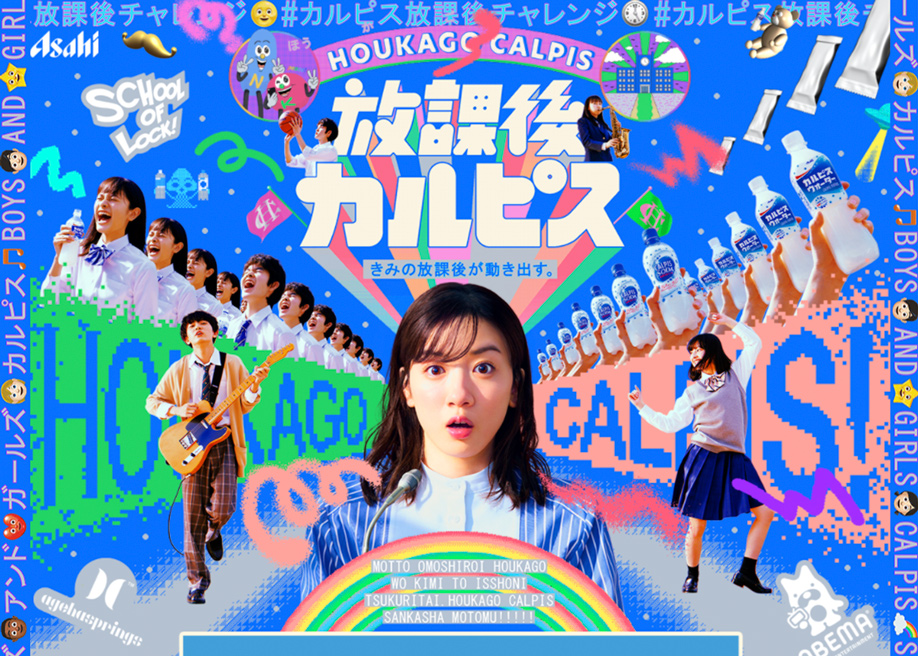
The following examples display a chromatic sequence in the background, which advances with the scroll as the content is presented. The color palette is revealed as we advance through long scrolling, and nearly all the cases contain a One-Page Layout with changing colored backgrounds. The colors group together providing a strong contrast between the background and the contents.
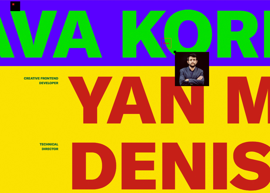
Getting contrast with Typography
Color finds its ideal counterpoint in typography being used as a graphic element, almost totally independently from the communicative value of the text. Backgrounds and texts play around with alternating high contrast or complementary colors, which eventually, switch in graceful animation sequences.
Optimistic Pairings
The popularity of soft pastels, with the famous Millennial Pink at its lead, is starting to wane. We started with a range of soft pastels dominated by pinks, and could end up with a loud range of colors, as we're already seeing in many fashion trends.
According to Pantone Color Institute color experts, the new trend is characterized by an extensive color palette with strong multi-colored combinations.
Combining our desire for stability, creativity, and more spontaneous design approaches, the color palette for Spring/Summer 2020 infuses heritage and tradition with a colorful youthful update that creates strong multi-colored combinations as well as energizing and optimistic pairings.
Leatrice Eiseman, Executive Director of the Pantone Color Institute.
In Brutalism in web design over the last few years, we’ve seen hyper saturated colors in irreverent and uncomfortable combinations that appear to go totally against the idea of visual comfort. Highly saturated colors compete for attention, resulting in a confusing user experience in terms of the perceived hierarchy of content and points of interest, and a compromise in findability and discoverability.
Despite these factors, it can be celebrated as a unique and interesting aesthetic experience, when understood in a much more creative context.
Color Exploration Collection
To discover more examples of color being used in beautiful ways see the websites in our "Color Exploration" collection.
-
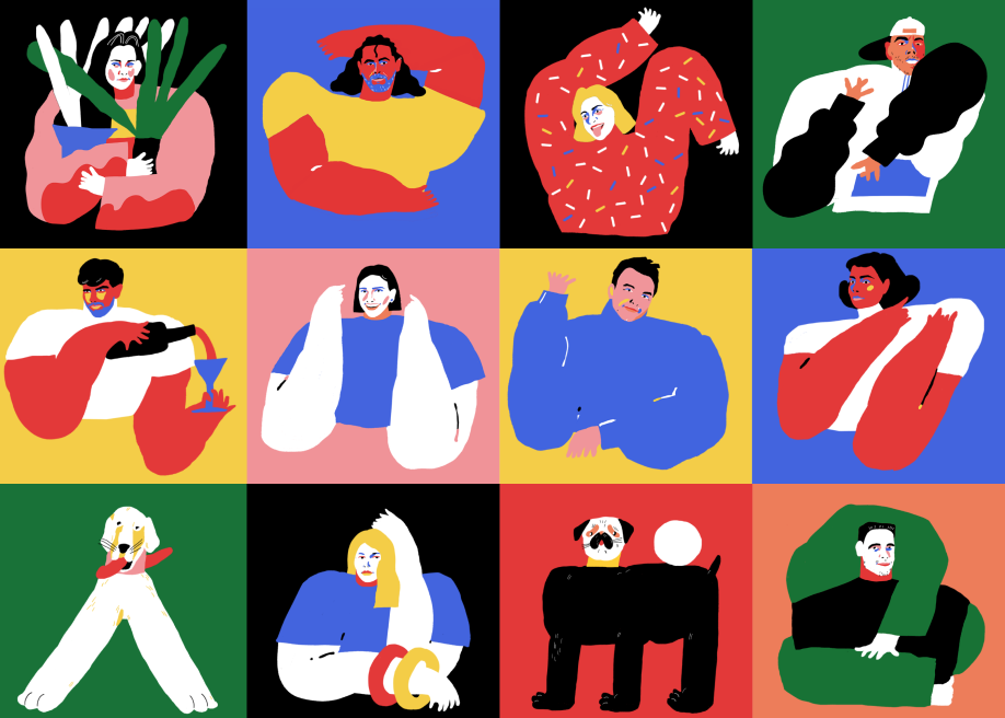
Tubik Family by Tubik , Oleksandr Petulko , Ksenia Lashko , serafima shpin' , Andriy Drobovych and olya-zakharyan in H.M -
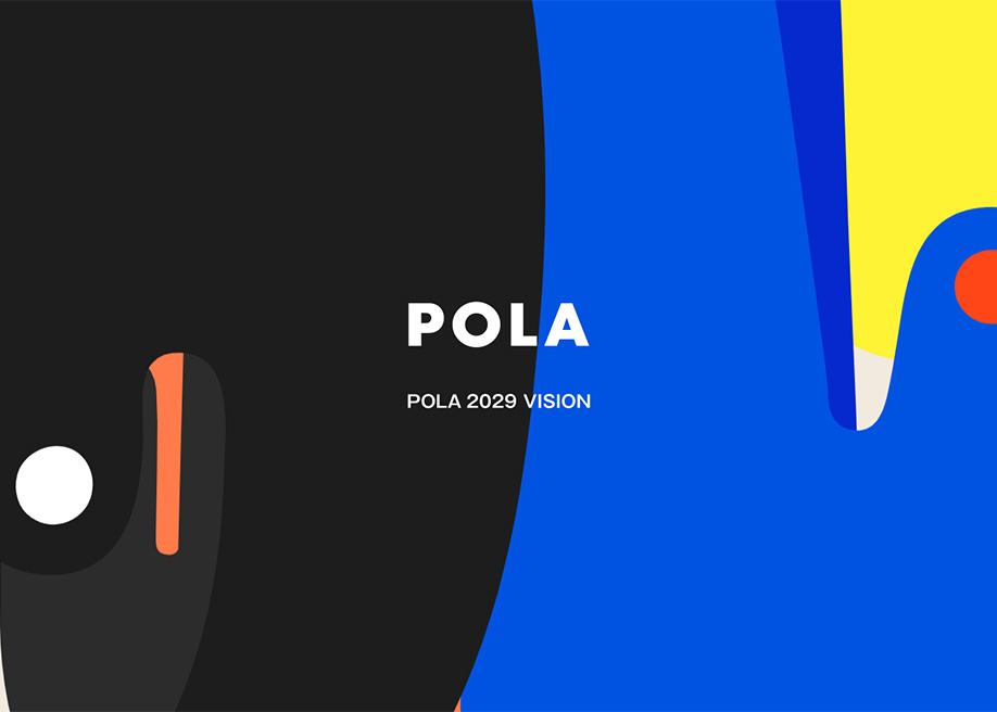
POLA 2029 VISION by mount inc. in H.M -
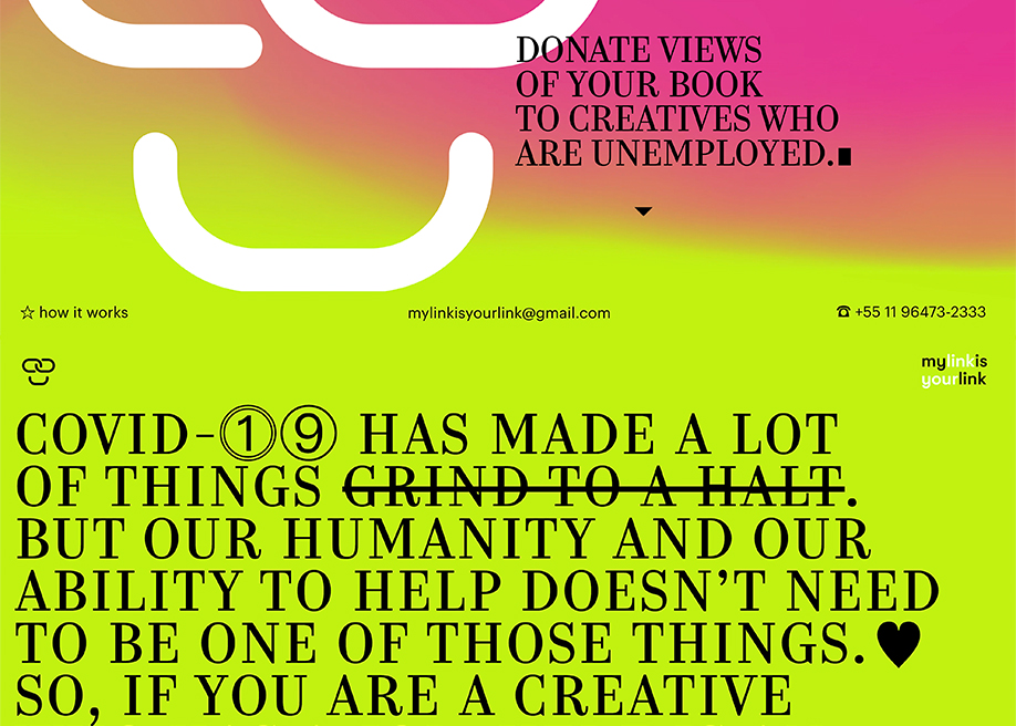
MyLinkIsYourLink by andremezzomo in H.M -
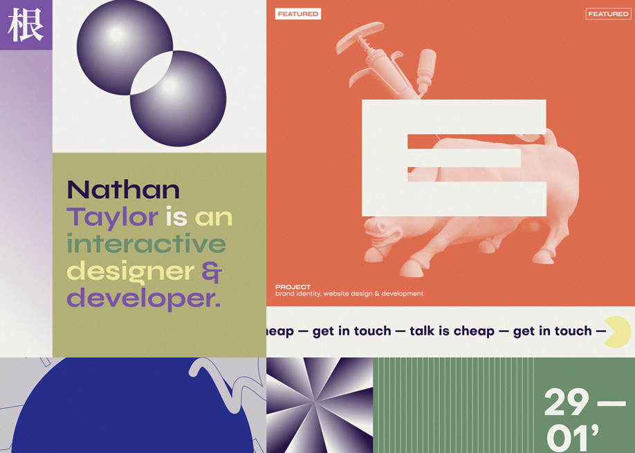
nathan.tokyo by Nathan Taylor in H.M -
Interactions from Montreal -
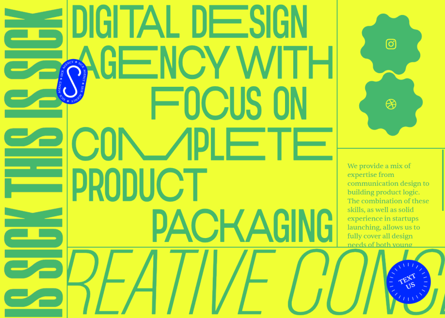
Sick Agency by Maxim Berg in H.M