Each creative portfolio narrates a story — not solely through the displayed work but also through the experience it provides.
I believe my case is now an exception to this statement. After more than a year of late nights, iterative design, and countless moments of "let's try this again," my portfolio has finally come to life at stabondar.com. Thanks to Den Potapov for all the creative ideas and design direction. I am so proud of how our collaboration turned out.
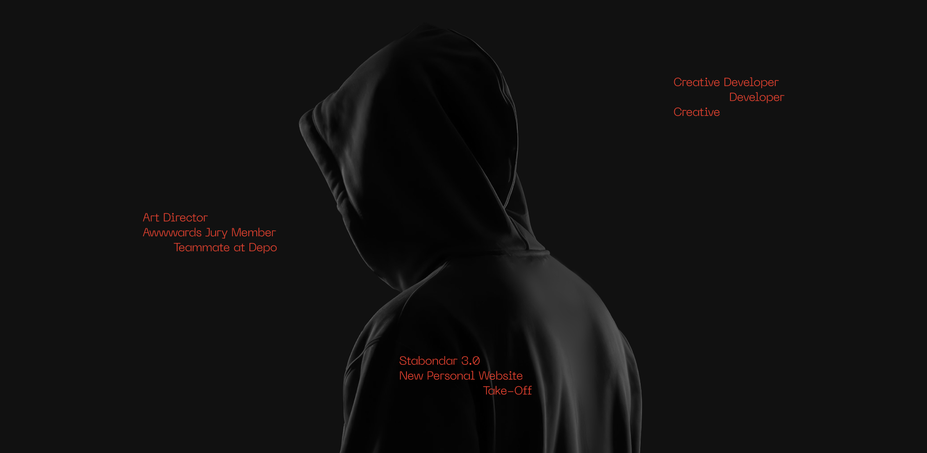
This is the fifth portfolio I’ve created for myself. I’ve noticed a concerning trend throughout the process: each new folio takes longer to complete than the last. If this one took over a year, I’m anxious about what will happen next.
This journey began with a simple yet ambitious vision: to create a portfolio that does more than display my work—it demonstrates my approach to web development through every interaction. I wanted visitors to experience firsthand the blend of technical precision and creative expression that defines my work as a creative developer.
The Concept & Challenge
Creating this portfolio has been an exciting journey for me, and it all started with a big question that many creative developers ponder: how can I share not just my work, but also my thought process? That's where the idea for stabondar.com came to life! I wanted to step away from the typical portfolio style with its grid layouts and minimal animations. Instead, I envisioned something unique that functions both as a showcase and a playful space. Each section of the site reflects different animation and interaction techniques, allowing visitors to truly experience my skills while enjoying a user-friendly interface.
This vision came with a few exciting challenges! First up was the task of achieving those amazing animations and WebGL effects while keeping performance smooth across all devices- this called for some thoughtful optimization. Next, creating custom interactions for each project while ensuring a unified user experience required some careful UX planning. Lastly, the technical complexity meant that building this out would take quite a bit longer than a typical portfolio site. The toughest challenge, though, was knowing when to hit pause on adding features. Every time I stumbled upon a new animation technique, I felt the urge to include it in the portfolio. This cycle of thinking, ' just one more thing, ' definitely added to the longer development timeline, as I kept refining and swapping out elements that just didn't hit the mark for me.
My Favorite Parts
I’ve spent a lot of time here and there polishing various things. However, there were certain parts where I spent the most time with joy.
Fluid Simulation Background
One of my favorite technical achievements is the subtle fluid simulation that runs beneath the surface of the entire site. This effect has been my dream for so long. I remember when I first started my web career six years ago. I wanted to recreate it in some of my projects, but it always seemed out of reach for me regarding technical skills and understanding. And yeah, it’s finally done.
The Physics-Driven Text
The home page's standout feature is the interactive "About Me" section with physics-driven text. Instead of a standard paragraph, I turned my story into an experience where each character acts as a physical object.
Using Matter.js for physics and GSAP for animation, the text appears normal but breaks apart as users scroll. Each letter reacts to gravity and collisions, resulting in a playful, organic effect. Users can even "push" the text with their scroll momentum, rewarding exploration.
This approach turns a simple biography into a memorable interactive experience showcasing creative problem-solving and technical skills.
The Interactive 3D Cube
Visitors encounter a complex feature: a 3D cube highlighting awards. This section offers an interactive experience instead of a simple list.
The cube uses CSS 3D transforms and GSAP for animations, reacting to scroll and mouse movements. As users scroll, the cube rotates to show different faces with award information.
Mouse movements also affect its orientation, enhancing the 3D effect. The interaction effectively reveals more content when clicked. The cube expands to show a scrollable list of awards, utilizing a custom transition system that preserves visual continuity.
The Cases Page Experience
The Cases page transformed into an unexpectedly joyful experience during development. What began as a standard grid evolved into a playful, interactive showcase featuring independently scrolling columns. Each column enables users to navigate projects at their own pace through mouse scroll or drag interactions.
I'm proud of the subtle WebGL distortion effects on project thumbnails during scrolling. As users scroll quickly, images stretch and distort based on velocity, then settle back when movement slows. This creates a tactile quality that transforms digital navigation into a nearly physical experience – as if manipulating real objects instead of images on a screen.
Unique Case Page Experience
Some time ago, I noticed that many developers showcase just images or videos of their projects in their portfolios. I found this really boring. So, I came up with an idea to implement some animations or elements I’ve already used in a real project. Yeah, it’s much more time-consuming to create each page and animate it instead of just updating an existing template, but I’m enjoying this process.
Recognition and Lessons Learned
Creating this portfolio taught me valuable lessons. I realized the crucial link between time and creativity. Setting a deadline was necessary, or I would keep refining features endlessly. Though I could always improve something, I had to eventually ship it and let it exist.
Working at the design-development intersection emphasized the value of collaboration. My partnership with designer Den Potapov enhanced our individual achievements. Combining our specialized skills while keeping a unified vision will shape my future work. This project's technical challenges deepened my understanding of performance optimization. Crafting complex animations and 3D effects required careful resource management and selective rendering, prompting me to choose CSS animations over JavaScript when fitting. These constraints ultimately led to more elegant solutions than having unlimited processing power would have.
My first nomination for Site of the Month. I'm not sure if I was close enough to win this title, but I've dreamed of placing in the top 8 highest scores this month for so long.
The GSAP team's recognition — naming the site Site of the Week and Month — acknowledged the care and craft of this project. Thanks to the GSAP team! Without you, this website could never have been so bright!
Technologies used:
- Astro Build
- GSAP
- Three.js
- Barba.js
- Matter.js
- Lenis Scroll