May 12, 2022
Case Study: Redefining the visual language for Revolt by Holographik Studio
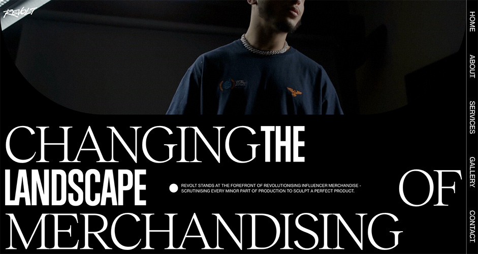
Any company that deals with client work can benefit from having an attractive and informative website. Since it showcases a company’s brand, values, and body of work, it serves as the first contact with potential clients, so it must be appealing from the very first instant that someone encounters it.
With this in mind, we set out to create a design that would embody the feeling that Revolt gives off, rebellious yet professional with attention to detail, all wrapped up in a contemporary package.
The Challenge
The main thing that we aimed to achieve in this project was to represent Revolt in a manner that it deserved. We’ve designed lots of websites before this one, and for each one we looked for an original idea that we then fleshed out until we had a complete product. But for Revolt it felt different, we felt that we had an obligation to create an unequivocally unique visual language, one that would be up to par with the bold and distinctive personality of Revolt.
Our solution was to focus on the dual nature of Revolt, they create merchandise for influencers, but their solutions can compete with current high-end fashion designs and quality. Their merchandise is made for a specific influencer, but at the same time they make it appealing to a wider audience, and their brand exists as a functional business, but its personality shines.
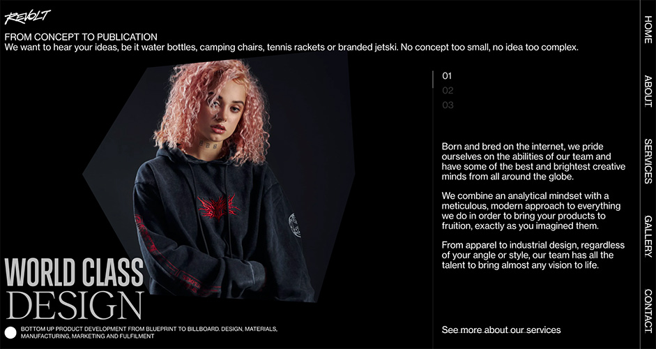
One visual theme that we implemented throughout the website is the juxtaposition of two opposing typefaces
One visual theme that we implemented throughout the website is the juxtaposition of two opposing typefaces; Reckless Neue, a serif font with a renaissance look, and Trump Gothic East, a condensed sans-serif font which had its debut in 1990’s cinema and was later used in a variety of entertainment content, from magazines to fashion branding and corporate websites. With these two typefaces, we had the ideal combination of bold precision and sleek artistry that we needed to create the ideal typographic solution for Revolt.

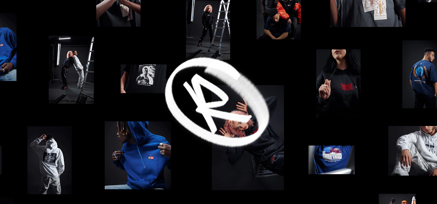
Images
Another area that had a lot of potential for being unique was the presentation of images on the site, as they were an especially important aspect of Revolt that we had to showcase. We haven’t only thought outside the box, but we thought a lot about the box itself, and what we can do with it.
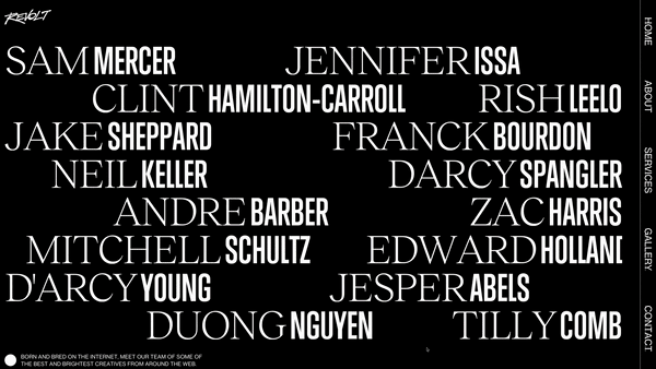
Typically, images are presented in a rectangular format, but we challenged that paradigm by creating variable shapes that morph into different forms. This practice gave us some flexibility in certain applications of images, like the team photos for example.
Having a totally different, or even a slightly different shape for each team member helped to convey that each member has their own personality, but they all share the same collective goal, which is denoted by the same general visual style of the images.
Team collaboration
The project required the hard work of multiple teams from our design studio, as well as an outside development team coming from Exo Ape, and we all had to be in sync in order to maximize our potential.
The project started with a client brief, it gave our designers the necessary information they needed to begin creating a design strategy. The next step in defining the whole design language for the project included the extensive creation of mood boards. We pulled inspiration from across the internet, and meticulously organized it so we could pinpoint the exact details that we found inspiring. During this process, we tossed a bunch of ideas around and we included our motion team, as they had valuable insights about the capabilities of the motion graphics that would arise from certain designs.
Our designers sketched out a lot of the ideas we had, some of which ended up being cut from the project. When we decided on a design, we started to polish it up and the motion team started creating motion graphics, so they could be applied to the various elements of the website. During this entire process, we were in communication with the development team from Exo Ape, as we had to stay within the developmental possibilities of the website. When we were satisfied with the designs, graphics, typefaces and motion graphics we sent them to Exo Ape, so they could finalize the development of the website.
All in all, everyone had an important role to play in the making of this website, and it wouldn’t be what it is today if it weren’t for every single amazing person that made an impact on the project. This wasn’t our first time working with an outside developer, and it was truly a pleasure to work with the people from Exo Ape as they had great communication and teamwork.
Technologies
Animation and details
To set the tone for the website, Exo Ape created a sprite logo animation that would serve as an introduction to what kind of brand Revolt is. On-scroll animations guide the visitor deeper into the world of Revolt, while shaped mask image reveals add another layer of motion to the design.
Throughout the site, Exo Ape added glitchy text reveal effects to accentuate the personality of the brand. One of the highlights of the site is the image gallery floating canvas that adds a feeling of depth and movement to the gallery page.
Frontend Frameworks and Libraries
For the frontend framework, Exo Ape used Nuxt.js, which is built on top of Vue.js. The framework offers flexible development features such as server side rendering, automatically generated routes, improved meta tags managing and SEO improvement.
Server Architecture
Future-proof hosting on Vercel. Vercel is a cloud platform for serverless deployment. It enables us to host websites and web services that deploy instantly, scale automatically, and require no supervision, all with minimal configuration.
Figma
The main design program at Holographik, almost every one of our designs gets made in Figma, and not only designs, but moodboards and strategies as well. Figma is a powerful tool that can help any design studio get on the same page, since it has incredible collaborative abilities. Thanks to Figma, we were able to discuss and elaborate on ideas, create the prototypes and final designs, and collaborate with Exo Ape, all in a single file.
About Holographik
Holographik® is a creative studio specialized in design and motion. Our work mainly covers strategy, art direction, branding, web and mobile solutions, 3d and motion design. We help brands and visionaries find dauntless and unique visual identities, create lasting value and inspire future trends.
Holographik consists of interdisciplinary thinkers, designers and artists with a deep understanding of art & technology and a shared desire to create outstanding visual solutions.