4 Years!= 4 Years: Project origin
My new online presence for my digital work – BryBry.co – came 4 years, 3 months after my previous one had gone online. It’s a strange statistic mentally. I look back at the projects I made 4 years ago and a little beyond, and I still have a place in my heart for them. I can see they are rough around the edges compared to my present-day taste, but the heart is there which I feel has stood the test of time, and so they have a place among my favourite pieces. Yet, my old folio site from that same period felt dated, and had become a big problem.
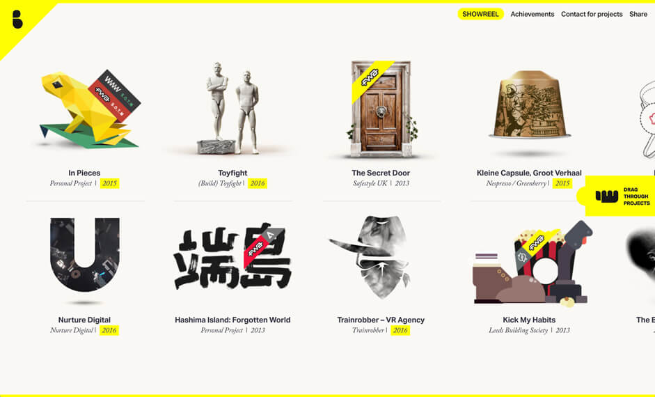
Portfolio websites for agencies and designers alike, are the playground where design is allowed to be whatever it can be, unrestrained from client chains, boring budgets or technical twists. The consequence of this? Folio sites age very quickly because they are immersed within a space which is ever-evolving – they show the wrinkles, and begin to tell a story of an entity stuck in the past within a cutthroat space where this is not entertained.
Just like so many (Come on, I know you’re guilty too), I’d fallen into that horrible loop of releasing projects and placing them on my folio site under the guise of ‘case coming soon’, linking to the live project and then tooootally never uploading such a thing. In fact, I had left some of those notices up for so long, that the sites weren’t even live anymore.
A new folio was necessary, but I had a couple of other underlying problems I needed to solve, which are important in getting into the vibe of how I was approaching this project. I am in myself above anything else, a creative – as time goes by, I realise more and more that some kind of creative approach, idea or anchor is the theme I attempt to run consistently from project to project and this is integral before anything like design, development, flow or animation have had even a sniff. The new site needed to express this concept-led approach.
So I needed to somehow bring this to the fore in a way which wouldn’t intrude the collection of work, but would also express that I’m a human being they can talk to, relate to and interact with to come up with something special if we worked together. Something seamless, something whispered – but something which could allow another human being to come away feeling as though they know ‘me’. This was the bedrock of my personal brief.
Something seamless, something whispered – but something which could allow another human being to come away feeling as though they know ‘me’. This was the bedrock of my personal brief.
Video Built the Radio Star: The concept
The base creative for the site centers around utilizing video as the only medium to showcase my selection of works, in an ever-present central element. Aside from it being a more engaging medium than using flat imagery (which by this point is simply no longer connected to what I feel is the most important part of my work), I realised it could be a sensible way of future-proofing my previous projects. Many of the sites I’d worked on were either being taken offline via being part of temporary advertising campaigns or were being heavily affected by browser updates, so snapshotting the projects as video screencasts seemed a sensible way to go too.
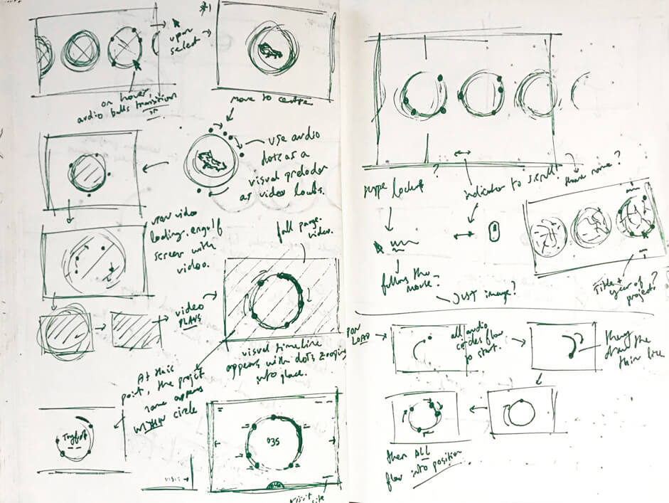
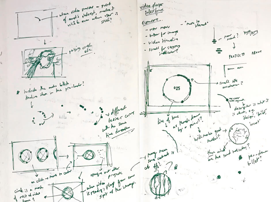
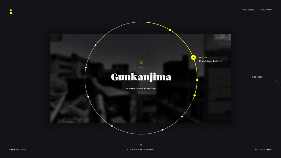
A specially timed and mixed version of my showreel acts as the way of navigation rather than being the traditional ‘skip intro’ reel which is prevalent among many sites where they are utilized as a foreword. Users are instructed to click and hold at any time during the course of the showreel, to open the particular project being shown at the time. I felt this could be an interesting way of fusing the clip-centric reel which quickly communicates my abilities in a short burst, with the human-expectancy of experiencing something you like, and thus wanting more of that thing. This is all backed up with a circular timeline which gives the overall composition some visual interest, as well as a secondary door to the content.
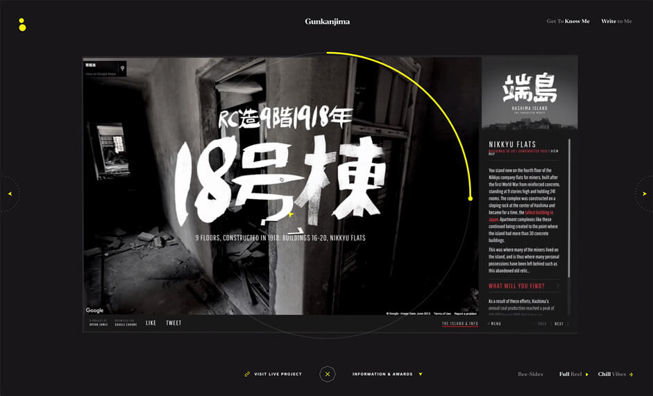
Then as a final icing on the cake to round off the video-centric creative route, the playthrough of each case study is fully narrated by myself to give an insight into the thinking that went into the project, in a digestible and personable manner which in terms of the brief, adds the touch I desired to connect with the human being at the end of the interaction. For this layer, I teamed up with my very trusted friend Bart Claessens, who recorded and mixed my words into a consistent, production-ready form.
Each case is presented via a video walkthrough of the site in question, and applied with narration over the top to describe the work.
There’s Something About BryBry: A rebranding project
As a small branding aside, the move to changing things up to be fronted by ‘BryBry’ came along because I hated the URL bryanjamesdesign.co.uk; James was probably a candidate for when Morrissey was naming The Smiths and it made me sound like a $5 logo artworker (no dis, fam) and BryBry is something multiple disconnected friends have called me over the years without me having mentioned that term beforehand – so I felt okay, let’s make this real personal.
This desire for personability attempts to be re-inforced in the site, with an About section which tries to go beyond a few paragraphs of text about how I totally don’t paint, be a dad, be a DJ, be a pro wrestler(lie), or be other such things and instead again answers the brief of communicating the person a visitor might choose to work with. I’m lucky enough to have an Awwwards video interview and so with this being a video-centric website, how better to communicate yourself than in how you talk, move, and otherwise look awkward in the eye of the camera? This is layered with small touch points delivered to the user by the time of the video. This allows small, absorbable content to be read in the way a human normally would with rhythm and timing.
Art Direction
I’m a firm believer that if you have an idea which you truly believe in, then the need for art direction and design to have their own poignant features diminishes greatly.
I’m a firm believer that if you have an idea which you truly believe in, then the need for art direction and design to have their own poignant features diminishes greatly. I believed in the base ideas within my site and so dropped way back on visual quirks while allowing subtle touches to try to finish off for a complete and pleasant experience.
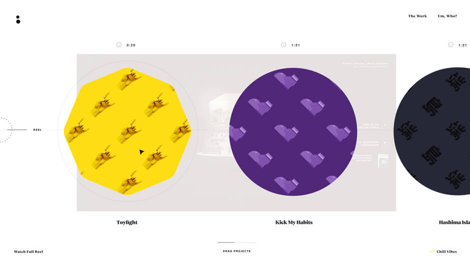
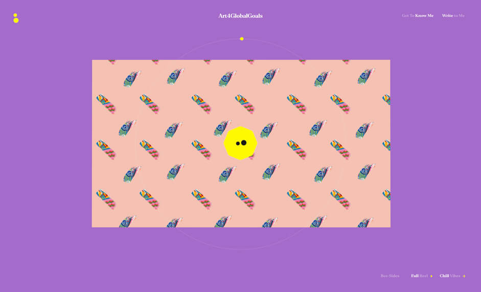
I kept with yellow as my branding colour for many years now, and it always allows for pinging in just the right spots I feel. There was still space for exploration in one small area of the site – the loading screen between two videos loading. For this, I explored a style I have loved ever since seeing it utilized on my own personal favourite website of all time, Maki-san. This repeating pattern background mixed with fluid movement gives a sense of verve and swag, and works well to indicate loading.
Hey You(Tube): Using an API to power video
[disclaimer: YouTube very recently updated their API, meaning that controls such as ‘share this’ and the author of a video are now showing upon a video changing, or being paused where old code took these away – I am trying to work out ways of taking these away at the moment]
With the heavy use of video in the site, and a repertoire of development skills which can never match those of an agency, the best approach was always to anchor off of an existing API, and I swung with YouTube for this site. I’d worked with it before, knew that it was pretty rock solid and good with load times, so it made a lot of sense.
The very intro to the site supplied a small development challenge. YouTube will attempt to load a video in as quickly as it can, which is great for usability – the drawback is that if you want something to be the very beginning of your visual-centric piece of work, then the first intro people have to your work can be blurry, pixelated and shoddy. So what really happens when you load the site in, is that we do wait for the YouTubeAPI-connected full showreel to be ready to play. The showreel then actually plays invisibly for just over a second, before then pausing at a very specific moment, triggering the site to show the interface to click and hold. An HTML 5 video element is also in place while all of this is happening – which contains the small startup of drum hits which crash the site into action – but because it’s an HTML 5 video element, the quality is crisp and playback is exactly as in the original. When visitors then click and hold to enter the site, this video plays out before removing itself to reveal the YouTube version of the reel.
Most of the experience achieved via YouTube hooked in is fairly straightforward, and something like the cool and very functional slow-down upon click and hold is fully integrated and utilizable within the API. Slowing down the video wasn’t just a cool touch added to the experience; it made the chance of a user crossing over into the next project as they click and hold a lot less, slowing everything down and limiting the time the video advances before they either release or a project is engaged. Setting the following line will slow down a video to half of it’s speed:
player.setPlaybackRate(0.5);
The other technically challenging part of the site is the creation of a circular timeline hooked into the YouTube API, but it’s a lot more simple than it might seem. Without getting into too much detailed code, the time of a video is simply a % of a total time, so you have a % always present (with requestanimationframe running to constantly ask for a time). This per cent is easily translated into DrawSVG code of a circle, with:-
TweenMax.to(timelineTimePath, 0.2, {drawSVG:timePercentDraw, ease:Linear.easeNone});
This code results in a smoothly running timeline following the % the video has ran through.
Small touches such as the colour-changing background within the reel also try to get the most from having this constant-running video time – in this instance, simply asking at what point in the video the user is in, and changing a data-attribute to the background colour element to fit.
Company Info
BryBry
Twitter:@wengerstoybus
Bryan James is an English Creative, Designer and in some areas Coder residing in Europe. I try to link creative ideas to development-based approaches, and attempt to make people feel something when they come to interactive projects.
