How is this website portfolio different from hundreds of similar websites? Its peculiarity is that it took only 1 month from the idea to the launch of the site. Concept, design, content creation, and development from scratch, all done in 30 days. That's what happens when people who love their job work together. How did we do it? Let's figure it out together.
The key idea of this site is a combination of visual aesthetics, modern technology and high performance. When the idea was born to update Leonid's personal site with examples of work, we knew one thing: the new site should reflect his personal vision of the digital world and make sure that all users of the site get pleasant emotions from interaction from the first seconds.
Part 1: Design
The first thing you notice when you go on a website is the design. It plays a primary role in the first impression, so we paid special attention to this component.
Composition is the basis of design
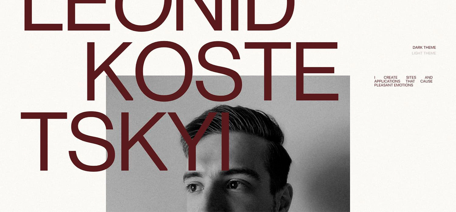
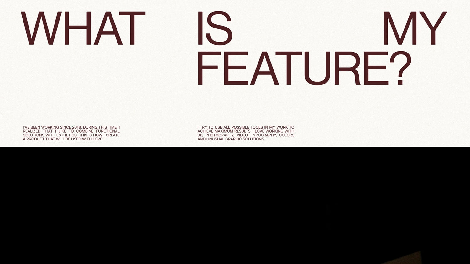
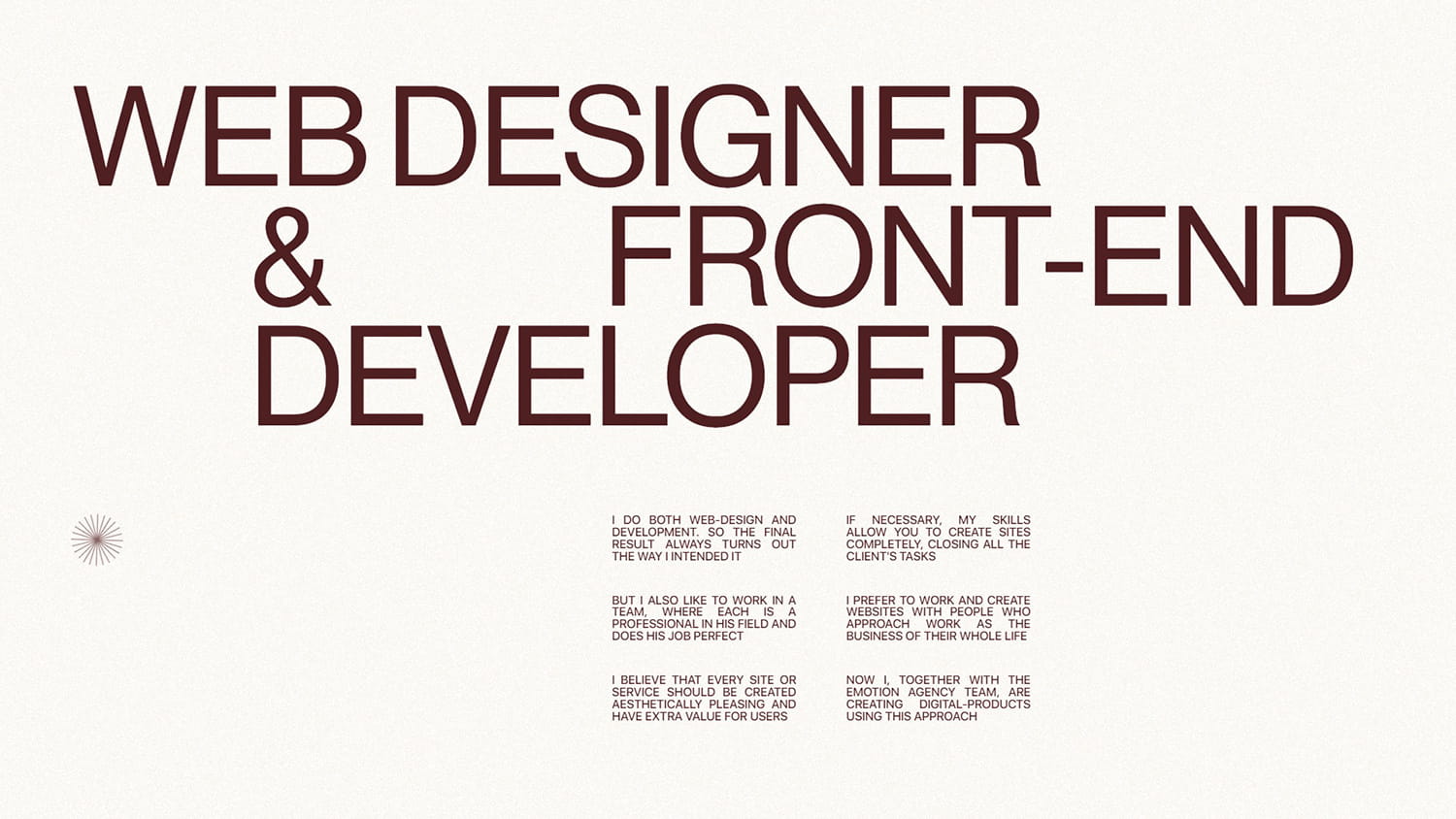
What immediately catches the eye are large headings, a lot of “air” (free space), and conciseness in the structure of the arrangement of elements. The composition has a minimum of graphic content — its role is played by the font.
Visual purity is sort of the motto of this site. The real challenge was to make sure that without an abundance of graphic elements on the site, the fashion trends of modern web design could be clearly traced.
This task was solved thanks to the use of fonts with different styles, different sizes of headings and body text, as well as the use of techniques from the “Swiss” typography. For example, a grid and text alignment on different sides of the container.
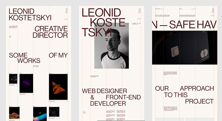
Grid
Usually, in projects, we use a regular column grid (12 or 16 columns), but in this project, we decided to abandon the usual column grid in order not to put the composition in frames. First, we created the first screen, and then, based on the content on it, we built guide lines that are used throughout the site.
From unusual visual techniques:
- Increase the contrast between headings and body text.
- Alignment of the text in width, as in a magazine layout. Again, the font here plays the role of a decorative element, and in order to achieve a more beautiful form, it was decided to use this technique.
Two-color themes for visual variety
For modern sites, using multiple color themes is already a standard practice, not a novelty. To make this technique more beautiful, an animation was added, which we called ”manifestation” in our team. Imagine light-colored parchment (or papyrus) that has been accidentally spilled with ink. The ink spreads, leaving intricate patterns behind, gradually staining the parchment in a dark color.
Color Theme Switch Animation
This animation is a reference to the idea that not always spilled ink on a clean sheet is a bad event. Indeed, in random decisions that occur in the work of a designer, something truly beautiful can be born.
Business Cards
Of course, it is difficult to make a dynamic website that will constantly hold the user's attention with just one job with fonts. Therefore, we decided to add some graphic elements. One of the notable things about the site is the business cards.
They are small and concise, and at the same time, they fit perfectly in the meaning of the footer, which contains contact information. And they can also be moved: it attracts the attention of users.
The interactive business card
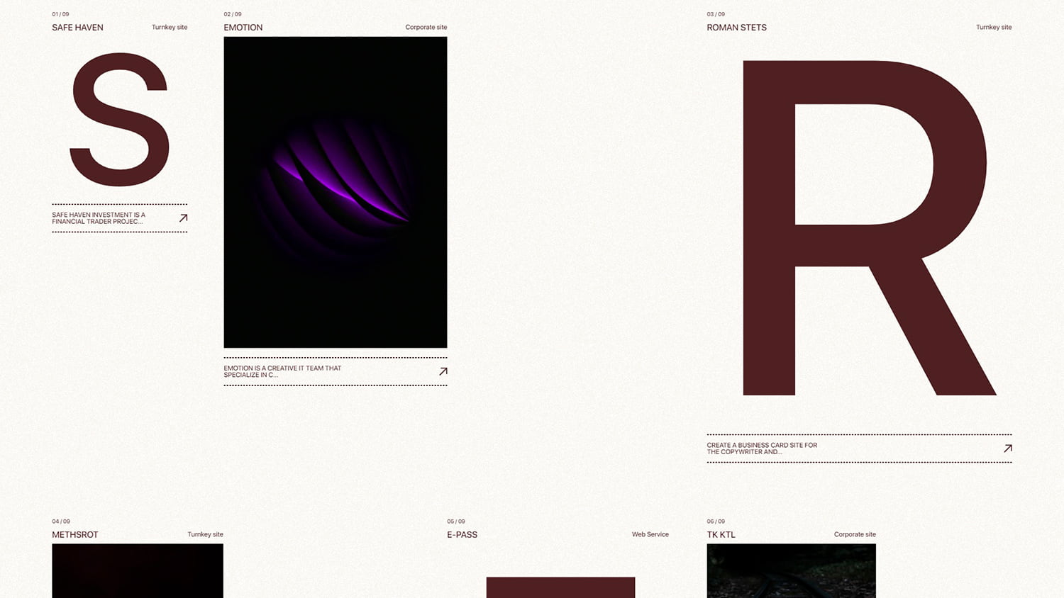
Case preview
For the section with projects, we came up with an interesting visual solution. It was necessary to make beautiful previews of projects, but it seemed bad manners to use screenshots of finished sites. The idea came to mind to visualize the preview using abstract images on the subject of cases, as well as capital letters from the name of a particular case. When you hover over a letter, magic happens and the letter transforms into an image. This is accompanied by smooth animation along the way.
Part 2: Development
This is probably our favorite part of this project. A modern website must be “alive” and responsive to user actions. Below we talk about the techniques and technologies used in this project.
Under the hood
At the core of the site is the Nuxt.js framework. We use Nuxt in our projects because it's the only framework that we think is the best for building “WOW” sites. It has many tools available out of the box for convenient work and interaction with animations and data. There are also a number of tools for optimizing the site (such as lazy loading of unused pieces of code, creating a PWA with caching, static page generation, etc). With all these features, the framework saves us from having to set it all up manually and concentrate on the creative process.
Site hosting
We use Vercel as hosting for the site. It is very easy to use and requires almost no settings. There are two main reasons to use Vercel or similar solutions:
- Vercel and similar services out of the box provide gzip compression, caching, CDN, and a number of other tools for optimizing the site. Using Vercel and Nuxt Static Site Generation, we provide high site responsiveness and minimal user wait time for the site to load.
- High speed of site deployment and making changes to it. The system is tied into a git repository and every time the code in the repository is updated, it also updates the data on the site.
Animations in the “Projects” section
When the user scrolls up or down the page, the project previews distort proportionately, bringing dynamics to the process of exploring the site. This effect is made using WebGL technology.
Project previews
Then the user clicks on the preview of the case, and the magic happens: the picture is “softly” stretched to the full width of the screen, and in the process of scrolling it is distorted. This animation combines the inversion of colors, and also remotely resembles waves.
Performance
There are a number of technical tricks that we use to ensure that sites with a lot of animation work smoothly and load quickly.
- We use GSAP for animations, we consider it the most convenient library for animating something, with good documentation, an ecosystem of plugins, and an excellent community.
- To create distortions on images, the effect of “noise” and other distortion animations, we use WebGL and our own small library to quickly and easily convert DOM elements to WebGL elements.
Here we want to draw your attention and tell a little more about this library
Most of the out-of-the-box solutions for interacting with WebGL, such as three.js, pixi.js, babylon.js are very powerful, cumbersome, and have a lot of functionality, thanks to which you can create complex experiences, games, etc. For ordinary image distortions and 2D shader animations, these libraries are too redundant, because you need to write a lot of boilerplate code to implement the desired functionality and, for a couple of animations, take with you from 400KB to 2MB of extra code of the library itself into the bundle.
We most often need to make sure that the elements that are in HTML (pictures, just div elements, etc.) are magically transformed into a WebGL object and inside the WebGL scene exactly repeat their position and size from HTML.
To do this, we wrote our own tiny library, the core of which is OGL, and its whole task is to find HTML nodes by selector, add them to the created WebGL scene, duplicating their scroll position and sizes from HTML inside the scene with the ability to loading textures (if it's a picture), and with the ability to create GLSL shaders for them. At the same time, everything works almost immediately “out of the box” and you need to write a minimum of boilerplate code.
«Softly» smooth scroll
To create a smooth interaction with the site, we use the smooth scroll technique. To do this, we also created our own library. Its main difference from a number of others is that it animates the native position of the scroll, while most other libraries override the normal scroll behavior and animate using the “transform” property. In our opinion, this approach is more universal, productive and works great on different devices and browsers.
And one more optimization
Another important optimization that we use when creating sites is the creation of one requestAnimationFrame for all animations. Based on our experience, this way the animations work more smoothly and there is no desynchronization between several animations (for example, native scrolling of the site and scrolling of elements inside WebGL).
Technologies
- Frontend framework — Nuxt.js
- Hosting — Vercel
- Animation library — GSAP
- WebGL library — Own Library
- Smooth Scroll — Own Library
Company Info
Emotion Agency is a creative IT team from Ukraine founded in 2018. The main specialization is the creation of digital products for solving business problems of small and medium-sized businesses around the world. The peculiarity of the team's approach to working on projects is that all products are created at the intersection of visual aesthetics, human-centric marketing, and modern technologies. Our clients are startups, companies, and entrepreneurs from various fields: marketing, logistics, architecture, finance, and more.