
The idea for this website came from one of my visits to the Art Gallery of Ontario. When I saw the exhibition I fell in love instantly and I thought: I must create a memorial for this amazing artist, to show the world what awesome skills human beings have, and to inspire them in the same way I was at that moment.
Käthe's artwork is unbelievable, her paintings tell the story of the concept behind the drawing and transmit an extremely realistic atmosphere of the person, scene or object contained in art. The most impressive things are the rich details that you can notice in the paintings.
Storytelling Mechanism:
The core of the website is Käthe's artwork and her story, so I decided to use a timeline, which is the most conventional way to build this kind of storytelling. My goal was not just to tell the artist's story, but to create a mix using the texts and her artwork synchronously, providing the user with an experience to follow her artwork alongside her life journey.
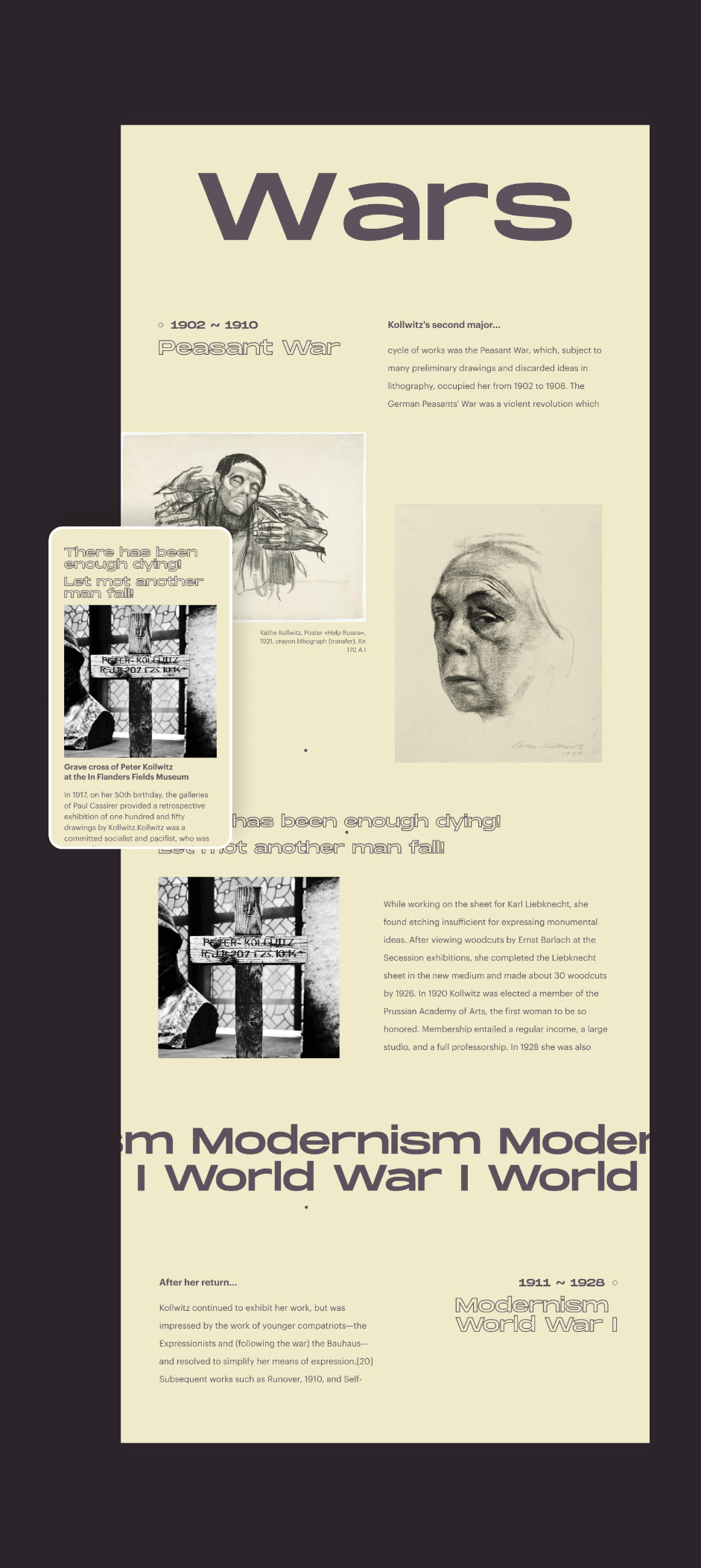
For me, it was essential to produce a website with rich detail to match Käthe's drawing method. This kind of website (storytelling) could be considered boring, so I spent a good deal of time polishing the details and building micro-interactions with rich visual details, and avoided using too much text.
Cursor interactions / DrawSvg / Hover States
The highlight of this project is the draw section and the shape of the stroke achieved, which gives the user an opportunity to draw with the same style used by Kathe in her paintings.
The Process & Challenges
As mentioned above, the biggest challenge was replicating “Käthe's painting shape style” for the drawing section, and making sure that the user would get a similar experience when they were drawing. This feature was important for the website, in an attempt to give the user the feeling and sensation of being an artist - and at the end of everything, the user would be able to download their experience/drawing and keep it.
Playground of the website / drawing interaction.
If I could change or add something, I would explore in greater detail the paintings and sculptures made by Käthe. I tried not to use images on a large scale (very big) in order not to harm the website's loading and the smooth scroll provided for the website - ast unfortunately, Google Lighthouse was already complaining about the number of elements contained in the same page.
This website was a great learning experience, especially about Canvas and Animation on the scroll.”
One of my main objectives, when I'm developing a website, is to implement something that I have never used/interacted with before, in order to keep learning and improving my skills. This website was a great learning experience, especially about Canvas and Animation on the scroll. I chose to use scroll interactions in order to practice and learn how to use the Intersection Observer and get BoundingClientRect works (two recent technologies in the Modern Javascript), usually used to build interactions on the user scroll. Both of them were extremely useful in the project, which you can play with a couple of animations based on the scroll.
Animations based on scroll.
Navigation System
The navigation was created by providing chapters of Käthe's life, at the beginning I was inclined to make pagination in the website, but the goal of this website was not to make the user spend a long time on it, but to make sure that they followed the artist’s life entirely and played around with the Draw Section.
Full screen menu navigation.
To represent the different chapters I decided to use the ink effect, one of my favorite effects which I believe perfectly matches the story atmosphere.
Background transition between chapters.
Technology
The stack for this website, I used these languages:- PugJS (php / html / transpiler)
- Sass (css / transpiler)
- ES6 with Babel.JS (javascript/ transpiler)
- Canvas
Before we finish I would like to highlight the animation at the beginning of the website. In the background of the preloader it is possible to very subtly see the lines drawing the word “Käthe”, I achieved this effect using Pearl Sequence and Canvas.
Background of the preloader.
Credits
Victor Costa is an internationally Awarded Front End Developer, who is completely in love with technologic interaction.