Born in the 80’s
Born in 1984, Gédéon is a creative agency and production company based in Paris. The agency was created for and by television, designing the on-air, print and online identity of the biggest TV channels around the world. Over more than three decades, they have produced hundreds of jingles, logos, idents and short films.
We were asked by Gédéon to help them refresh their identity and digital presence with a whole new experience.
The cobbler's children go barefoot
Creatives tend to not be very keen on working for themselves and Gédéon was no exception. They spent more than thirty years producing extremely refined brands and identities but their own logo and online presence had been set aside for a few years.
What makes Gédéon unique is obviously their experience. The company had been around for a while (30 years tho!) and created iconic brandings like the national French TV channels France Televisions. They needed a nice and fresh overhaul but we could not simply start from scratch with a such immense background.
Their identity has always been their work. For that specific reason, they were looking for something that would be subtle enough to be associated with any of their projects, but with enough room and creativity to stand out when necessary.
We want our work to speak for itself, not some boring corporate message.— Gédéon
The new identity was designed as an extension of the previous one, illustrating the evolution of the company from the eighties, (they were possibly one of the first ever creative companies specializing in broadcast identity and design for TV channels) to today’s modern and contemporary vision.
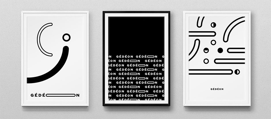
We worked on something that could convey that expertise and heritage but also be durable and that could be used in a wide range of contexts. We came up with a skilful blend of tradition and modernity, a reference to the agency's historical anchor and experience, but also its ability to push creative and modern concepts.
The “o” letter evokes the camera lens and the creative eye of the studio. It was defined as the center of the creative expression of the wordmark. Something that works like an emoji, sensitive and meaningful, but also playful and fun.
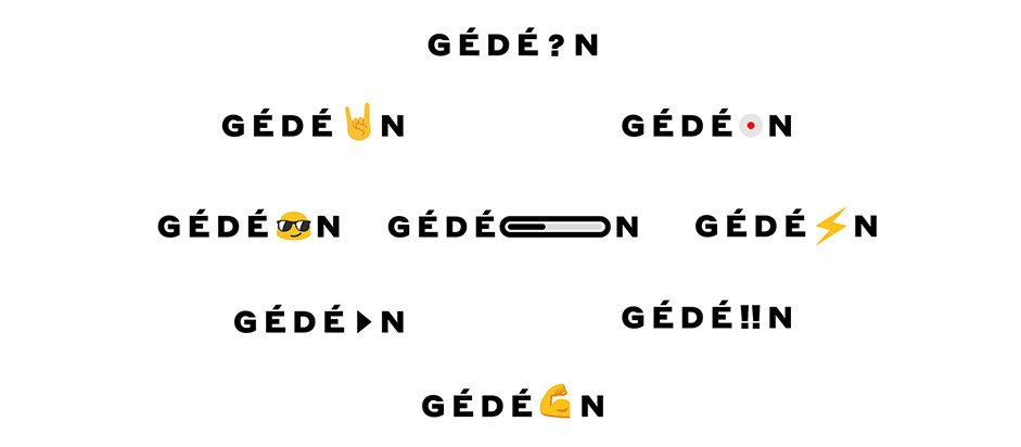
A bold and sharp wordmark combined with an elegant and refined serif type. The simplicity and sharpness of typography compositions is balanced by playful and animated shapes evoking the moving images. Simple, bold, elegant, with enough room and flexibility for creative twists and playful moments.
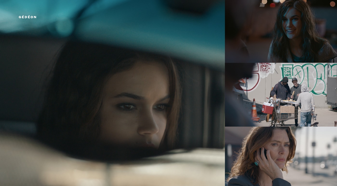
A (moving) image speaks for a thousand words
Gédéon’s body of work has always been linked to moving images. All their productions are tight to motion, from 2D or 3D animation to movie productions, animated jingles and logos, moving images are part of almost all of their projects.
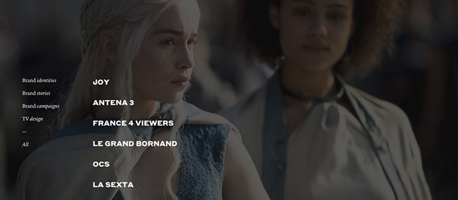
This was the starting point of our design research, with the TV screen metaphor as the key element. We wanted to put the visitor in front of a wide, fullscreen and interactive video player. Something that instantly showcased the agency’s work and allowed the user to switch from one project to another seamlessly, like a TV remote.
Inspired by video displays, we came up with the idea of using the video assets of their project base as the main website element. The interface lays over a huge video background which moves from one project to another by simply hovering and clicking the project names. This ended up creating a cinematographic user journey where video and moving images are all around the pages.
The less possible interface and text, the more possible moving images, the core of Gédéon’s work.
Click & Chill
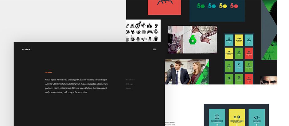
Gédéon creates a very wide range of projects for an even wider range of clients. From brand identities to complex motion idents, jingles or even short and long movie productions, each project is carefully crafted with an original art direction, dedicated content production, sound design, etc.
We needed a way to showcase the story behind each project, the behind the scenes, the people involved. Something that brings a deep and meaningful insight to the project.
The biggest creative challenge was to create a flexible layout system allowing us to build detailed case studies for each project and covering all the possible configurations. In addition to that modular behaviour, we also wanted to design a system where each project page would have its own design style, coordinated by the project itself.
We created a dedicated case-study structure based on a modular approach, allowing us to build pages with a specific architecture for each project. Simply by swapping and organizing modules inside the page, we could create an infinity of contents.
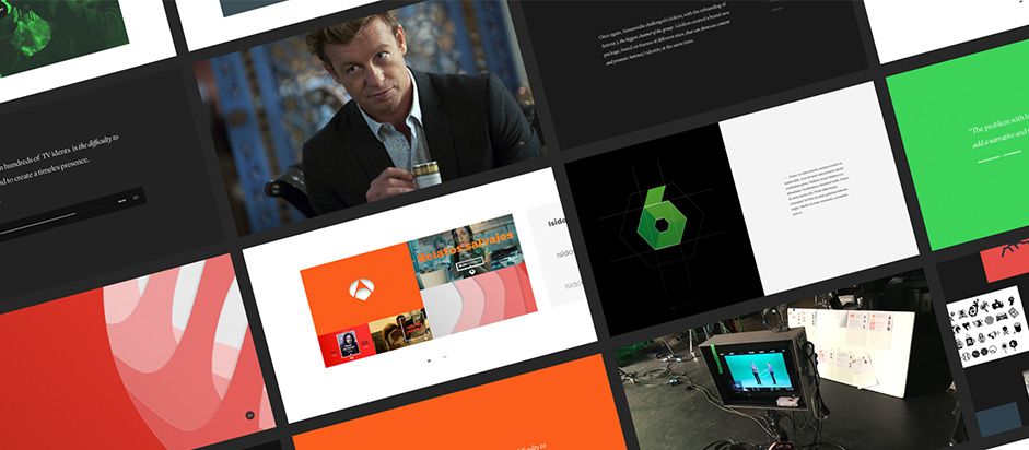
We also built with a customization system to allow design and style configuration within each module. Colors, typography and style can be adapted inside each page to coordinate the project art direction with the page look and feel.
That feature brings a unique look for each project page extending its concept and art direction, but stable and flexible enough to support dozens of work references and content production for maintenance.
Last but not least, we also created an infinite loop navigation system to ensure a seamless journey from one project to another. As the user browses the content we automatically bring the next case study to the top of the page.
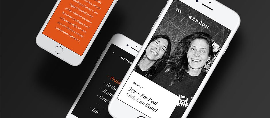
All the design and page structure were adapted to mobile and tablet constraints with dedicated layouts and transitions. Page structure remained unchanged with a vertical adjustment enhancing the content discovery. Interactions and navigation also take into account the touch interactions. Swipes and scrolls are dispatched all around the layouts to provide a smooth and fluid user journey.
Technologies
We used Wordpress for back-end management. The front-end is structured around Laravel v5.3 and the internal wordpress REST API. Then, the front-end integration consisted of HTML5, SASS and Javascript (based on ES6). The transformation/transpiling operations are made by Gulp.
In each back-end and front-end segment, we played with some great plugins that enhanced the possibilities: ACF, WP Super Cache, Greensock, Barba.js, etc...
Company Info
We are a French collaborative and independent design and development team based in Paris. We specialise in creating and building digital products for people and brands with a focus on user experience and interaction.