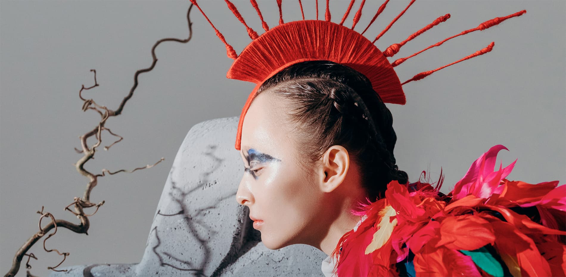
About a year ago, I received a request to create a personal portfolio website from a talented photographer and my friend Daria Izbash. Dasha creates bold and diverse shots for fashion magazines and commercial clients, and the site should be trendy and fresh, reflecting the aesthetics of her works.
I was faced with the dilemma: how to make a website with its own character and personality, but at the same time keep the focus on the author's works and not overload it with an abundance of design and techniques?
Design
At the beginning of any project, I usually choose the same approaches to use throughout the site, as well as the degree of their freedom. Following the constraints set by yourself throughout the design process allows you to achieve consistency and sets a certain coordinate system in which the site will exist in the future. Something unobtrusive but effective was needed here. Often, the set of design techniques depends on the corporate identity and the tone of the voice of the brand, but since this project is about a creative person, the whole style was created from scratch.
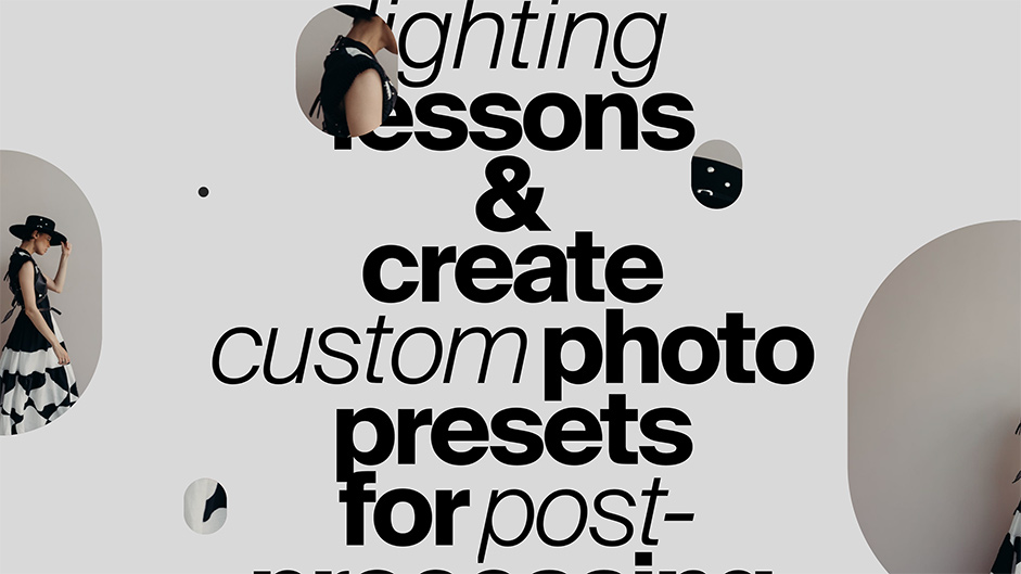
Decorated large paragraphs
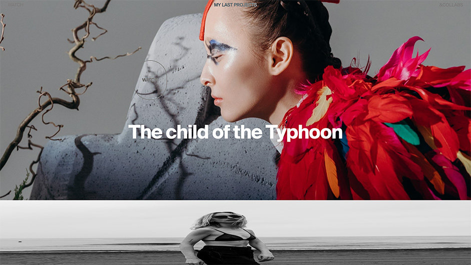
This approach works great when there is a lot of photo content, and you need to add emotions to monotonous text blocks. The maximum effect can be achieved by using the contrast of large typography and super small images.
Photos can be superimposed on the text in a chaotic manner, or lined up in a single line under the title
Photos can be superimposed on the text in a chaotic manner, or lined up in a single line under the title, making it possible to use this technique on various blocks throughout the site, ensuring integrity and uniformity.
The main finding in this project was that such a technique can be used not only with photos, but also with other elements. For example, here in the footer, in addition to the text, additional graphics were needed, but I had no intention to use the photo again, since they had already met in the block above.
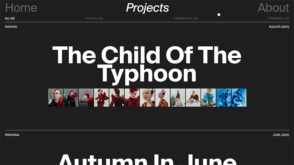
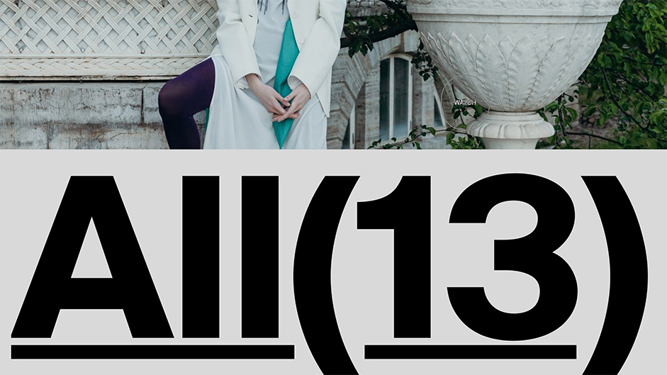
Center-width-center
The simplest and boldest principle of text layout, which I often use in my projects. The point is to align the text either in the center or to expand to the full width, and then combine these screens.
This approach requires the use of super large typography to completely fill the screen, and sometimes it tells you good solutions. For example, after the slider with projects on the main page, I needed a text accent, and since the text in the block before it was aligned to the center of the image, here using the principle of “Center-width-center” I made a huge “ALL” button to the full width of the screen. It looks spectacular and atypical.
Rhythm and visual storytelling
On the main page, I wanted not just to show disparate blocks, but to tell a whole story so that it would be perceived as a complete story and reveal the author's personality to the fullest. In this case, dynamics and attention management are very important. Alternating blocks in various animation techniques helps to achieve this effect: sticking the screen, inserting videos and changing the background color. It all starts with a dark background, then it changes to light, and the main part is as dynamic and saturated as possible from the point of view of animation, at the end there comes a tie and the background goes dark again.
Home page scroll animation
Technologies
At the beginning of the project, I had no idea that I would need to take on the role of not only a designer, but also a developer. Therefore, after finishing the design, I began to look for a solution for implementation and settled on Webflow. I've had experience working with similar tools, but it seems Webflow is the only no-code constructor capable of fully implementing even the most complex design ideas. It has a fairly high entry threshold, and it takes time to study the tool itself, so I studied the possibilities of Webflow and made up the project at the same time. Here are some tips that will help you do it faster:
Webflow is the only no-code constructor capable of fully implementing even the most complex design ideas
- Take your time to sit down at the layout right away, take a look at Webflow University, there you will find a lot of videos and articles that will help you get started.
- Study the limitations of the platform beforehand, as this can significantly affect the design and lead to some adjustments. For example, on a Project page made on CMS, I came across the fact that the number of Collection fields can be no more than 30, which means that you will not be able to add more than 30 types of content to such a page (photo, image, link,...), and since each dynamic element on the page is a separate field, then it's not much at all.
- If you do not know how to customize some components (slider for instance or burger menu), look for a similar solution in Showcase. There you can not only see how other designers implemented it, but also copy it into your project and adapt it to your design.
Designer's Info
Vikki Breusova is an independent digital designer from Cyprus, with almost a decade of experience:
→ Instagram
→ Twitter