Introduction
The portfolio project of Coraline Colasse came to fruition through a cross-border collaboration between Fabio, a Creative Developer from Italy, and French Art Director Coraline. The primary goal was to create an eye-catching website meant to introduce Coraline and showcase her professional work. Perhaps hard to believe, but it took less than three weeks of hard work and sleepless nights to breathe life into this website - made possible only by our clearly defined intentions.
Goal #1: Presenting the website with a “Wow effect”
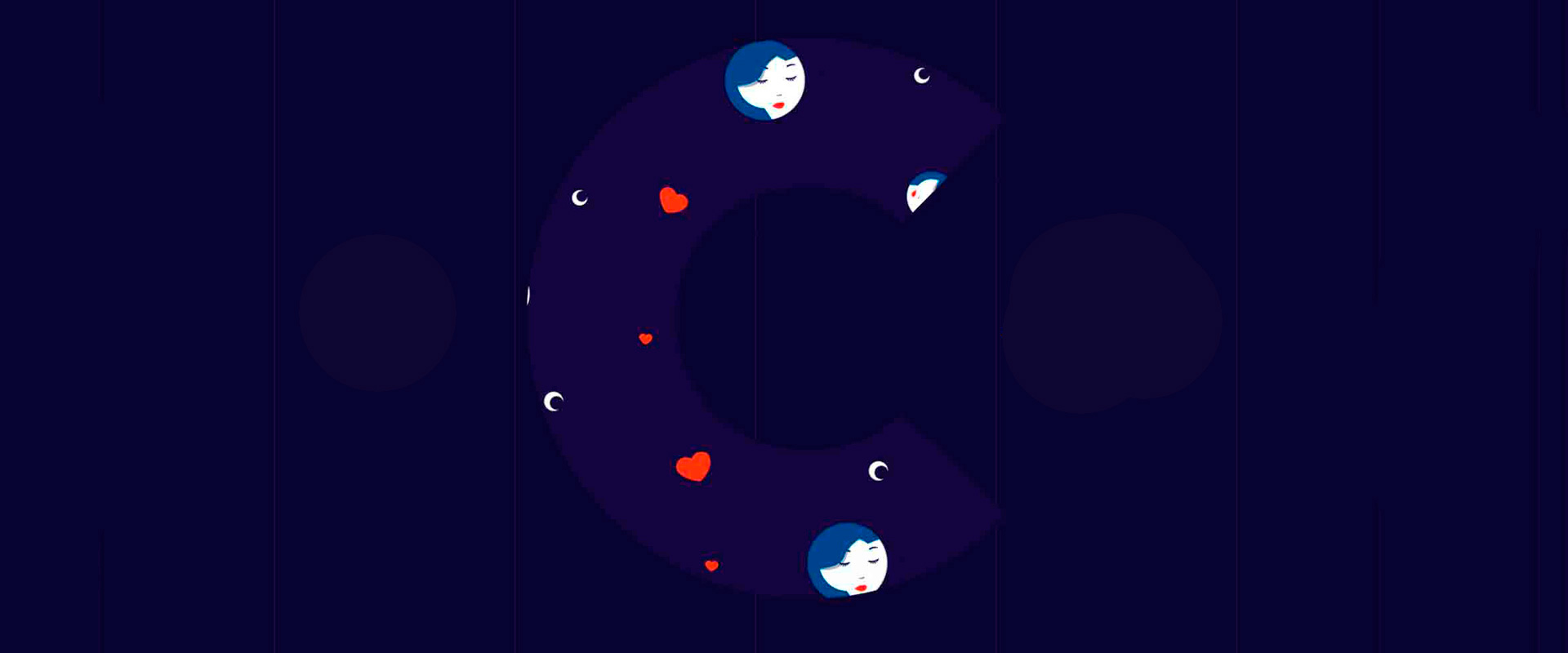
The most important thing when crafting a visually striking web platform is offering users a real experience and to achieve this wow effect, visitors must be encouraged to interact with the site. When laying the groundwork for the arts direction, Coraline first envisioned the “mask with the C", which would allow viewing projects and creating shortcuts to case studies. However, while working on the animations, Fabio had the idea to get rid of the generic slider-effect and make the navigation more playful and responsive, implementing a drag and drop interaction throughout the page. A parallax effect on mouse movement and an interactive shadow-effect makes the C appear organic and material, effects which help to promote an impression of infinity and depth. The basic premise is to make the visitor continuously ask themself, “am I seeing everything?” - and keep on dragging.
-
Dragging the homepage makes you surf all projects
Goal #2: Keep it simple
Since this project was meant to be Coraline's portfolio, the choice of content was fairly obvious - anything else would have been rather peculiar. Nevertheless, it was necessary to settle on two absolute essentials: site structure and user experience. We decided to adhere to a "keep it simple" approach.After considering a one-page structure – which, admittedly, has advantages such as smooth and fast navigation - we settled for a classic solution with a burger menu and three indexes; Home, About and Projects. As simple as that.Home throws the user into this drag and drop wow effect, which was the primary goal. The About page features a short description with highlighted keywords, allowing the user quick reading in order to identify essentials.
-
Highlighted keywords on “About” makes the zig-zag reading easier
These highlighted keywords are crucial aspects of the site’s art direction, as hinted by the Projects detail page.
We were aware that on websites such as this, most visitors aren’t particularly interested in reading texts or descriptions - they simply scroll randomly and glance through the visual elements. Highlighting keywords helps integrating descriptions with the content and the site’s graphical interface, giving them value and allowing users to determine what text stand for with a quick glance.While loading the page, we used this effect to create cool animations based on delayed keywords highlighting.
Goal #3: Icing on the cake - micro-interactions
As we’re sure most reading this are aware, micro-interactions have recently become the new pet-peeves of UI designers. One could say that micro-interactions are details which transform lame interactions to cool experiences. Throughout the project we kept the immortal words of American architect Charles Eames in mind:
The details are not the details. They make the design.
This project has been detail-oriented from design to code, always with the mindset of striving for perfection. While coding, Fabio brought added value to the project by designing microinteractions for every single interactive element. For example, have a look at the social networks’ hovers – an animated block sweeps smoothly over the icons. The burger menu and navigation position on the Projects scroll page also react to mouse-over.
The Previous and Next buttons on the Projects detail page also feature interactive behaviour. The small action bar is fixed on the screen’s bottom, but when the page is fully scrolled it changes appearance - extending across the whole page-width and alerting the visitors which case lies in either direction.
-
Previous/Next animation
The page transitions were also designed with a detail-oriented approach in mind. Each time the user switches page, a previously hidden red block appears - making transition between pages more interesting.
Transitions adapt their behaviour in accordance to which link has been clicked. For instance; when the burger menu opens, the red block appears from below, giving the impression that the menu is rising, and then vice versa when closed. On the Projects detail page - when navigating between cases - the transition appears from left or right according to selection, creating an orientation showing users which direction they’re headed in. Try it!
Goal #4: Case studies must be methodical
It could be argued that the most important element of a portfolio website is the way in which projects are presented, so we opted for a standardised structure.
Before breaking down the details of case studies, we’d like to talk a bit about the Projects list. Each case appears in full screen with a related image as background, instilling upon users the mood of the project itself. Scrolling up or down, the viewer can surf the projects’ preview – as suggested by the animated icons. Every change is perfectly adapted to the viewport, and maintains the same experience in all desktop and tablet devices.
-
Projects scrolling page
We’ve barely touched on responsiveness thus far, even if the website is obviously fully accessible from every imaginable device. At first glance, most desktop elements suggest their own responsive behaviour, but in the Projects list page we had to make an important decision; cutting off everything but the respective project’s featured image and title. We felt this bare-bones approach was necessary to allow full accessibility from mobile devices - we also added a “call to action” arrow in order to make it even more intuitive.
Technologies
- Frontend Frameworks and Libraries: SASS, Greensock TweenMax, Draggable and SplitText, FullPage.js
- Backend Technologies:Wordpress, Advanced Custom Fields, Autoptimize
- Tools: Photoshop, Sublime Text, Codekit
Company Info
Coraline Colasse is a French Art Director – she has some advertising experience but is mostly fond of UI/UX design. Driven by passion and curiosity, she seeks to learn and discover new things each and every day. Coraline is also a photographer and illustrator, and works for a digital agency in Paris.
Fabio Carretti is an award-winning Creative Developer based in Italy. When he’s not immersed in coding, he plays metal music on stages all across the world.