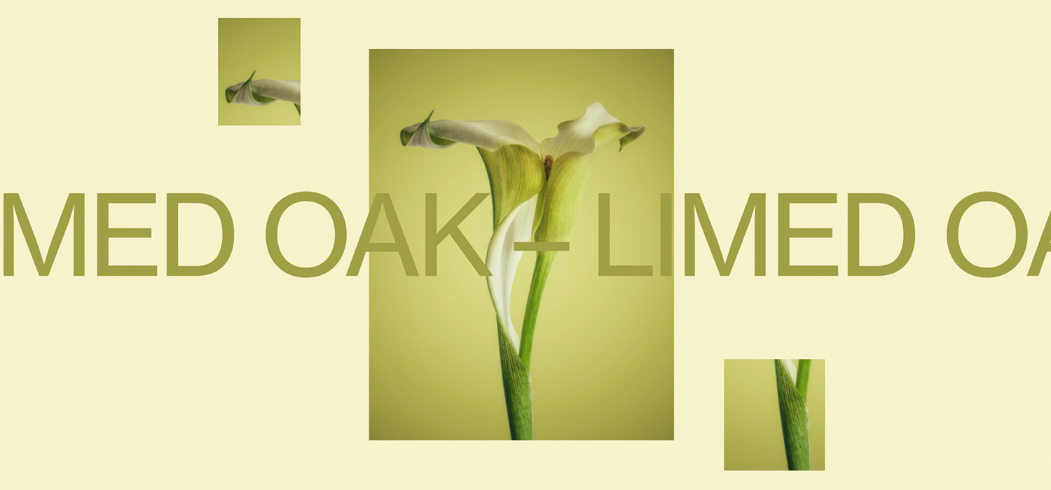
We have always had an intention to educate people. One day the Obys team decided to create an educational site with useful tips and examples. Last year we presented the project “Typography Principles” to the whole design world.
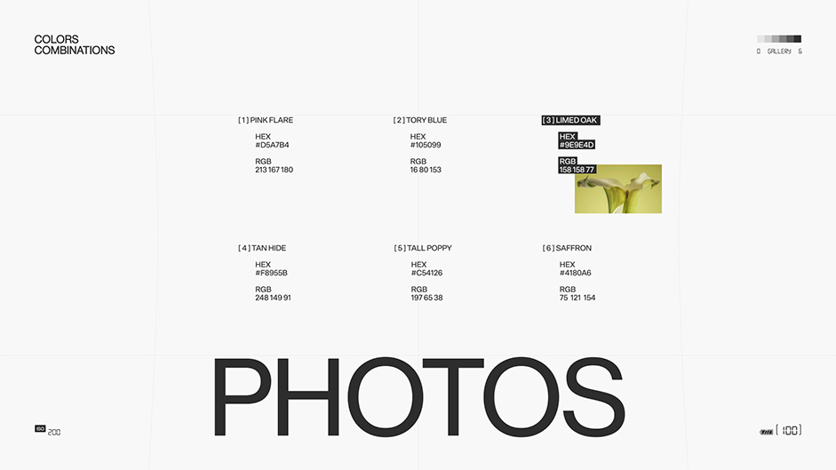
This site became super popular and received more than 200,000 views without any advertisements. We were inspired by the success of Typography Principles and started working on the second site – Colors Combinations. Here we combined six photos of different photographers and complemented them with color combinations.
The Main Idea
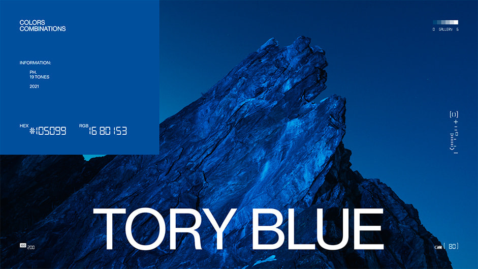
People often ask us: where do you look for inspiration for your projects? The answer is quite simple – in everyday life. Inspiration is hidden in people, in the beauty of nature, in architecture, in books and magazines, in posters and websites etc. And photographers are the people who try to catch and capture this beauty in photography. That’s why we always wanted to create a portfolio for one of these talents. This website became an illustration of how the photographer sees the world through their lens. The whole site is like a camera (it even has a battery!).
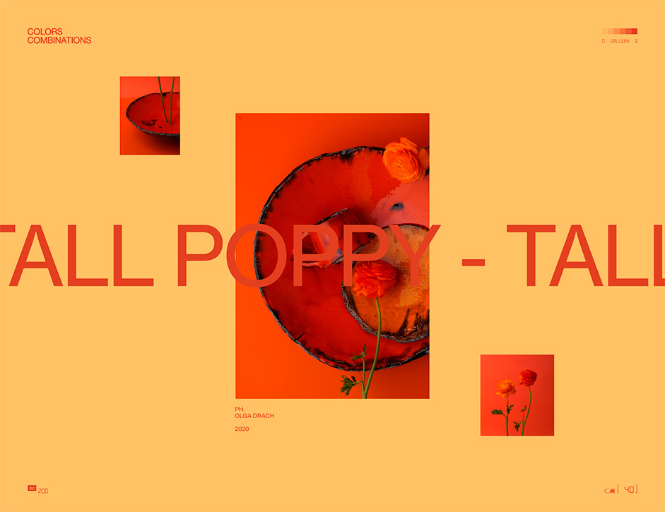
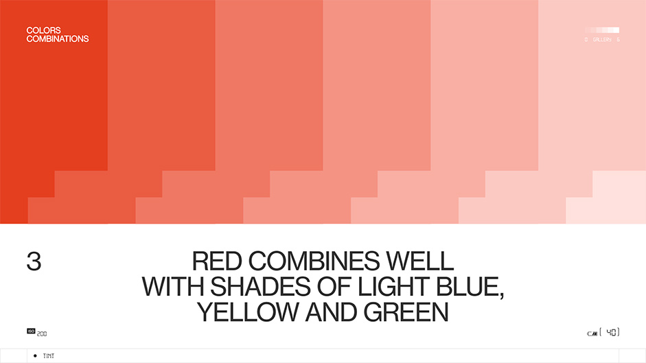
One interesting fact about the battery: while you scroll the site, it diminishes until the end when it becomes completely discharged. The main idea is not only how to find inspiration but also how to use it in the design process: how to combine colors and shades, how to find non-standard color combinations for the projects.
We wanted to create an educational site that was not boring, but with interesting storytelling and memorable features.
Colors Combinations turned out to be not only a good addition to the site about the principles of typography but also an independent educational website. It can be useful for all designers and people who try to find inspiration in their everyday routine. But also for junior designers and experienced ones who open new horizons and expand their own boundaries.
"Not boring" storytelling, and memorable features
Anyone who follows Obys agency, knows that we are the masters of storytelling. This is our strength and weakness at the same time. Here we tried to not create a site-portfolio but an educational project. The user must understand what this site is about, even without reading the texts.
Now let’s talk about colors. Why did we choose these six ones? We looked for cool photographers, took colors and combinations from them. We tried to find all the main colors and so that they were not similar to each other, and the pages change color when hovering over additional colors.
The second font is more technological and similar to the font that was used on old camera interfaces.
The fonts. The first one is regular sans serif. At first we wanted to use a serif font, but then the project became more fashionable. We needed it to be simple, technologically, since this site is like a camera, in which there is a gallery, a focus on the photo, settings, battery. It was necessary that the pieces of advice on the site were easy to read and so on. The second font is more technological and similar to the font that was used on old camera interfaces. On the site there is also a block where we show how light passes through a prism and diffuses into different colors. Have you noticed this feature? The menu on the site requires special attention. It is like a gallery with six photos and the color information on each of them.
Challenges
The biggest challenge was to find photos for the Colors Combinations project and get the photographers’ permission to use them. The photography had to meet our tastes and ideas for the design concept. We got a lot of refusals to use photos, because some of the photos were already used in magazines, some were part of advertising campaigns. Several photographers wanted us to pay to use their work every month. We changed the content, even once completely changed the concept because of the final photos. We are glad that there are a couple of works of Ukrainian photographers and even Ukrainian nature.
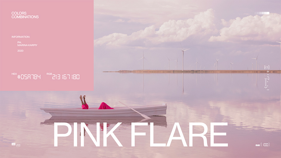
It was difficult to find photos and color combinations to make everything look cool and stylish, and to create unusual palettes.
Technologies
If you are familiar with Obys and our projects, then you know that we often use Readymag to create something wow and unusual. The designer can create a site without developer involvement. This time we used this tool again. The big challenge of its use is not to copy yourselves. Readymag has rather limited capabilities, and we often have to figure out how to achieve the desired effect in an unusual way. This process reminds us of different tricks that directors or cameramen use when shooting films: when, for example, instead of 3D graphics, they come up with techniques in which everything looks just as cool, but is implemented with available resources. But we like Readymag, because it presents a kind of challenge for us to create unusual animations, which is Obys signature style.
Company Info
Obys is Ukraine-based design agency that creates unique graphic and web experiences all around the world.
