A portfolio website, for creatives, is the window to new collaborators, clients, and opportunities from all over the world. This is the place where we communicate to possible clients what we do, how we do it, what sets us apart, and invite them to contact us…in just a couple of scrolls. Yep, no pressure. Frankly, your website is your greatest selling tool, so I’d say invest your time and money on it.
If done correctly, you’ll have an impressive ROI, but also, your portfolio website is the place where we can go all out with our design. Without client briefs and constraints, we have a white canvas to have FUN. Even though creating our brand and website is definitely challenging, it’s a very unique and creative process that every designer will enjoy.
Your website is your greatest selling tool, so I’d say invest your time and money on it.
As the Founder and Creative Director of Antara Studio, creating my own brand and website was a very introspective process. The quality of Antara’s website defines the quality of our approach with clients, so everything about it had to communicate how it is to work with us as a team.
Antara Studio’s landing page.
Desktop Design
Just like our branding process for clients, I defined Antara’s brand essence and concept first, then created a design around it. After giving it a lot of thought, I landed on the final concept: “where aesthetics and functionality meet”, as these two pillars are equally as important when creating a great design. Derived from this concept came the two gradient blob figures on the landing page. One representing aesthetics and the other one functionality. These then became important design elements throughout the entire site.
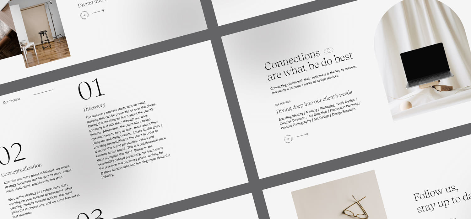
Since we don’t only offer digital services, our website is designed in an editorial format, and my choice of editorial typography plays an important role. I experimented with large and tiny type sizes to keep the flow interesting and digestible, as it is pretty loaded with lengthy texts. Something I love about editorial websites is how they can “break the rules” of classic web design. The small-sized texts become a decorative design element or figure, almost like an illustration.
Something I love about editorial websites is how they can “break the rules” of classic web design.
I chose monochromatic colors because I wanted our work to be in the spotlight, and adding a bright color palette could compete with our portfolio’s hierarchy. As the visuals started to take shape, the wow-effect didn’t really come in until Mario Maselli, the amazing creative developer I partnered with, gave the designs a true spin. Many of the design decisions were taken collaboratively with Mario. The smooth yet edgy typographic animations gave the site the elegant and bold personality found in Antara Studio’s work.
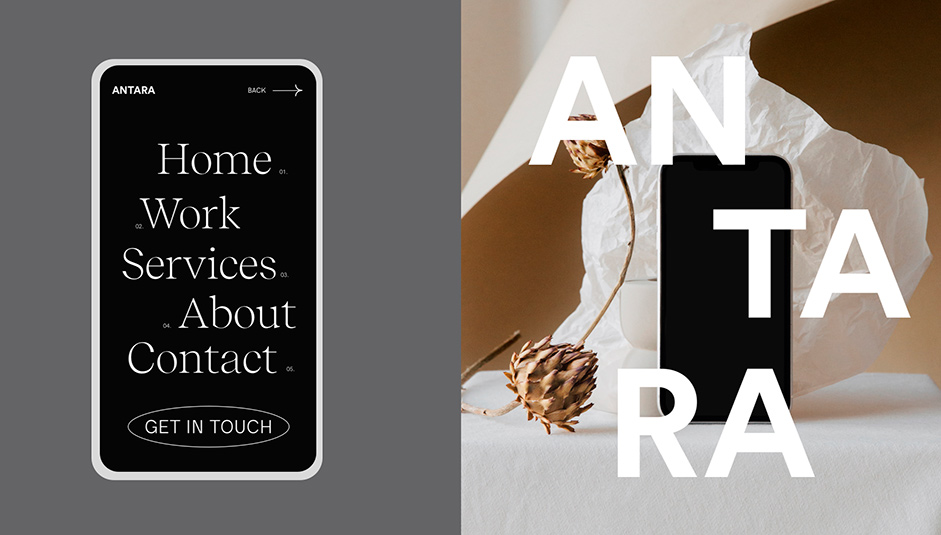
Mobile Design
Designing Antara Studio’s site in mobile form was challenging because the lengthy texts can make the scrolling times longer. In this case, we made sure to play with animations and typography in a way that the reader wouldn’t get bored.
Mobile web design.
Takeaways:
These are the key takeaways to make a website that attracts global opportunities:
- Define the most important message you want to communicate and then communicate it in a very memorable way. This can be your value proposition or just something that makes you stand out from the rest.
- Define your style and personality with your dream client in mind. Design elements like typography, color, and photo selection will communicate your brand’s personality and resonate with the viewer.
- Create a layout that highlights your work and that goes in line with your work style.
- The “wow-effect” comes from the animations you chose to apply to your design, so partner with a great creative developer to help you create animations that resonate with your personality and design style.
- Your website communicates who you are in just a few scrolls, and if you communicate quality and trust, chances are more people will hit that contact button.
Technologies
All decisions on the development of the site were made by the amazing creative developer Mario Maselli
JS Libraries
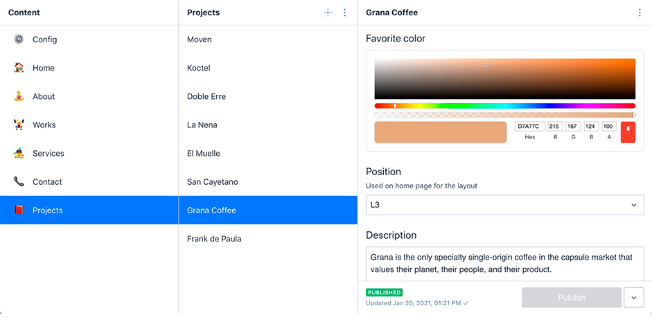
Content
Mario built this site with the help of 11ty, so we are actually generating a static site. It should be really fast (fingers crossed). He used only Javascript (no frameworks) and made use of some libraries that made it possible to achieve smooth page transitions and scroll animations.
Animations
To create animations, Mario used Highway js + Gsap to handle all the page transitions and animations. The page transition is just a simple Fade in/out combined with Gsap Split text animation that gives a smooth feeling throughout the site. Three.js was used in two different places, the first being the works section on the Homepage which is a vertex shader that is attached to the mouse movement to achieve a bending type of animation. The second is the gradient blobs that are just a fragment shader inside a circle.
Content
The content is managed by Sanity a free and Open Source CMS powered by React. It's very powerful and it has the ability to customize almost anything that you want. The only limitation that we found out later is that when you win an Awwwards the amount of traffic to the site is huge and the bandwidth from the free plan ran out. But they have a nice option to pay for the extra bandwidth that you use (so not a big problem).
After generating the Schemas and data structure with Sanity, we created the templates with the help of 11ty. Eleventy is a static generator so when hooked with the data from Sanity it generates static HTML from each page/post from the site.
So how do you put everything together? This is where Netlify comes to the rescue. Sanity has a hook that triggers every time that you make an update to the site. The hook is triggered on Netlify and runs the build (it can take a minute or two), which puts everything together and serves all the static pages and assets.
Mario really loved this setup. It’s simple, fast and it lets you focus on the right things. We would totally recommend it for projects that don’t need a big amount of modules/components.
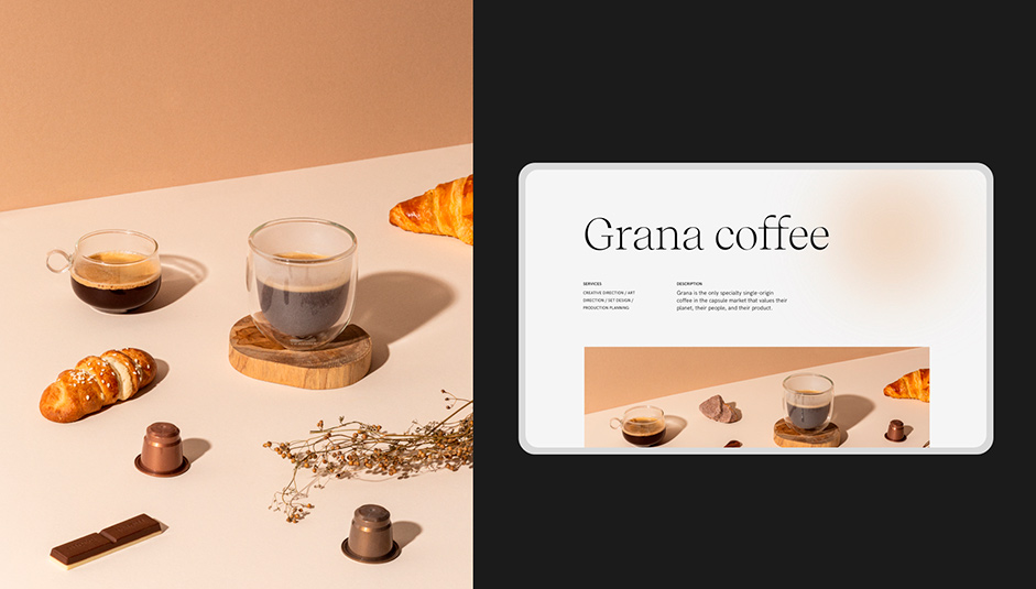
Mario’s selection of animations gave the visuals more life. The Projects page introduces each project with a lot of movement in a smooth and elegant way.
Company Info
Antara is a graphic design studio based in Guatemala specializing in brand identity, packaging, and web design. Only a year after being founded by Isabel Mendez, Antara Studio has been mentioned and awarded by some of the most prestigious international awards, striving to put Guatemala in the spotlight for its amazing and underexposed design talent.