Jan 24, 2022
20 Years of Xbox Museum by Active Theory Wins Site of The Month December 2021
Wrapping up last year on a high, 20 Years of Xbox Museum by Active Theory has won Site of the Month December 2021. Thanks to everyone who voted, the winner of free year in our Design Directory is at the end of the article, big thanks to Active Theory for sharing this case study on the "making of" the website.
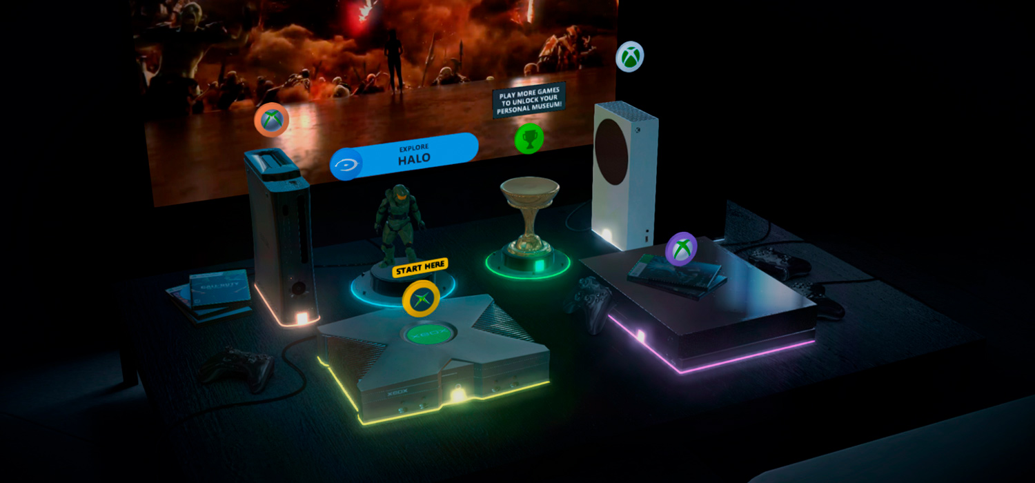
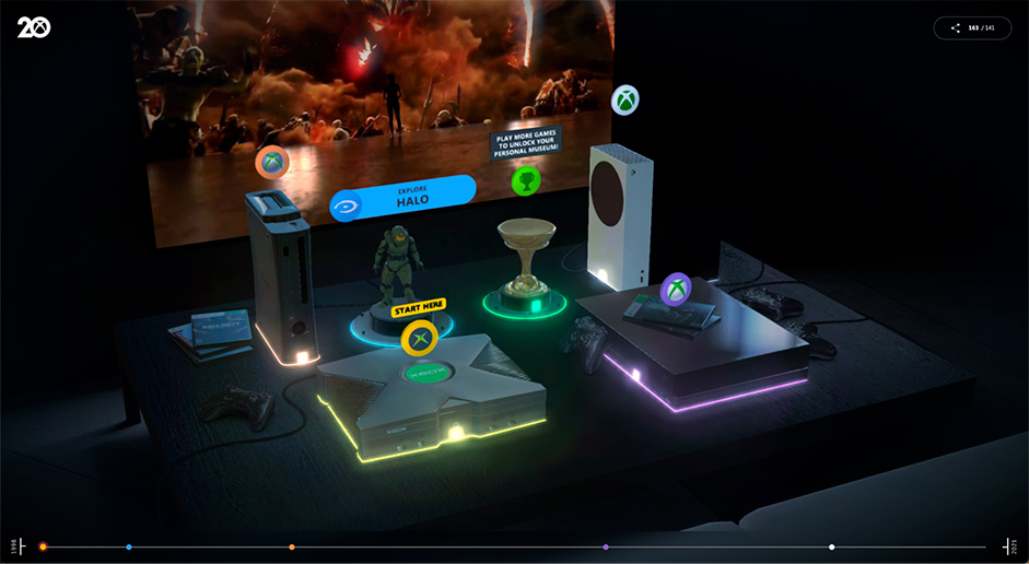
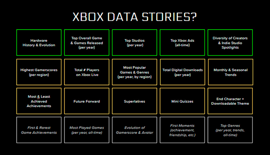
The 20 Years of Xbox Museum is an immersive microverse featuring six custom 3D environments. In the experience, users can explore together with realtime avatars, learn about the history of Xbox and generate their own personal museum using Xbox account data.
In March 2021, we connected with the Microsoft team to be briefed on an exciting new digital experience to celebrate the 20th anniversary of Xbox. This kickstarted months of experimentation and the eventual launch of the 20 Years of Xbox Museum in November.
Case Study Video
Originally the brief was laid out to achieve two main goals; 1) showcase the history of Xbox as a franchise through an honest, nostalgic lens and 2) give users individual data stories to relive their Xbox journey over the past 20 years.
We started by running parallel working streams around creative concepting and UX, as well as exploring data story solutions (a process we’re familiar with through working with Spotify on their Wrapped campaigns over the past five years).
From Humble Beginnings
The experience was targeted towards both existing and future Xbox fans. This meant providing a user journey that was not only deep and meaningful to the faithful, but keeping things light enough for anyone to jump in and have an enjoyable experience.
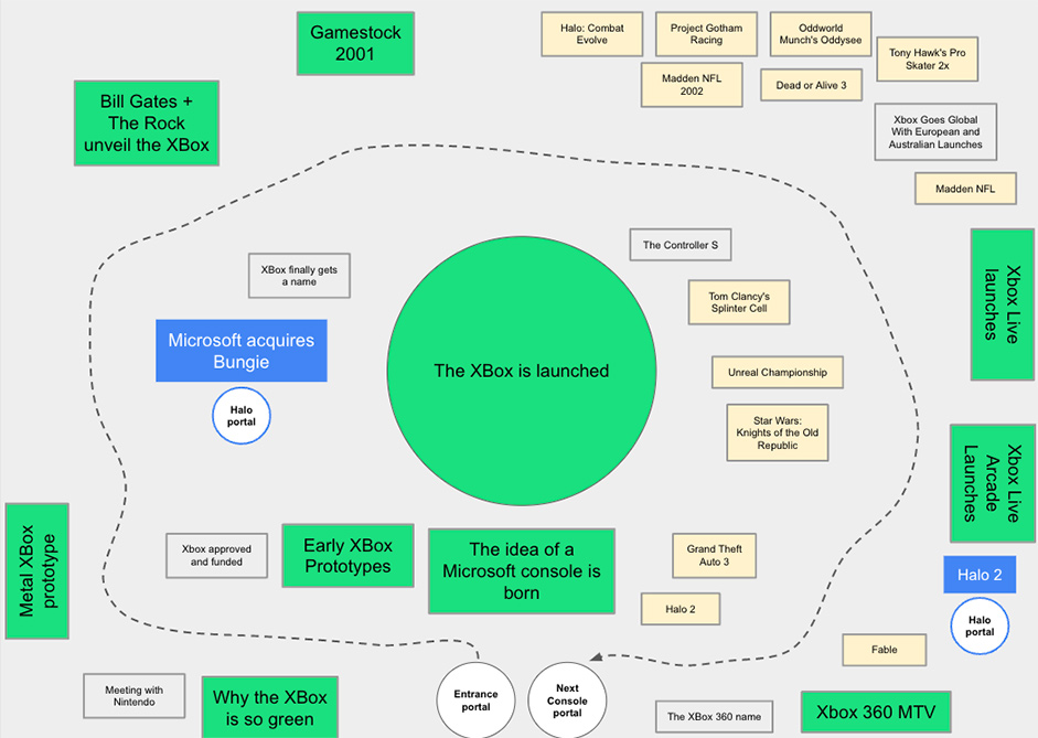
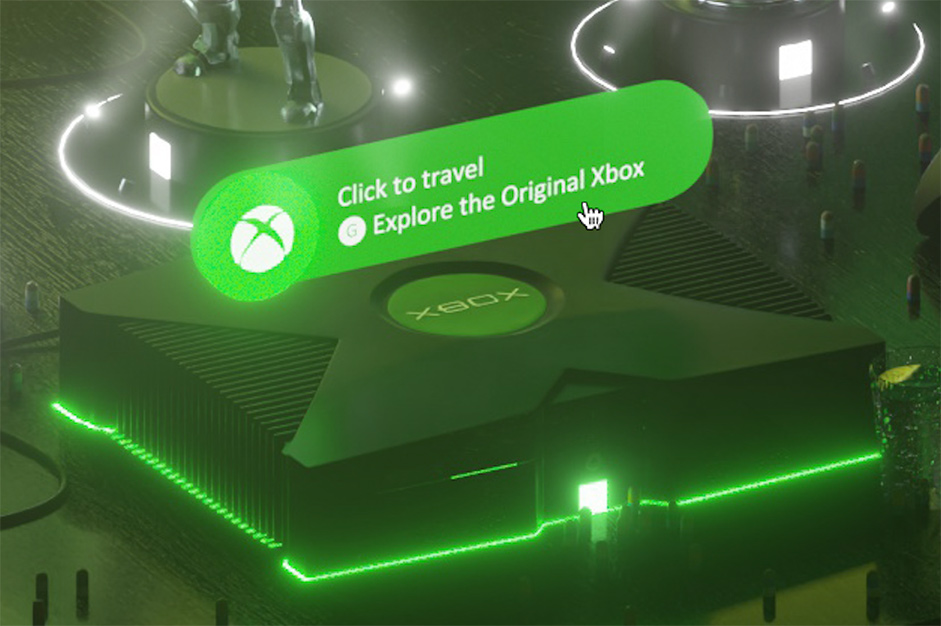
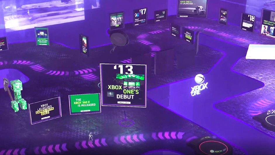
Our suggested creative wrapper was to use the different generations of consoles as content pillars and to structure the experience around these. This meant having the Original Xbox, Xbox 360, Xbox One and Xbox Series X as 4 key categories to ideate around. Initial concepts explored how we could use the UI styles, graphical capabilities and physical consoles themselves (more on this later) as creative elements to play with throughout.
Early explorations started with an explorable 2D timeline. While the UX made sense, this proved creatively limiting. As each Xbox generation has a mass of content and fandom, we wanted to explore ways of giving fans a truly immersive experience that felt appropriate for the anniversary occasion.
Introducing Dreamwave
Over the past two years, one of our biggest work streams at Active Theory has been the launch of our immersive events platform, Dreamwave. Dreamwave is a portfolio of work including online events and microverses designed as connected digital spaces for communities to gather, celebrate and learn.
With the success of microverses like the Secret Sky Music Festival (which took place in April 2021), we introduced Xbox to the idea of creating a microverse of connected, explorable 3D environments. Through Dreamwave technology, we would be able to easily lay the foundations for an immersive 3D museum that would take users through the different generations of Xbox and even include a generative personalized museum based on Xbox account data.
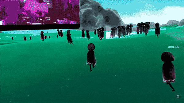
Dreamwave hosts connected, digital spaces for communities. Secret Sky (left) and Sundance Film Festival (right)
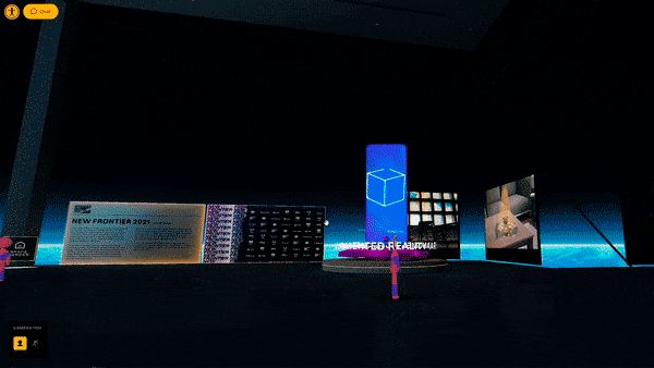
Creating an Immersive World: Foundations
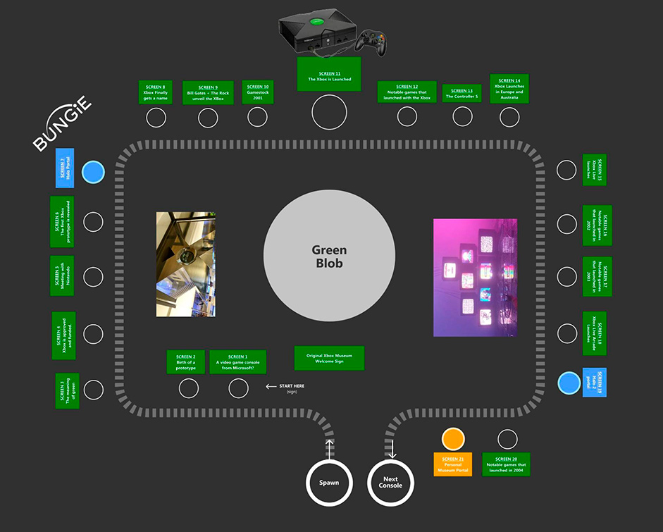
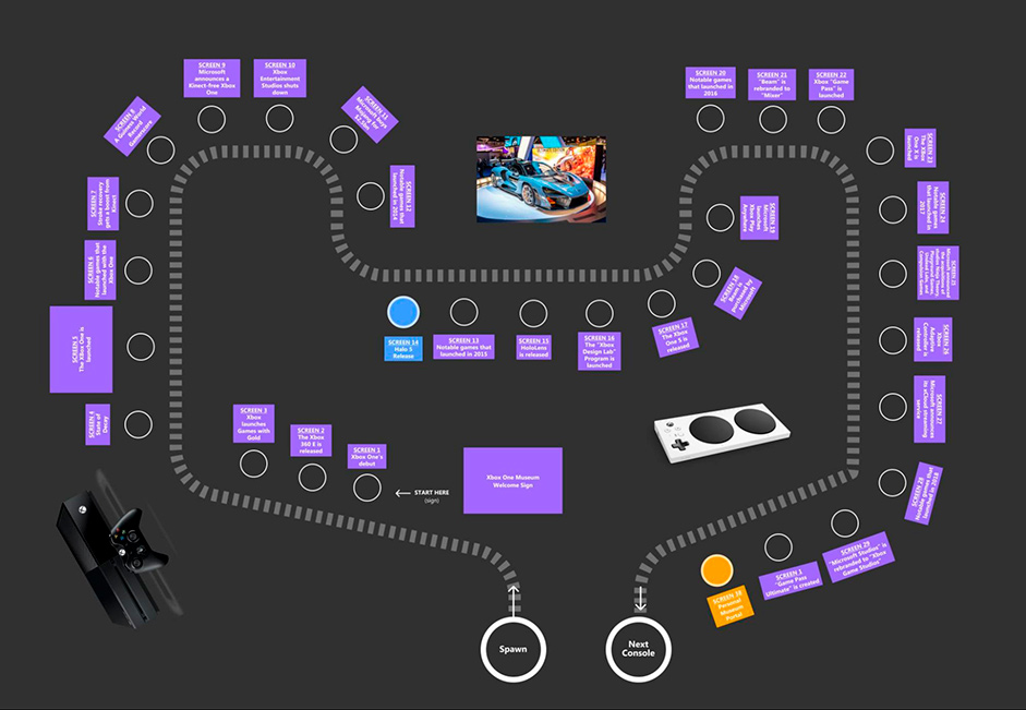
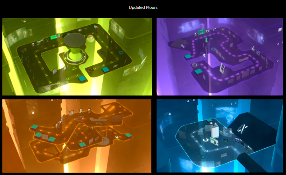
The concepting stages for a Dreamwave build involve mapping out the physical space and determining an overall environment aesthetic. For the Xbox Museum, our initial plan was to have users enter each console and view content while situated physically inside the hardware. This meant creating floor layouts for each of the 4 consoles, as well as an additional Halo museum and the personalized, generative museum - making six in total.
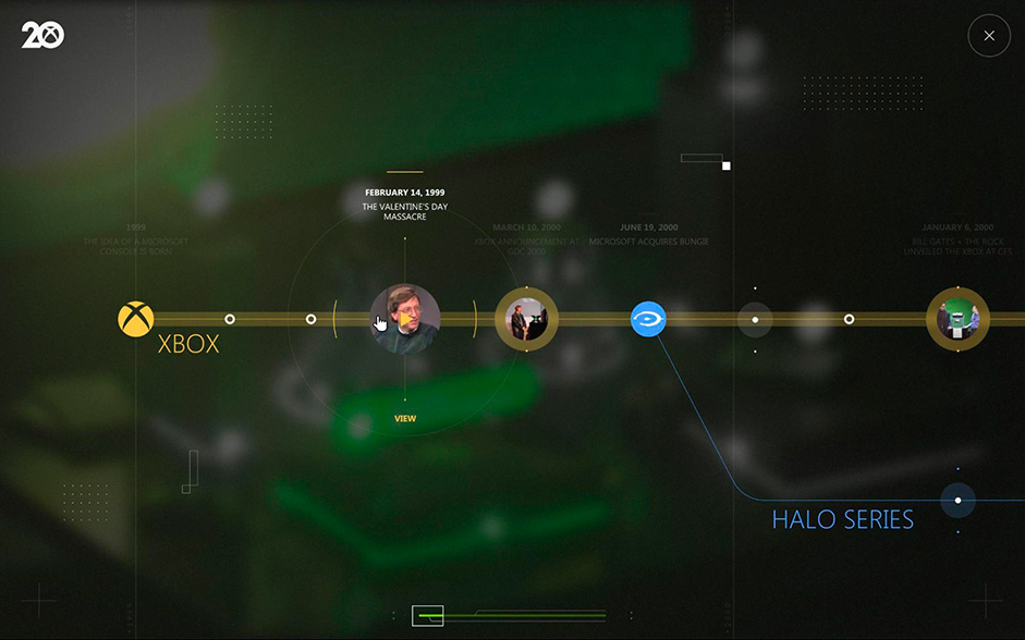
While we were making good progress, we were also mindful not to completely abandon the original concept - a 2D timeline. This led to a divergence in UX that would allow fans to either explore the 3D space as an avatar, or simply select different content points with regular web UI.
The 3D environment itself was the hero piece, but by selecting into the 2D UI, users could visualize how the Xbox story unfolds over time, as well as quickly jump between content.
Content research
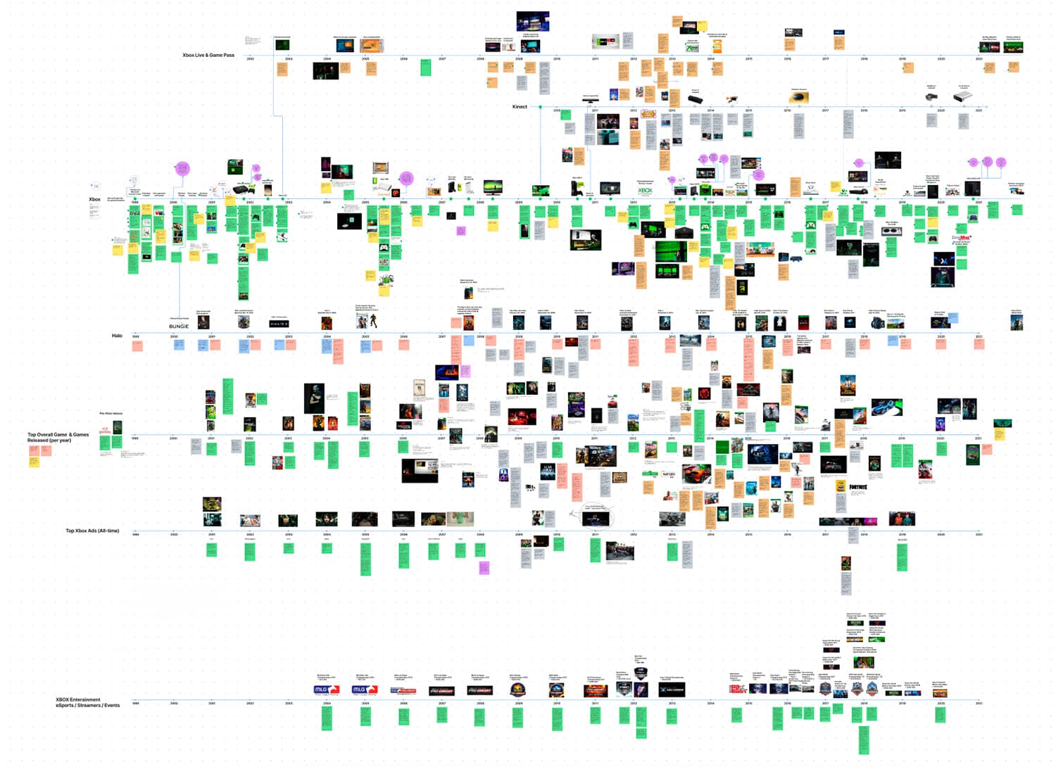
An immense amount of content was on display in the museum. To help provide recommendations on how to curate the galleries, we undertook a huge collaborative effort with the Xbox team diving into historic content over the year.
We laid this out in a series of FigJam boards.
An avatar is born
For users navigating 3D spaces in Dreamwave builds, we often use controllable avatars. This made even more sense for Xbox, given the gaming audience who are typically familiar with ‘WASD’ movement on a keyboard, or joystick movement on a phone.
For the designs, we decided to keep the avatars as simplified humanoid characters (paying particular attention to making them fairly androgynous). These went through a few iterations as we explored different colors, outfits, and accessories.
In a nod to a popular series at the time of launch (Squid Game), we were even inspired to use the classic controller buttons of X, Y, A and B as character modifications. Each user was randomly assigned a letter on load and had the ability to change their style through an customization panel.
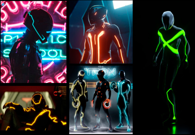
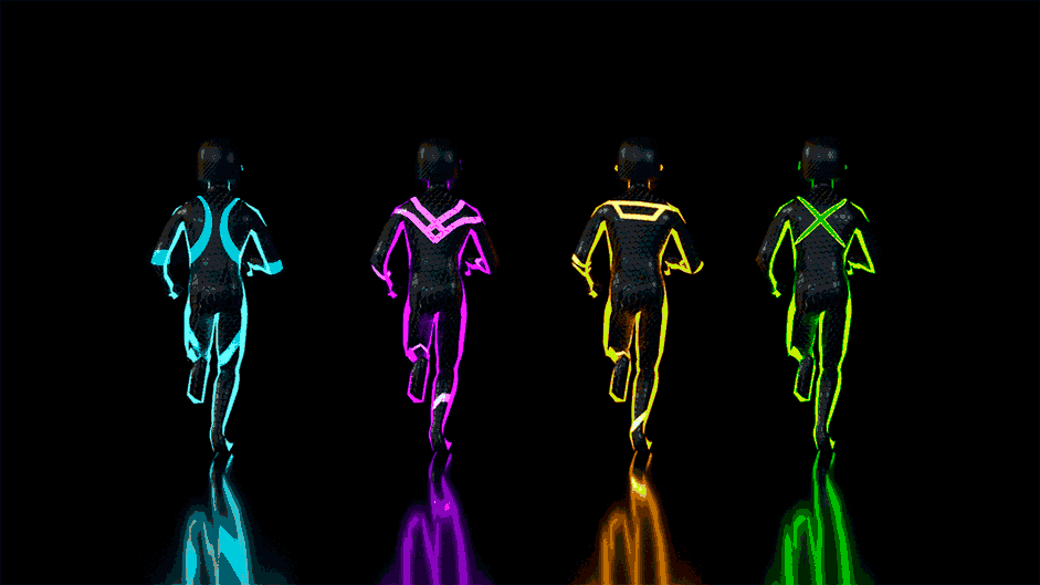
Evolutions of the avatars from references (top left) to production build (bottom)
Improve the floor plan
With avatar iteration, content sourcing and data exploration well underway, we began to develop the floor plans and look and feel into an early build.
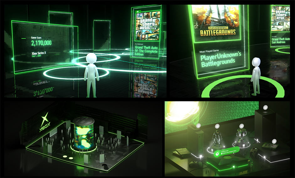
For each of the six galleries (Original Xbox, Xbox 360, Xbox One, Xbox Series X, Halo, Personalized), we developed detailed floor plans that laid out how users would explore. In doing this we kept in mind some learnings from previous gallery builds we’ve created with Dreamwave such as at Sundance Film Festival.
In terms of laying out content, we knew that users typically wander down one side of a room. Unlike a real, physical gallery, in which people wander round an entire room and look behind them, in digital galleries users are much more likely to move sideways along a single wall. With this in mind we tactically positioned content along alternating walls to guide users.
Content was displayed side-by-side to make it easy for users to browse
We also played with prototypes of content turning on and off when users approached the screens. This felt slow and cumbersome when trying to switch between different pieces of content quickly and we eventually moved away from this.
Originally content would appear as users approached This was later changed
We also set up directional arrows on the floors, leading users around the space (and up and down multiple levels in some galleries). These floor plans contained portals placed throughout the environment to encourage users to move on to other 3D spaces to explore.
Finally, to decorate the floor plan with more than simple static content on wall panels, we placed different 3D objects in each gallery to add some variety to the experience.
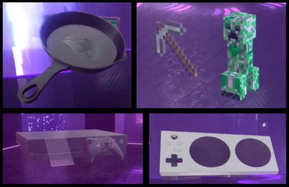
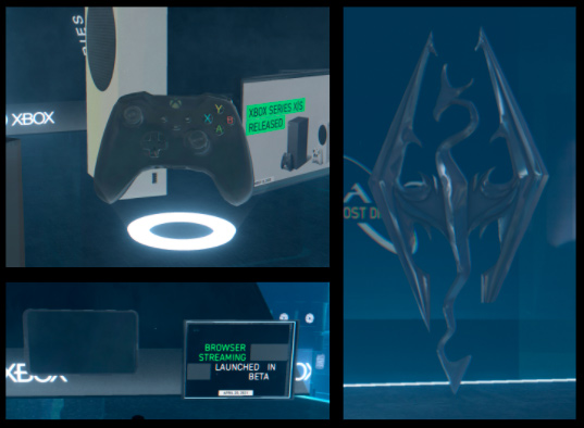
3D elements were on display throughout the galleries
Creating a sense of scale
The initial concept for the museum was to take users into each piece of hardware, with the gallery of each existing inside the console. While this remained the concept throughout early ideation, when we created this in the build, we found it to feel cramped and claustrophobic.
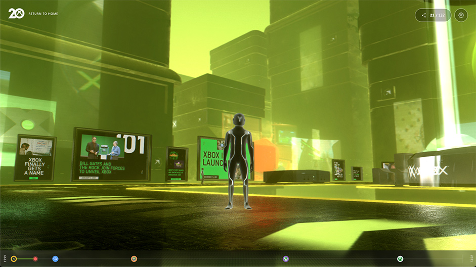
This shift coincided with a change in art direction to go beyond the classic black and green of Xbox. To improve this, we shifted to a concept on the other end of scale: an expansive city with a more varied color palette.
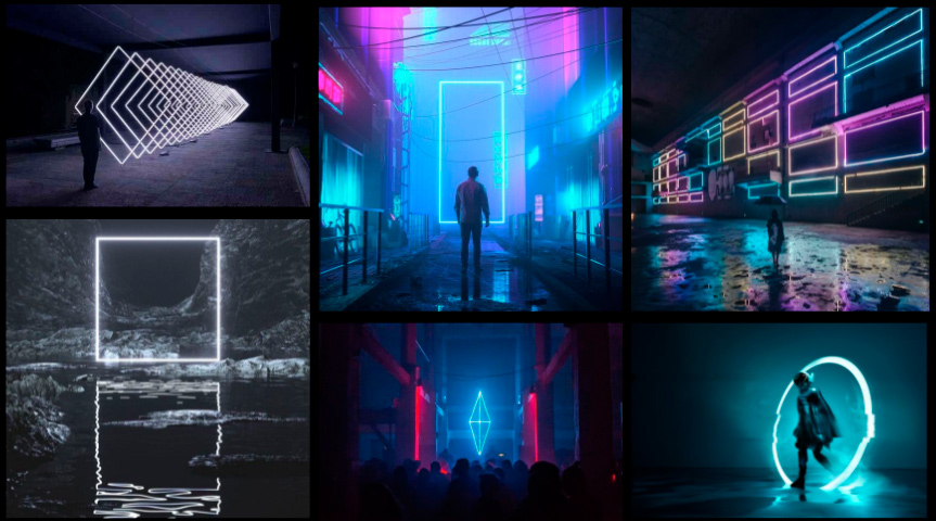
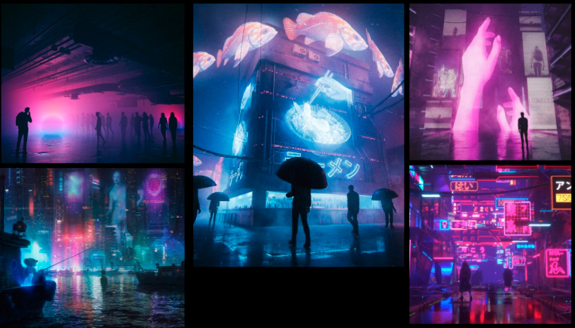
Early city moodboards featuring neon lights, holograms and volumetric fog
For users in the experience, the city is merely the backdrop environment surrounding the galleries. To create this effect in a convincing way, we situated the museum galleries inside a much larger 3D city space. As the user can only explore the gallery grounds, the actual size of this floor plan relative to the city space isn’t important, but stepping back we can get a sense of how big the surrounding city is relative to the museum.

Tapping into nostalgia
Another objective of the build that tied into the overarching anniversary campaign was tapping into user nostalgia. We aimed to do this with both the visual direction and the content.
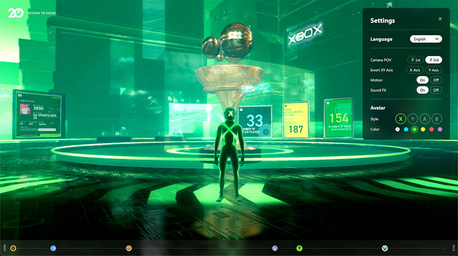
This takes place immediately on the landing screen, as the menu for the museum experience isn’t actually in a 3D world, but a nostalgic living room featuring all the consoles laid out in front of a television screen. The room is also detailed with controllers, wires and stacks of games.
The content itself was also selected to trigger memories. An exciting aspect of this was how open and honest Microsoft was willing to be in their retelling of the ups and downs over the last 20 years. While there are natural highs with some of the massive sales numbers and games, franchise struggles such as the red ring of death were also on display throughout the experience.

Users approach and select into content for deeper dives
Halo Gallery Iterations
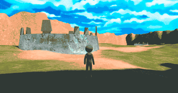
While there were 4 major galleries for each generation, we wanted to give special treatment to one of Xbox’s biggest franchises: Halo. This was identified at an early stage, with the initial Halo gallery environment based on ‘Blood Gulch’, a significant multiplayer map from the franchise.
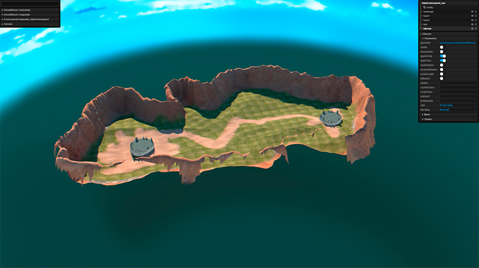
As the art direction of the overall project evolved, we flipped Blood Gulch into a night-mode scene to make it fit the rest of the museum. This iteration continued to not quite hit the mark for us as the neons and content didn’t really match the natural surrounding environment.
WIP of the Blood Gulch map when we took it into night mode
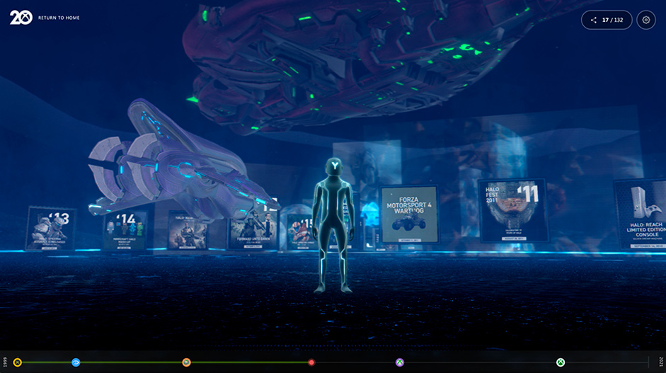
The final version of the Halo gallery ended up moving away from Blood Gulch, and instead focused on bringing other elements of Halo into the premium gallery space (as opposed to making the gallery space itself inherently Halo). This included a Master Chief statue (the series protagonist), a floating spaceship and various smaller 3D models.
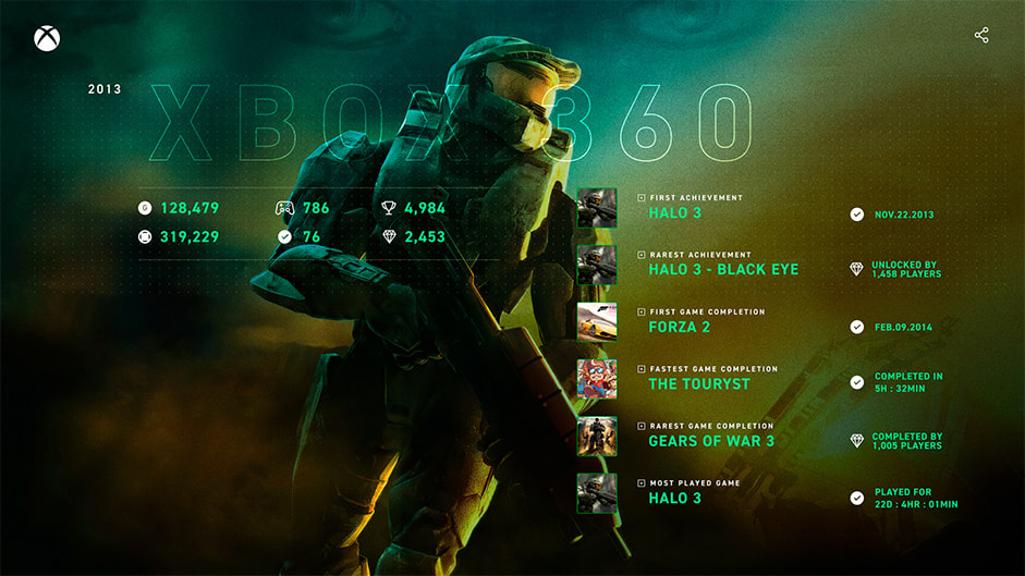
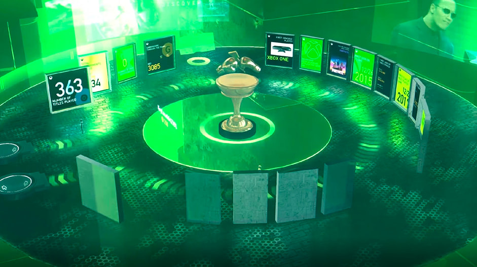
The Personalized Museum
Going back to the original brief, one of the two main objectives was to give users an individual data story to relive their Xbox journey over the past 20 years.
Similar to the galleries themselves, this involved determining the content (although in this instance the content would be dynamically displayed based on an API pulling data from Microsoft accounts) and creating the space.
With data stories, it’s often a chicken-egg approach. We want to know which data points we can use to determine the creative, and the data team wants to know which data points to build into their API for our creative. The solution was an iterative approach in which we gradually built out the creative, suggesting data points, and the Microsoft team worked with us to confirm data availability.
The personalized gallery itself was a simple layout. As users’ content would differ and we wanted to have the focus on the content (not a curated floor layout), we kept the plan to a simple circular arena in true-to-brand Xbox colors.
Go Live and Reactions
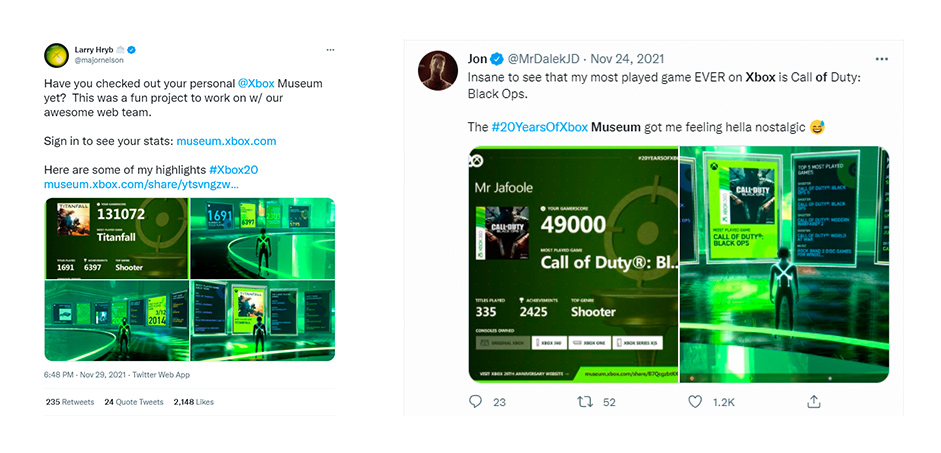
Lining up with other 20 Years Anniversary celebrations, the site went live in November 2021 and was immediately picked up on social media and in the press. Twitch streamers invited fans into their personal museum to hang out (using the shareable web link) and thousands of fans logged in to learn about their Xbox story.
Final Words
The 20 Years of Xbox Museum embodies so many of the reasons we love to build creative experiences on the web. It’s accessible. It’s shareable. It’s easy to use. It’s fun.
Thank you to everyone at Microsoft and Xbox for bringing this idea to life with us and hopefully see you all with more in the future.
The 20 Years of Xbox Museum is available at https://museum.xbox.com/.
Thanks for all the votes - the winner of the free Pro Plan is ceeed_g please DM us on Twitter to collect your prize!