


…People will forget what you said, people will forget what you did, but people will never forget how you made them feel.
This gem of a quote comes from a brave visionary named Maya Angelou and perfectly summarizes the essence and significance of UX.
In the past, The Man needed to be convinced of UX design’s importance (not anymore: just direct them to conversion rate optimization, a system devised solely to increase profits using UX as a tool). But the challenge is still here: the part where we apply UX design to receive actual, tangible profit via conversion rates: better leads, higher sales, more sign-ups, etc…
So, the real question remains: How to create an experience that drives visitors to convert?
Note: This post is written with the assumption that UX design is everyone’s job: designer, copy writer, developer, marketer... Good experience is in no way limited to prototyping interfaces and research.
Here are some tips you can benefit from:
Love at First Sight is Real
No-one appreciates tardiness, so the first step is to make your page load fast for a good first impression.
Love at first sight means that users will form split-second decisions about staying/not staying on your page based on their very first look at it. That’s why above-the-fold space is the most valuable real-estate on a page.
It’s irrelevant how you design it: Larger-than-life images, background videos, animations or more. Use every trick in the book to do one thing: Encourage Scrolling.
Scrolling is an action that users take. Before you encourage a click on the CTA, you need to encourage scrolling by enticing visitors to know more about the product/service/offer. This can be done with visual cues (downward pointing arrows, top half of a full image, etc.) and compelling content (concise intro that introduces the product).
Also: avoid information overload.
Know that CTA placement above-the-fold has no bearing on conversion rate. It’s not about hiding/displaying the button, but giving visitors the option to convert when they are ready.
Remember: The trouble isn’t getting attention. The visitor is already on your page, it’s safe to say he/she is paying attention (for a very short amount of time). You need to increase that duration and compel them to delve deeper.
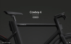
Here are some great examples of compelling above-the-fold designs:
The Girl (or the Guy) Next Door Look
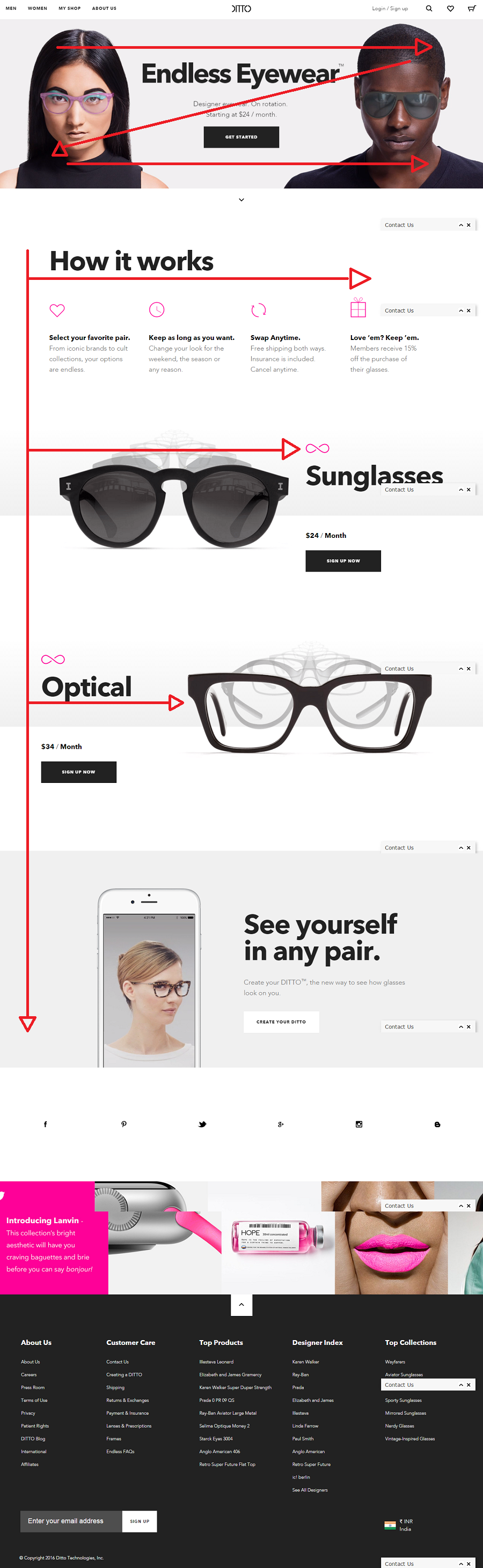
There’s an upside to looking like everyone else. Simple and familiar designs are perceived as more beautiful.
The designs that actually help conversions are designs that don’t distract visitors. If people are spending more time working out what your navigation-hub icons mean than actually scrolling through the page and clicking that CTA, you have done your job poorly.
Ever wondered why our eyes move to the top left area of the screen when we are looking for navigation? Why we click/tap on colored text? Why we are more comfortable scrolling down than sideways?
It’s called the mere-exposure effect, aka familiarity bias. Essentially, we prefer things we are familiar with. Since it’s fatally optimistic to assume anyone has the time to spend familiarizing themselves with your landing page interface, you can use the elements web users are already familiar with.
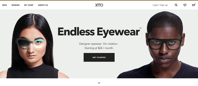
Let’s break up the example from Ditto. Here’s the entire page:
Now check out the pages for iPad Pro, Verisign’s .name Domains, Google France’s Moteur de Réussites Françaises. Notice the general layouts of all these websites.
The magic lies in details and how you use them. There’s nothing ‘creative’ about the wireframe itself.The general layout of your site should ultimately be clean and logical, coupled with visual breaks (like flipping image-and-content left to right) to keep monotony at bay.
TL;DR Is the Rule, not the Exception
First, to all designers and developers reading this: do not treat text as “fillers”.
Okay. Now answer this: How carefully do you read the Terms and Conditions or a Privacy Policy before installing a software/game?
Exactly. No one reads huge blocks of text (well, lawyers do, but they get paid to do that).
We are a generation of skimmers: we scan through a page on the internet until something catches our eye and makes us stop and pay attention. High-res visuals and brilliantly colored animations are more likely to do that than words, but also keep in mind that users are scrolling through a landing page looking for information.
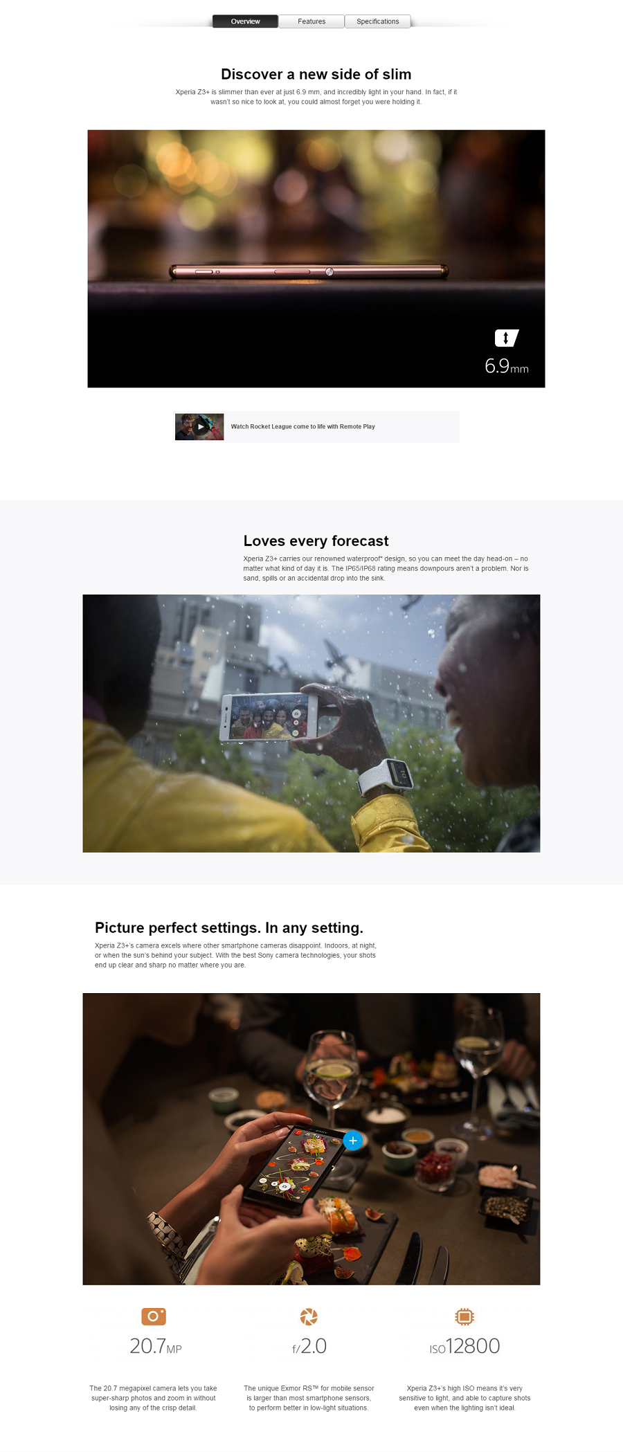
Take Sony Xperia’s landing page for instance.
Now compare it with the quick specs section at the bottom:
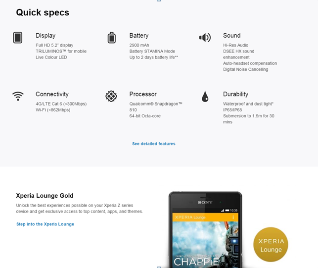
The huge images look great, sure. But the only texts that serious customers will pay attention to are the features’ headings and the quick specs at the very bottom of the overview page.
Solution: Maintain a balance between text and visuals. Remember that more images will distract from actual information, and consumers are more likely to buy things that actually have some value attached to attractiveness.
- Brevity: Break large bodies of text into manageable chunks of info. This means tightly worded sentences of 10-12 words (max.). Large walls of text immediately trigger the “TL; DR” response.
- KISS: This is a cliché for good reason; your landing page isn’t the place to wax poetic about your offers in pompous words (more on that in a moment).
- Use Formatting to highlight important words. In a sea of ordinary text, words that are bold will attract attention.
Down with Corporate Obfuscation!
Dear copywriters,
If your content hides more than it shows, you have done your job poorly.
Do not assume readers are morons. Phrases and claims like “Our quality personified solutions give you returns much higher than you envisage in the initial phase” may look smart, but if you can’t say that in a simpler way and back that up with proof (actual testimonials and case studies), you are just shouting at a wall.
Introduce your product/service/offer clearly and precisely in a language anyone can understand without second glance. This isn’t dumbing down, this is breaking corporate obfuscation.
Form Length is a Myth
I am not dipping my toe in the raging debate over form length. While there’s plenty of research showing short forms convert better, this also means that you are getting poor quality leads. Like everything else, form length depends on the context. Free sign up forms should be short (Twitter, Firefox), while customers filling insurance forms online will feel differently.
My point is: People will go to any lengths to get a product/service they really want or need, and that includes filling a form. Your leads are only as good as the information you have about them. If your product is desirable enough, people will fill that form.
This doesn’t mean you shouldn’t optimize your form and make the form-filling process comfortable/interesting for users on all devices.
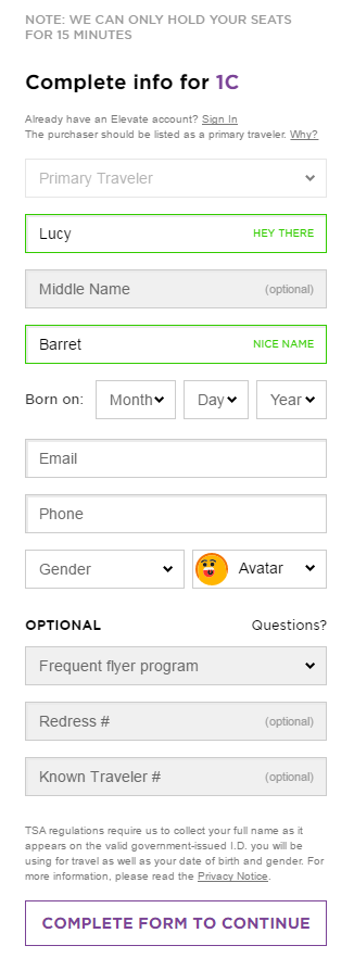
Personally, I am a big fan of Virgin America’s entire flight booking process, made simple thanks to radio buttons, clickable options, lots of whitespace, etc. It’s also interesting, thanks to conversational language. Just look at this beauty:
Remember one rule: Make sure you are making the form filling process comfortable.
Tip: Include the form when your ‘ideal user’s journey’ has made him/her ready for conversion. Don’t just blandly throw the form at everyone at first glance.
Tablet-first Design
Tablet-first is a relatively new design concept. From conversion rate optimization perspective, it’s sure to rock it to the top of the best-practices list.
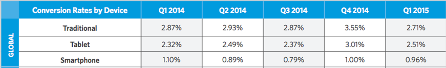
The Reason: Conversion rates on desktops and tablets are comparable, but dismal on mobile.
This is because despite its almost universal usage, mobile still feels like an unsafe device to make payments or give away personal information to a majority of people. It’s a mental block.
That doesn’t mean you should ignore mobile users. A large chunk of your audience is still using mobile to look up information. Tip: Instead of wasting too much time and resources completely stripping down your message to essentials, you can use dynamic serving to give a mobile-optimized landing page to your mobile users.
It’s a Ferris Wheel, not a Roller Coaster
Just remember that Good experience carries on after the user clicks on the CTA. Do not forget post conversion experience.
Saying thank you is good etiquette. But post conversion is also the ideal time to encourage engagement for a long-term relationship (listen close, B2B providers).
Tip: Show recommendations for products/services (recall Amazon). Offer freebies to show your appreciation. Encourage referrals, social shares, etc. (any one thing at a time, though. Don’t overwhelm).
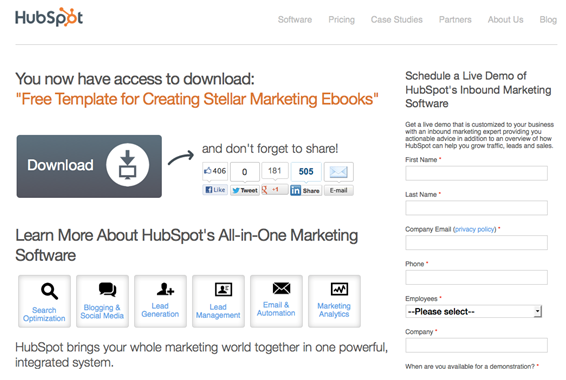
Here’s my all time favorite post-conversion message:
Last Bit of Advice
Drop the assumption that there are any best practices or that they are applicable to everyone. Take every bit of advice given here by me (or anywhere else by anyone else) with a grain of salt. Learn, implement, test, and debunk them.
It’s the scientific method of improvement.
Author Bio: Lucy Barret is a Sr. developer at HireWPGeeks Ltd, where she manages all HTML to WordPress conversion projects. She loves storytelling and spends her free time researching omnichannel journeys through her Google Glass.